
Jenus
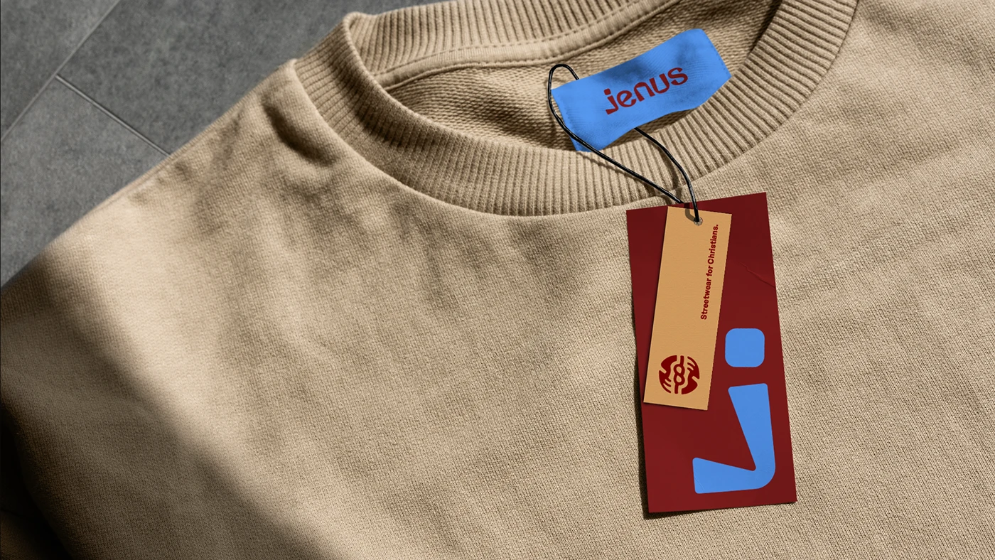
A streetwear identity that treats faith as culture, not costume.

We blend strategy, creativity, and technology to help brands grow, connect, and stand out in an ever-evolving digital world.





A fintech identity built to make saving and investing feel secure, not intimidating.
Eternull Media
Abdul Hannan
Founder & Creative DirectorStashio
2023

Stashio emerged from a powerful vision — to give people across Africa a secure, transformative approach to saving and investing their hard-earned money, built on the belief that everyone deserves a prosperous, secure future.
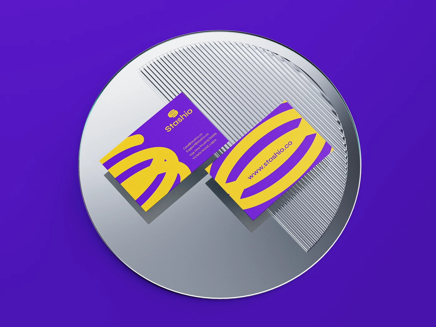
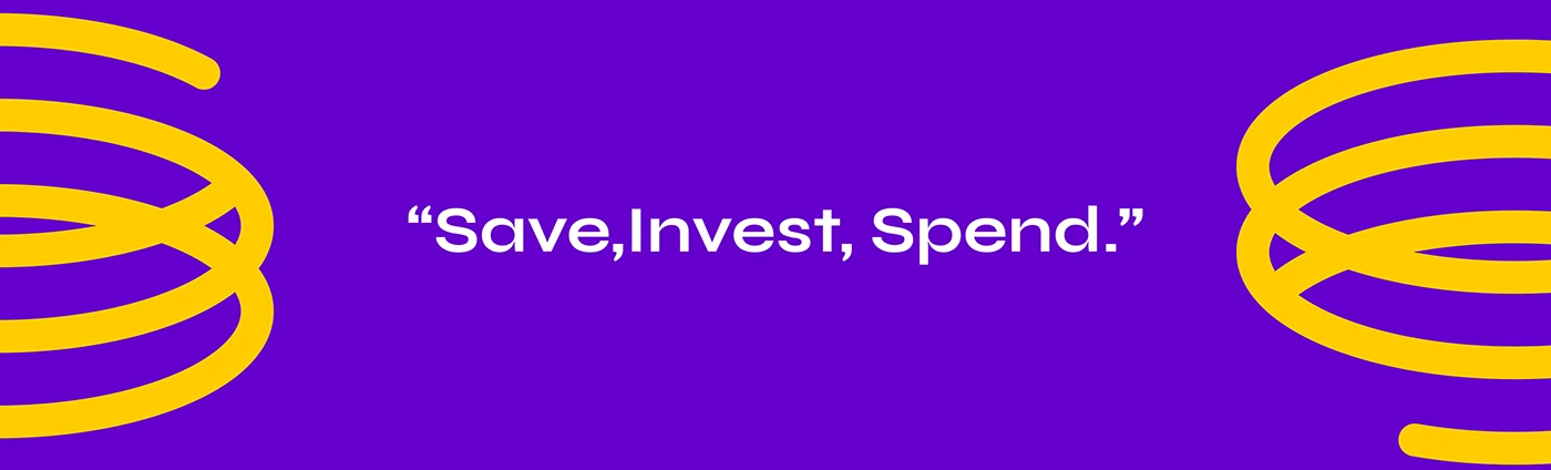
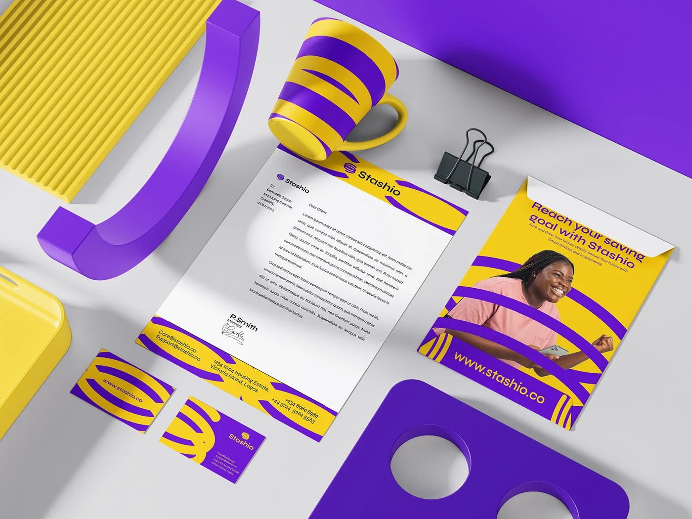
Fintech products live and die on trust, so the identity needed to feel secure and credible without becoming cold or corporate. We built the system around a looping, infinity-inspired mark — suggesting continuous growth — paired with a confident purple-and-yellow palette that stands apart from the blue-and-green convention of most savings apps.
The result is a brand that feels optimistic and empowering, meeting people exactly where financial products often fail to: with warmth, clarity, and genuine encouragement.
— Unlocking the true potential of everyday savings.
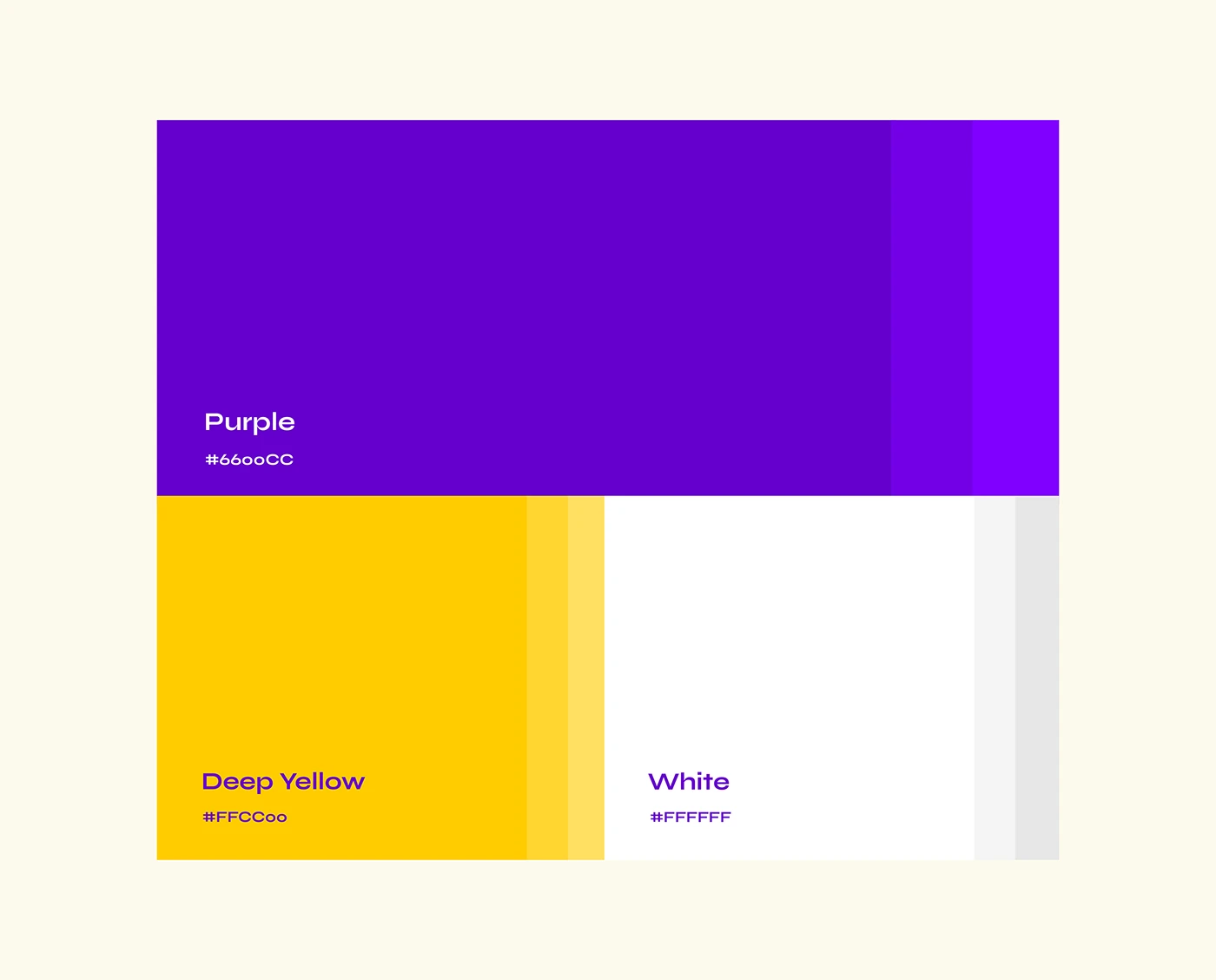
Financial products face an inherent trust barrier, and savings apps in particular must balance credibility with approachability. Stashio needed to feel secure enough to hold someone’s savings, and welcoming enough for a first-time investor who has never used a product like it before.
We positioned Stashio around empowerment through clarity — the idea that anyone can grow their savings when the tools are designed for them, not around them. A looping growth mark and a bold, optimistic palette carry that promise across the entire product.

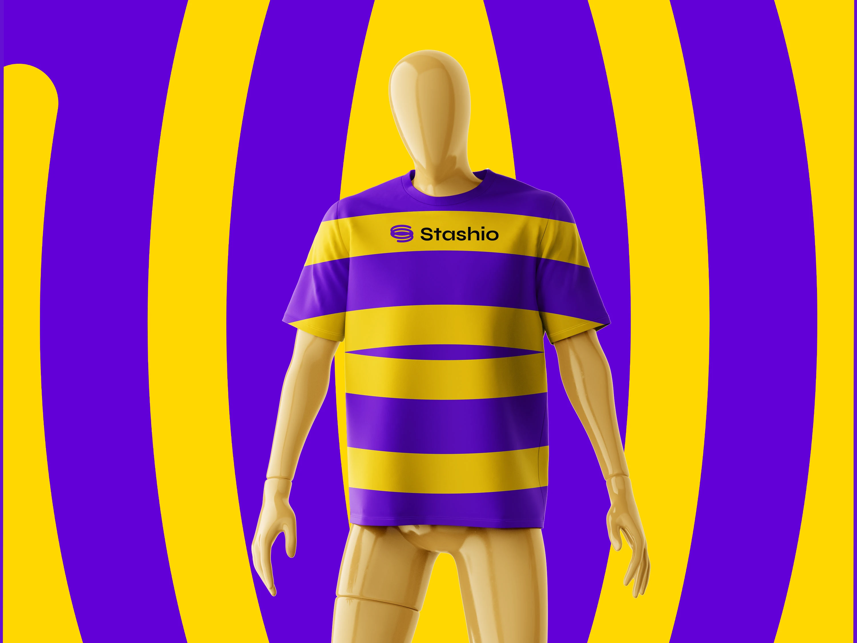
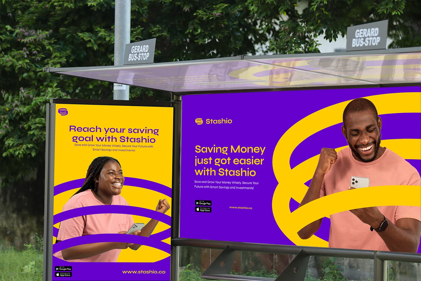
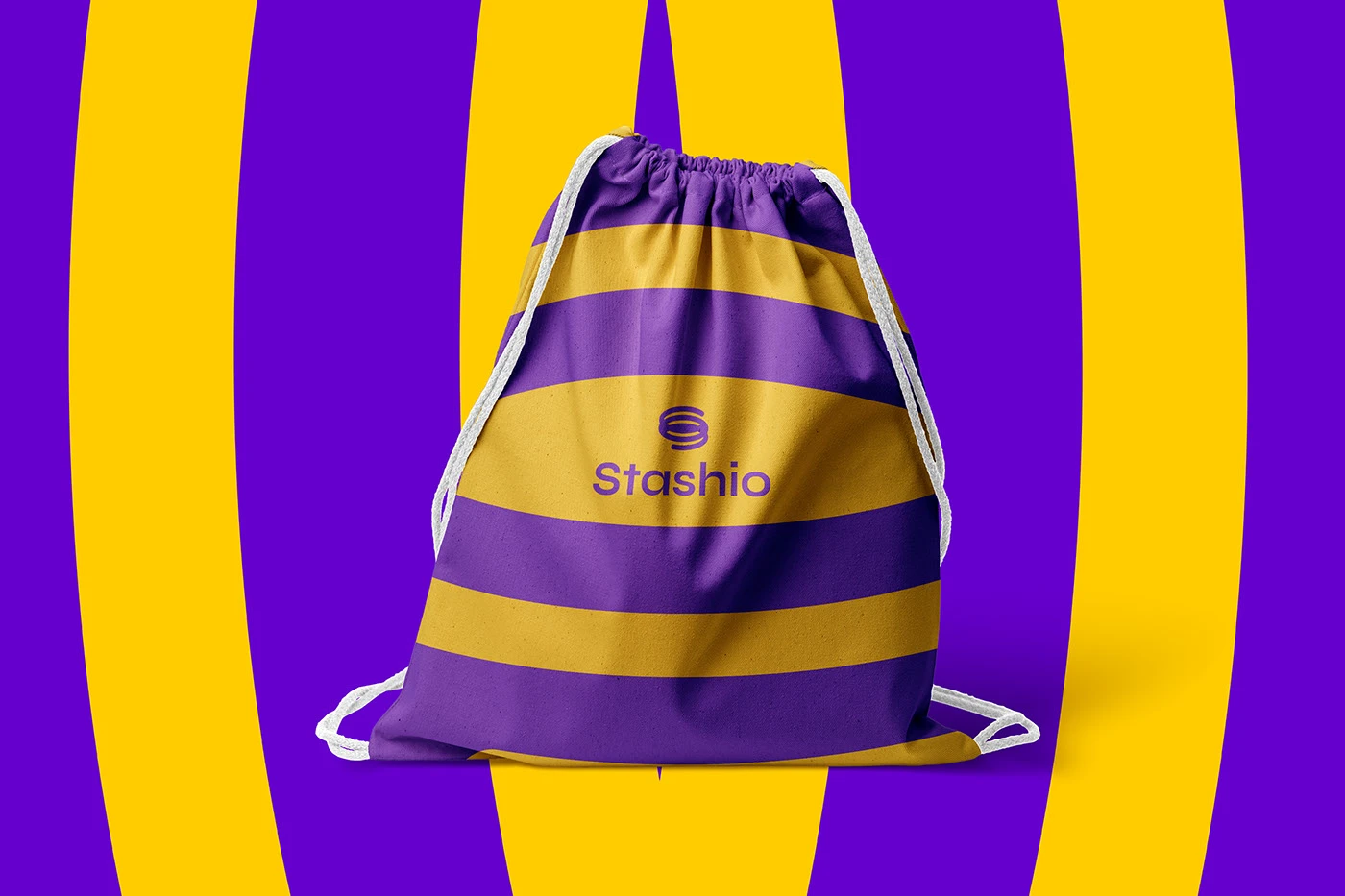
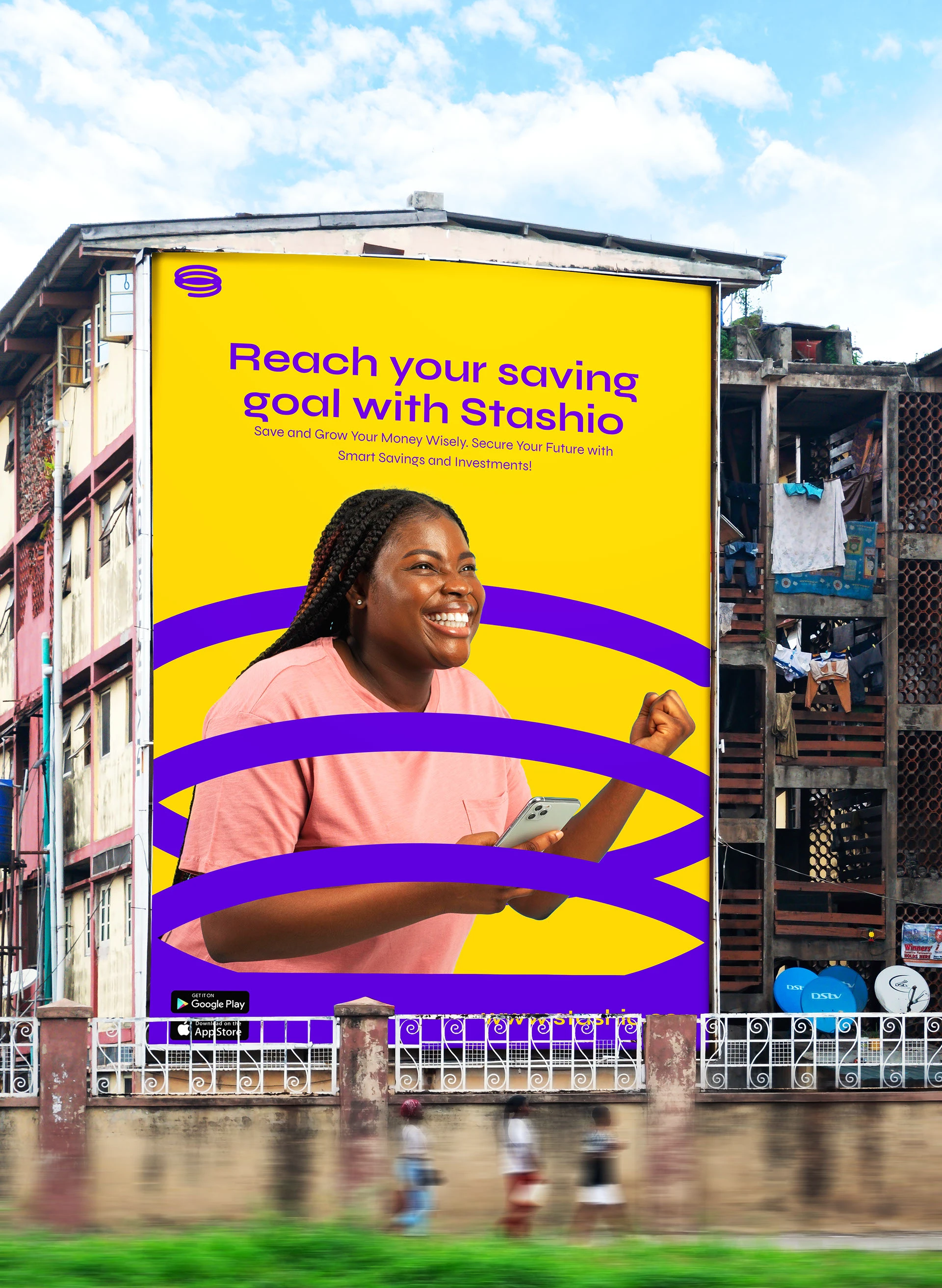
A looping, infinity-inspired symbol anchors the system, paired with a confident, geometric wordmark. A bold purple-and-yellow palette — distinct from typical fintech blues and greens — keeps the brand feeling optimistic across app, campaign, and outdoor use.
App interface

Outdoor & campaign
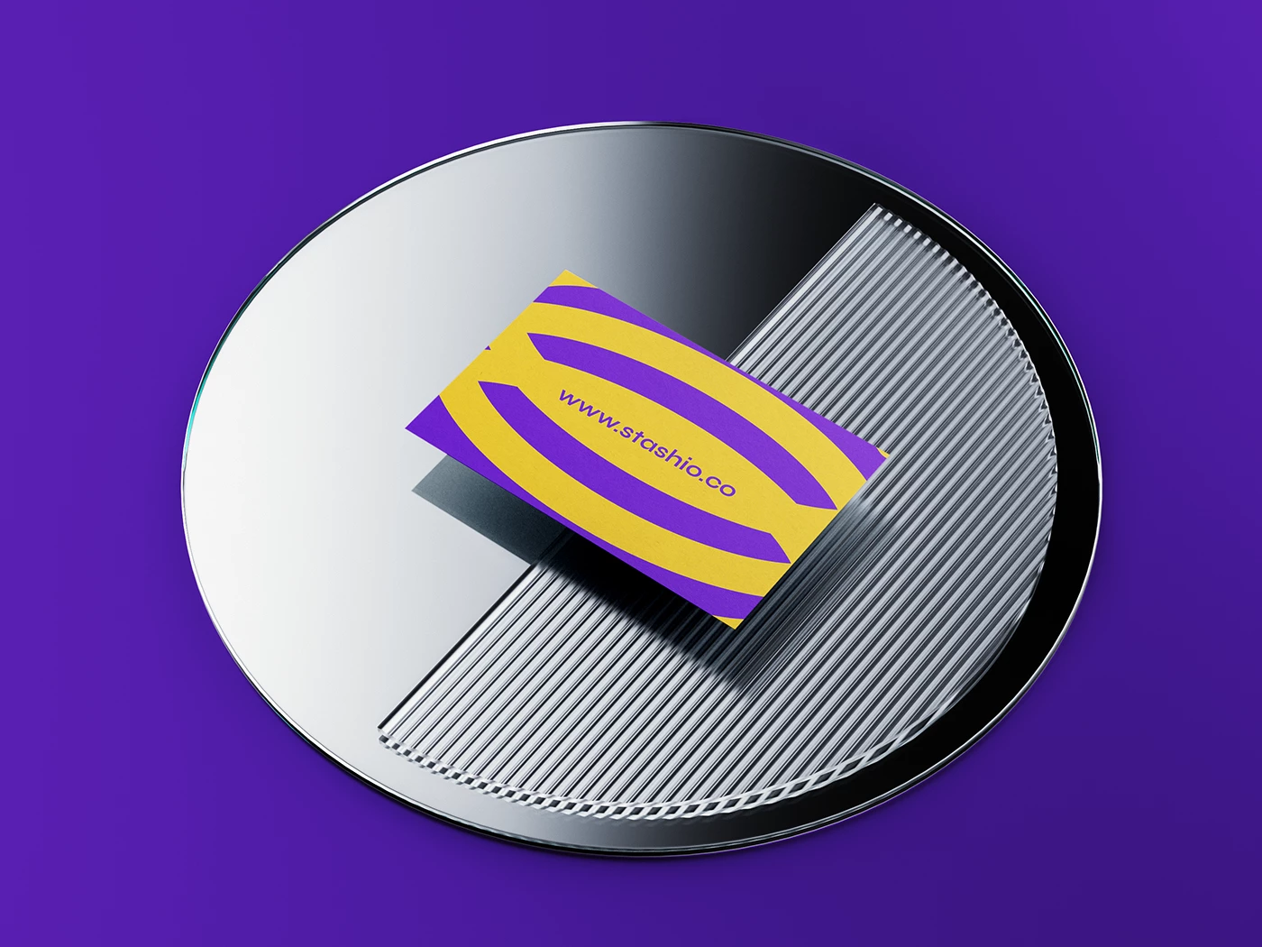
Brand system



01 / 7 App interface.
Stashio now has an identity that makes financial growth feel achievable rather than intimidating — a system built to earn trust from a first download through years of saving.
Financial products live or die on trust. Eternull gave us a brand that makes people feel confident putting their savings in our hands from the very first screen.
Founding Team