
MacuDefense
An AI-generated UGC campaign for an eye-health supplement, built around one symptom most brands never name.

We blend strategy, creativity, and technology to help brands grow, connect, and stand out in an ever-evolving digital world.





A streetwear identity that treats faith as culture, not costume.
Eternull Media
Abdul Hannan
Founder & Creative DirectorJenus
2024
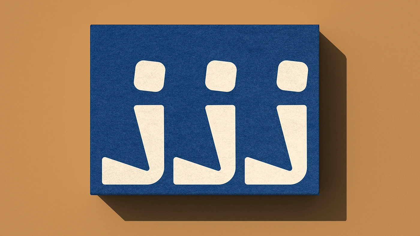
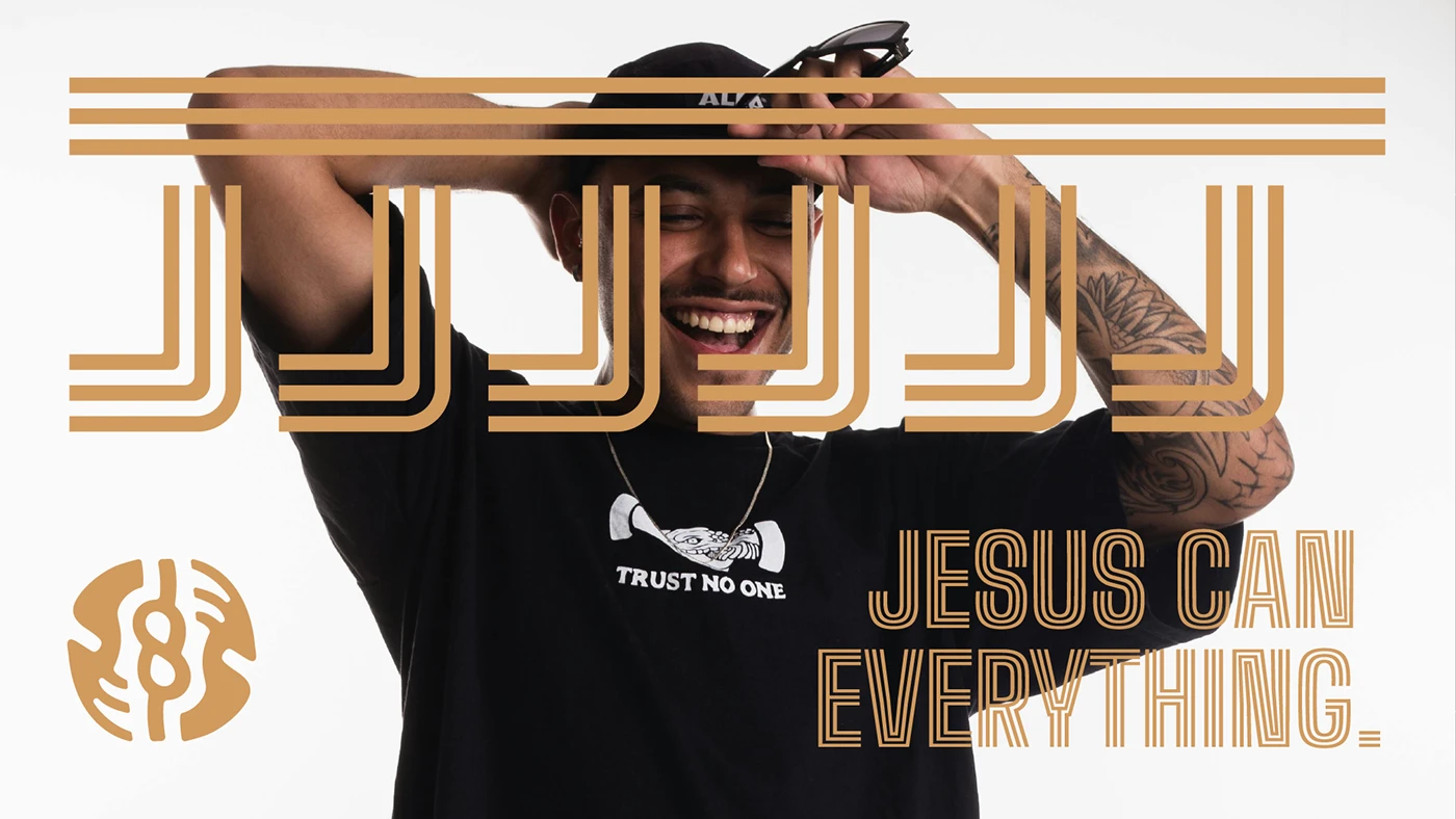
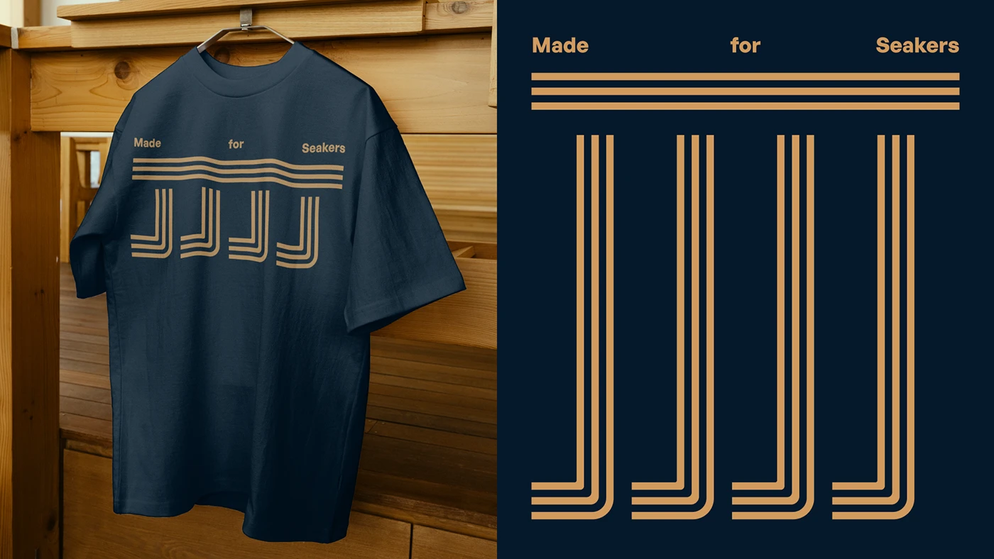
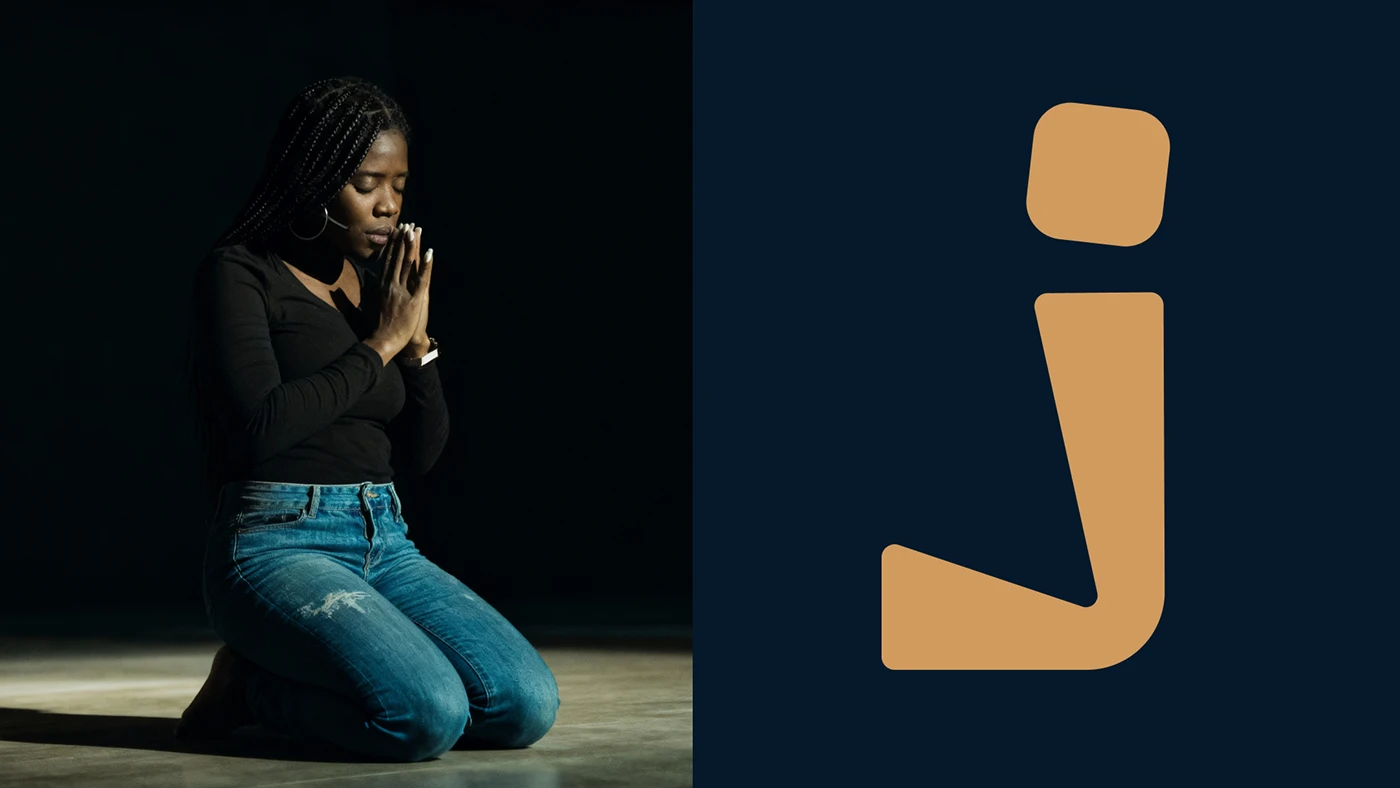
Jenus is a Christian streetwear brand born from the union of faith, identity, and style — built to move away from the common stereotypes of Christian fashion and toward a contemporary design language that belongs on the street, not just the pew.
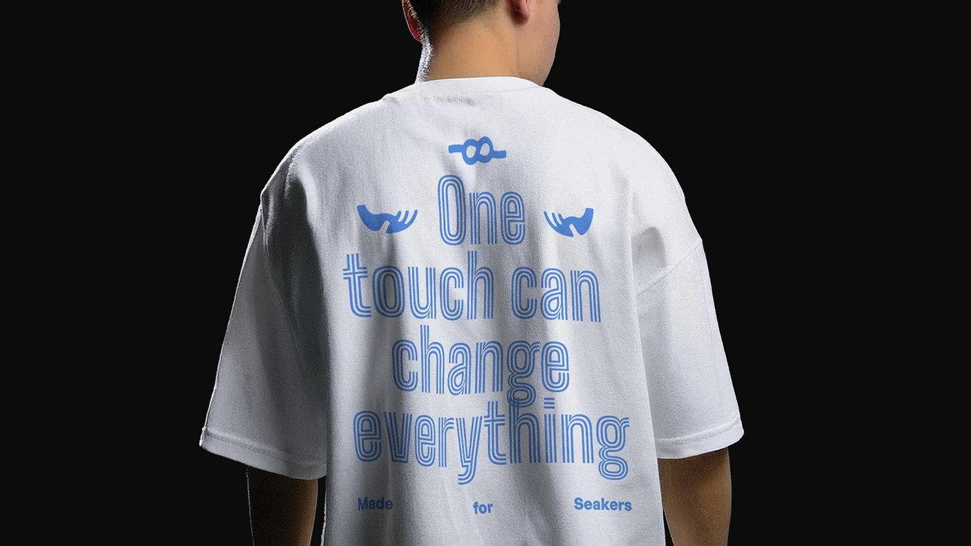
The identity had to hold two things at once: bold, expressive streetwear energy, and a reverence that never tips into kitsch. Every mark, from the woven tag to the drop-shoulder tee, carries the brand’s belief system without reducing it to a slogan.
The result is a system built for belonging — a wordmark and symbol that read as comfortably on a hangtag as they do on a sleeve, designed to travel with the culture it speaks to.
— A declaration of belief, cut for the street.
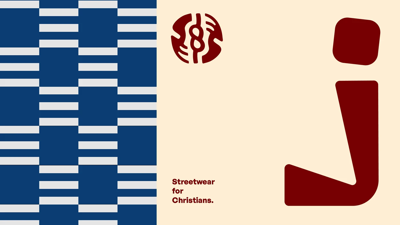
Christian apparel has a familiar visual language — and it rarely looks like streetwear anyone actually wants to wear. Jenus needed an identity confident enough to sit next to any global streetwear label, while staying unmistakably rooted in faith.
We positioned Jenus around a single idea: faith worn with confidence. The strategy leaned into bold typography and a restrained, two-tone palette — letting the clothing carry the culture instead of loud graphics carrying the message.
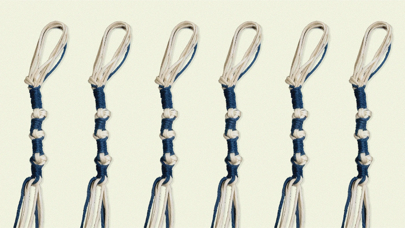
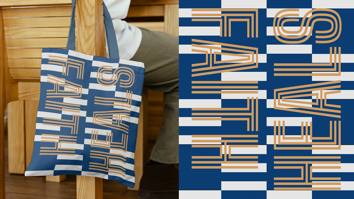
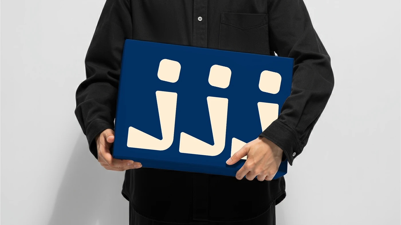
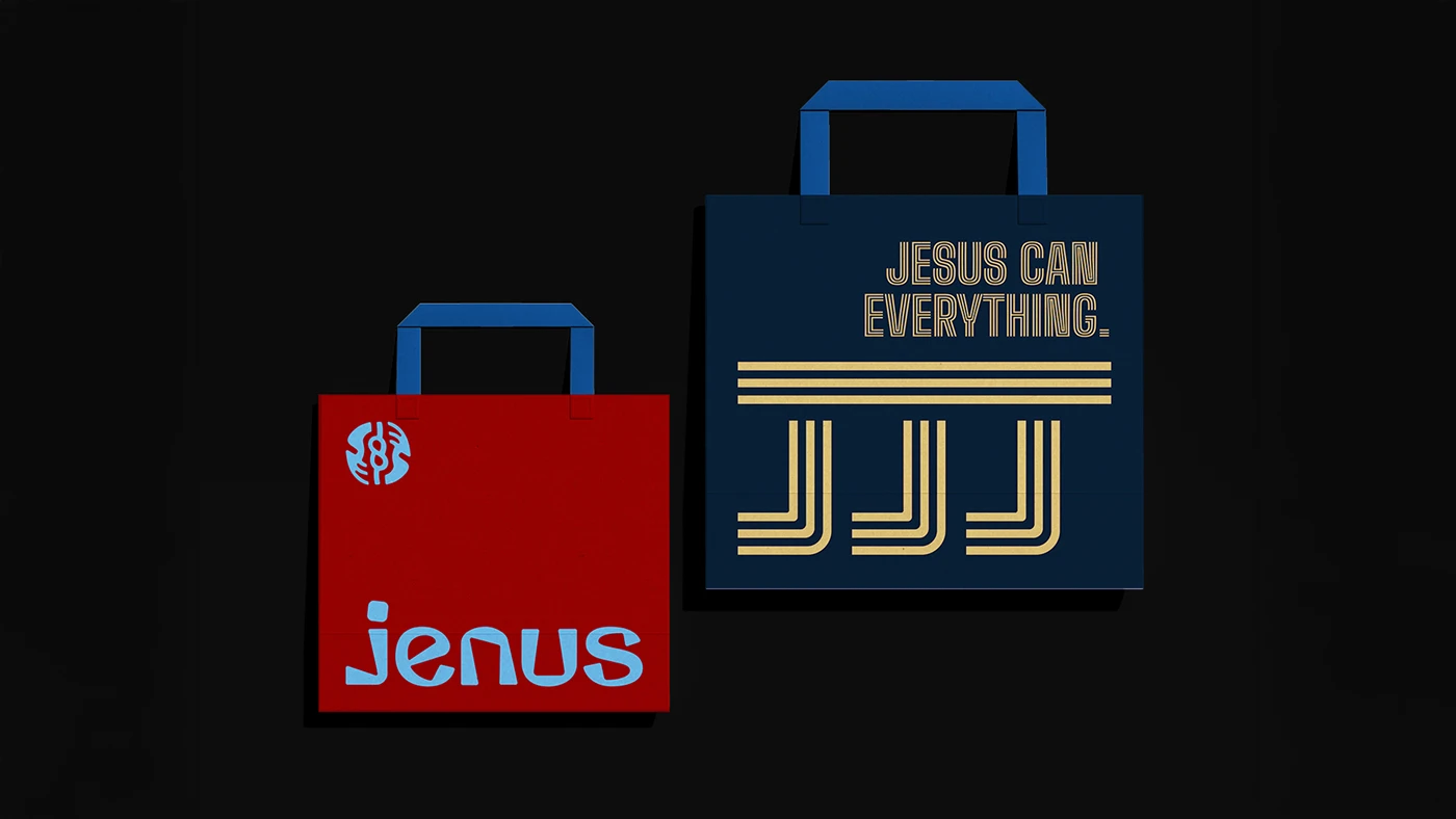
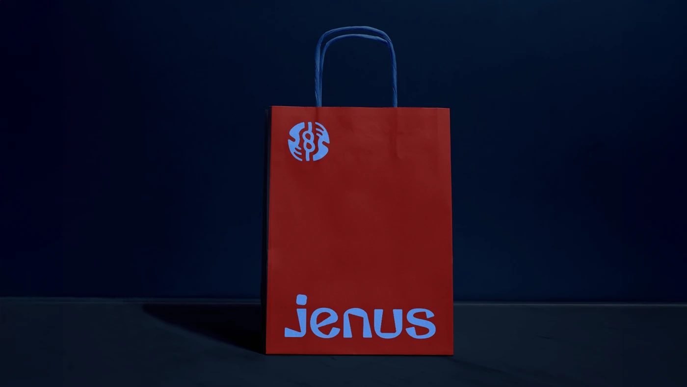
The wordmark uses a rounded, confident display face paired with a custom symbol built from interlocking geometry. A deep red and sky blue palette gives the brand instant shelf presence, while a cream neutral keeps packaging and tags legible.
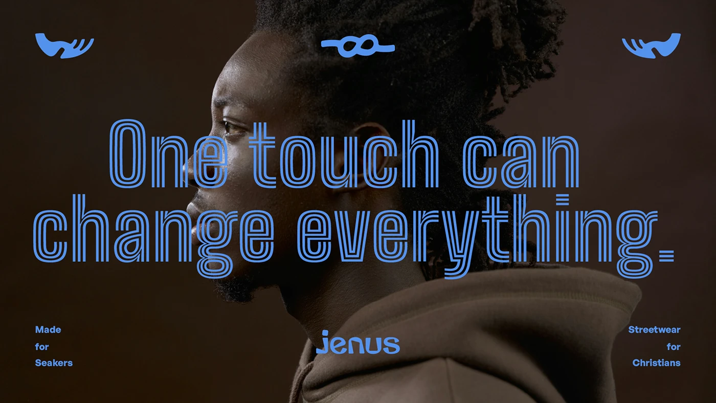
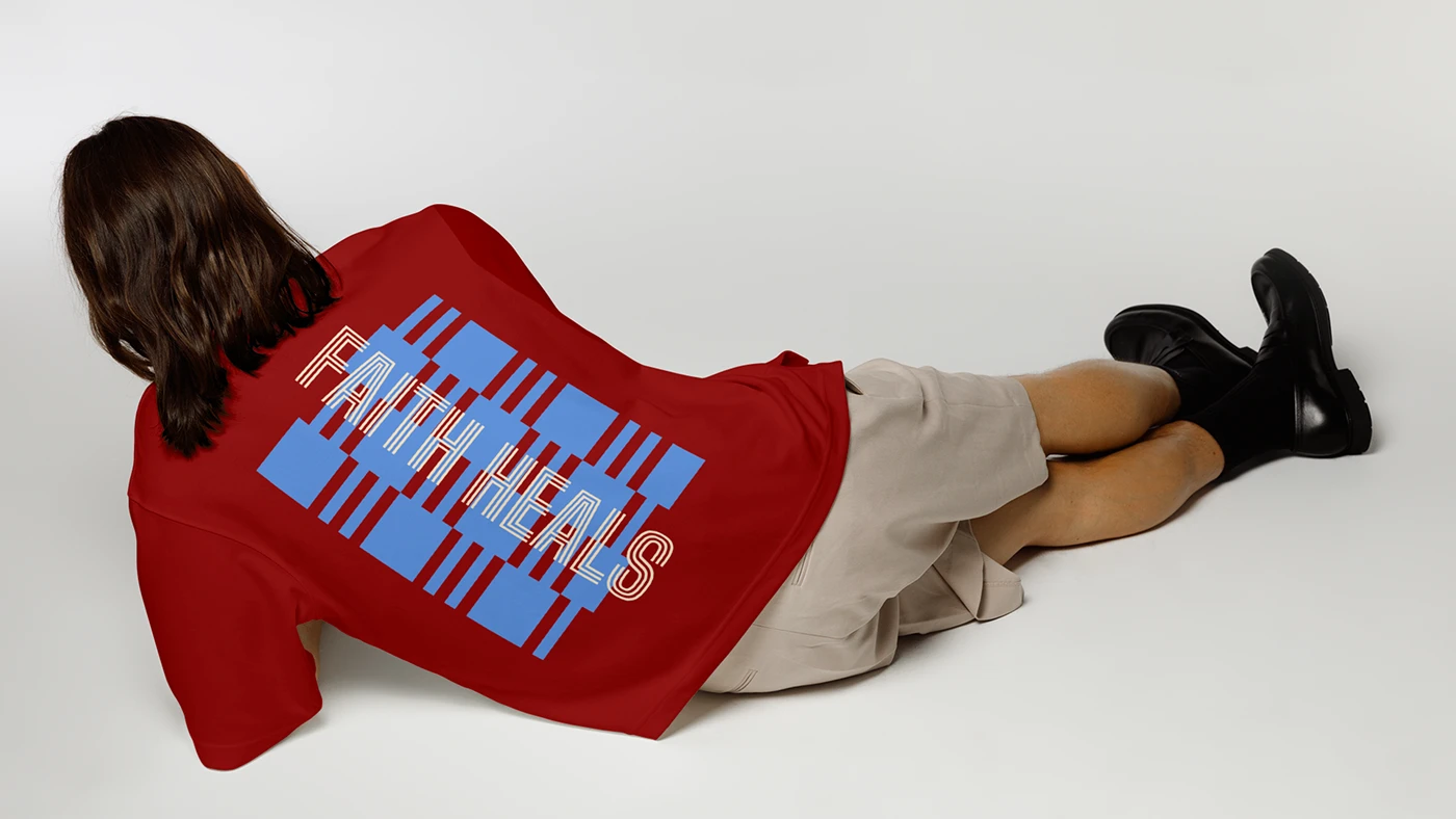
Apparel & hangtags
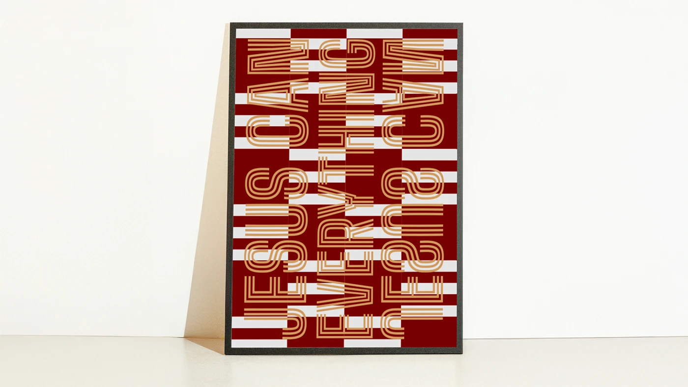
Packaging & pattern
Lookbook
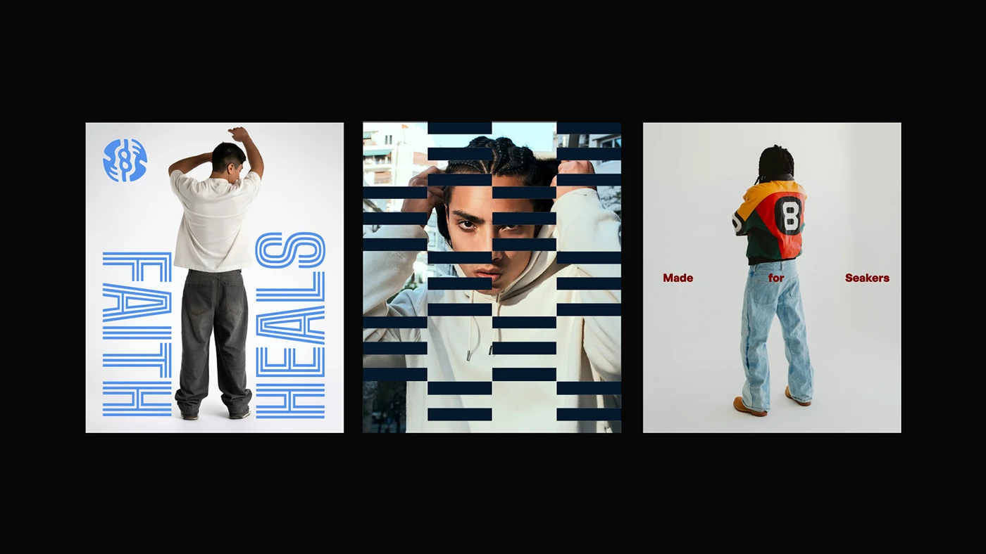
01 / 7 Lookbook.
Jenus now has a visual identity that competes on the same shelf as global streetwear labels — one that lets the brand grow beyond a single drop into a lasting culture.
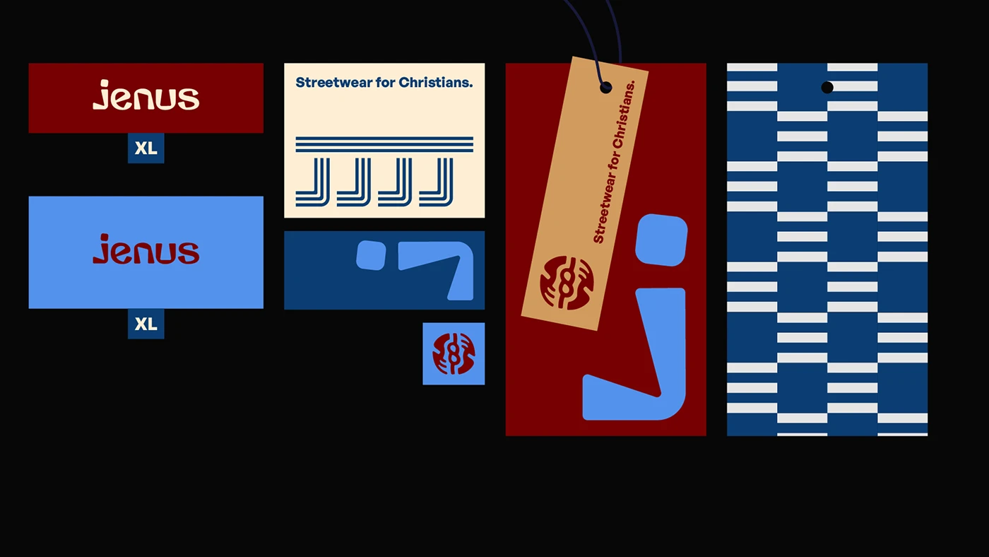
For the first time, our packaging looks as considered as our clothes. Eternull understood exactly what we meant by faith as culture, not costume.
Founder