
Klein
A nail studio identity built around confidence, warmth, and quiet precision.

We blend strategy, creativity, and technology to help brands grow, connect, and stand out in an ever-evolving digital world.





A visual identity for a community platform built on connection, not noise.
Eternull Media
Abdul Hannan
Founder & Creative DirectorClogen
2025
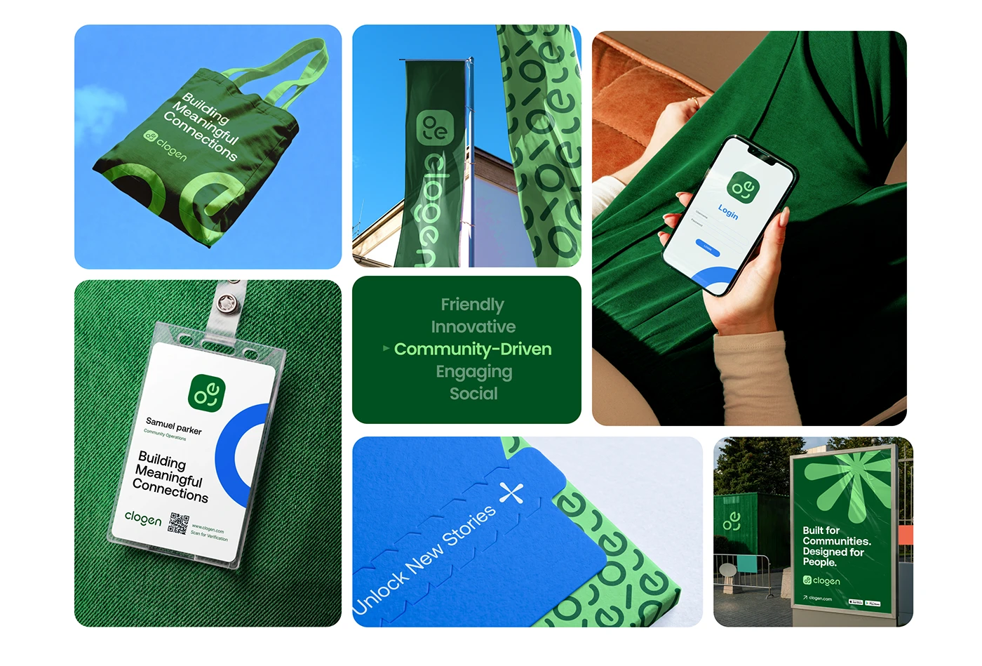

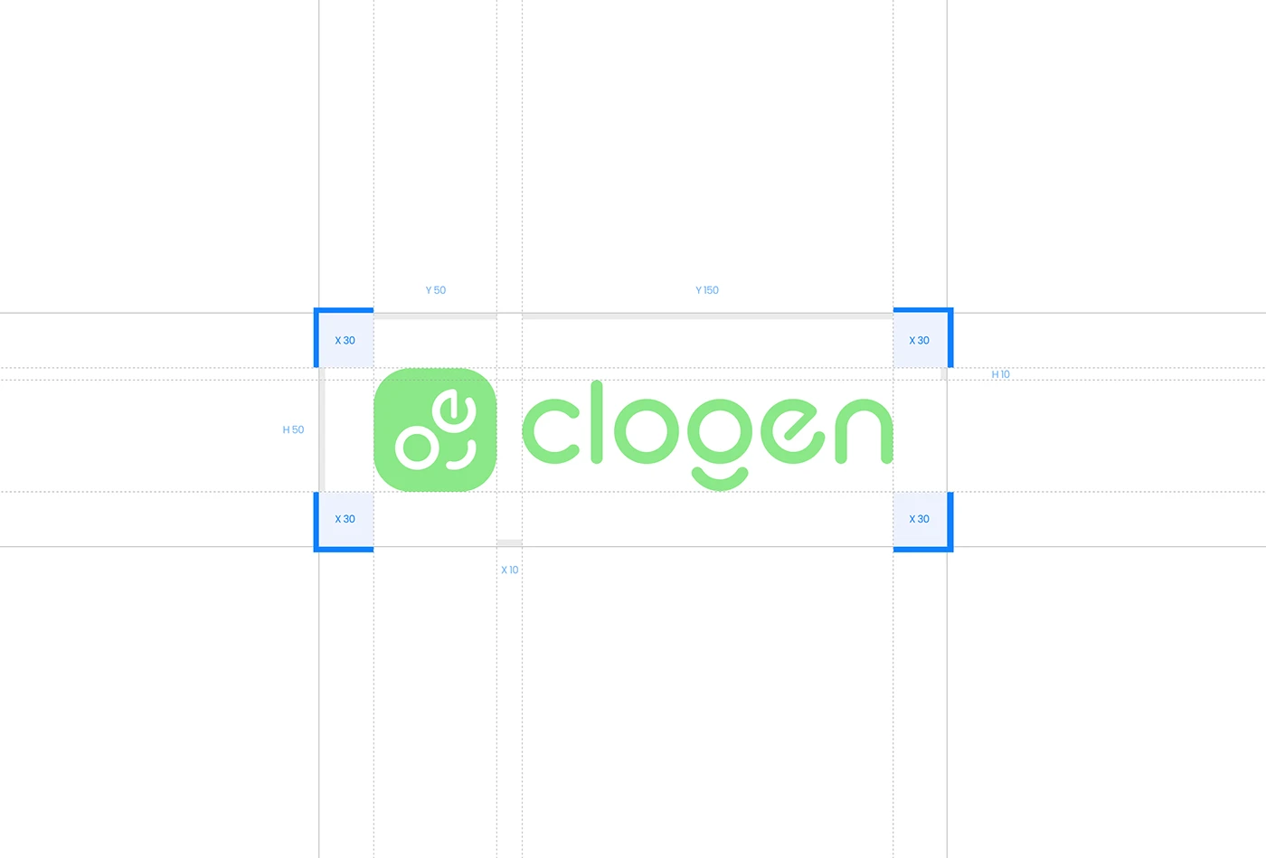
Clogen is a modern community and social platform designed to help people connect through shared interests, meaningful discussions, and collaborative experiences — a trusted space for individuals, creators, and communities to grow together.
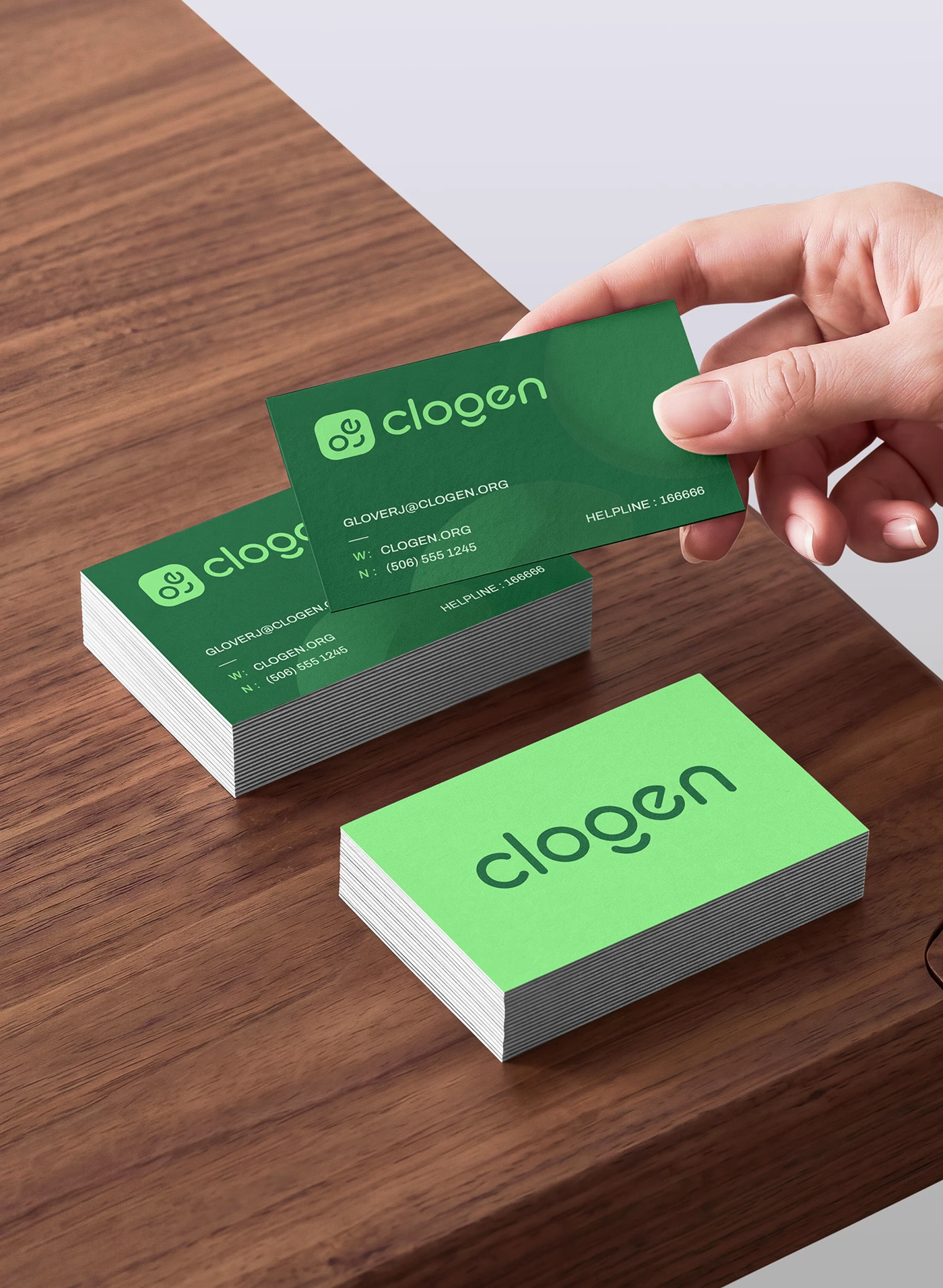
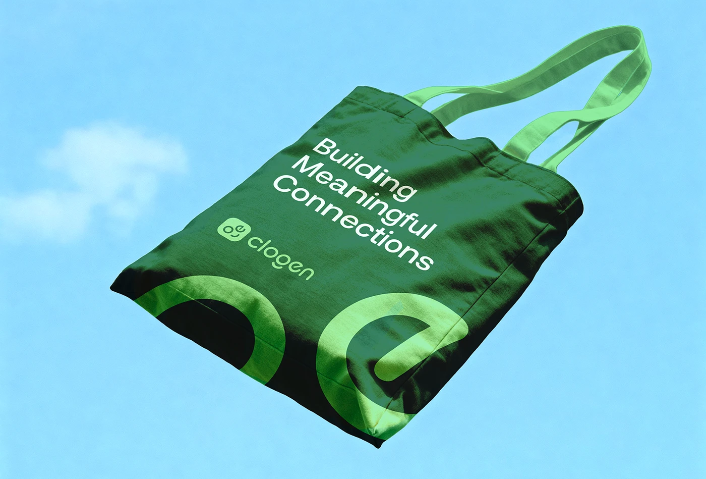
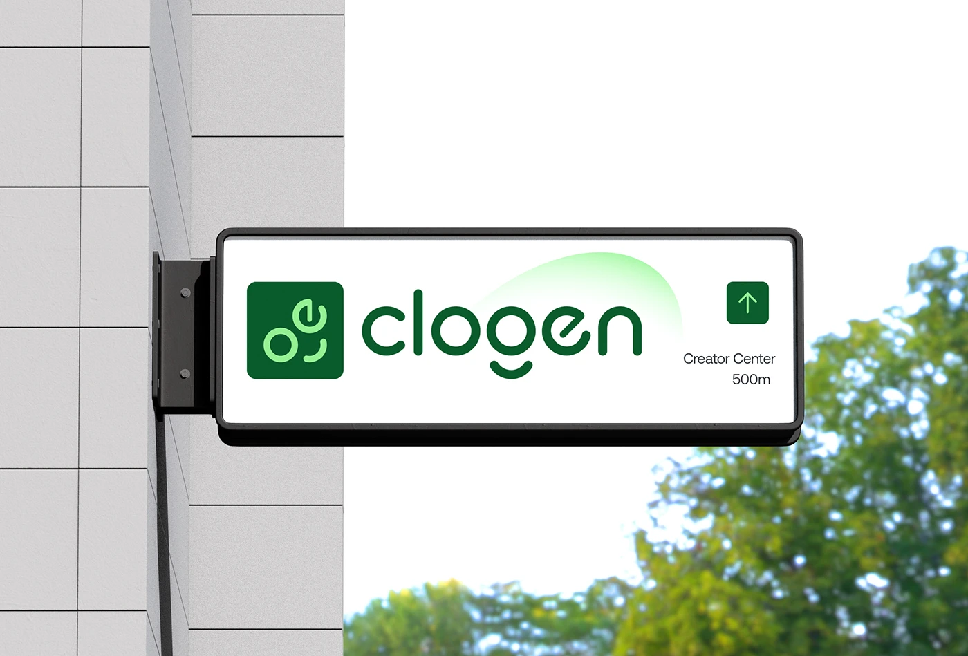
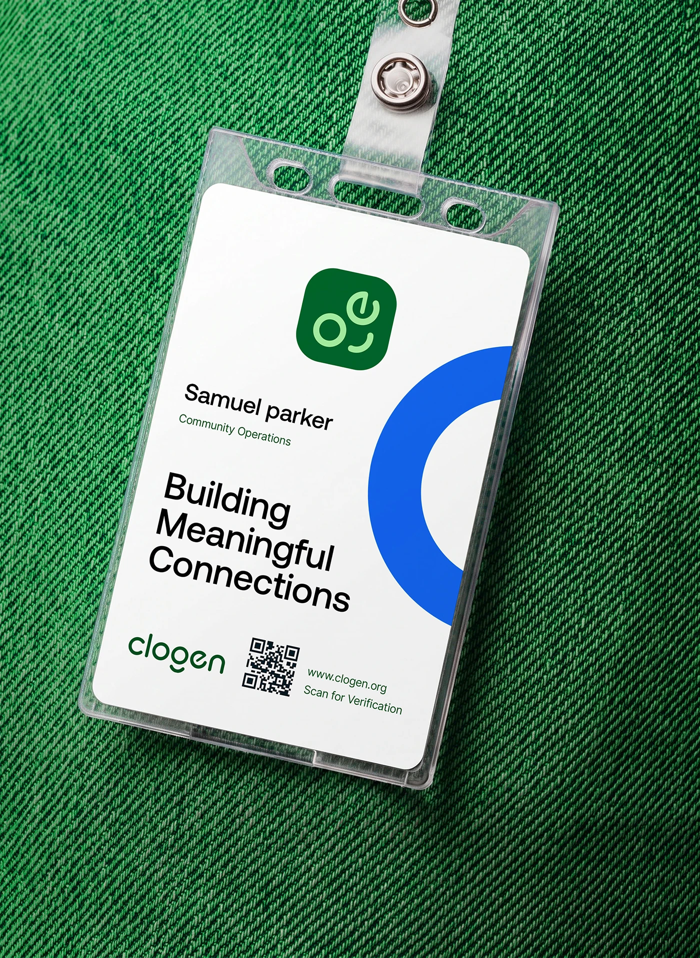
The identity needed to feel warm and human in a category dominated by cold, corporate blues. We built the system around a rounded, friendly wordmark and a symbol that reads as two people, mid-conversation — abstract enough to scale, specific enough to mean something.
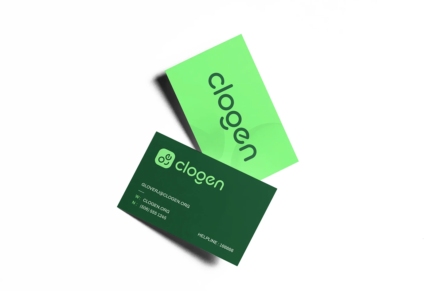
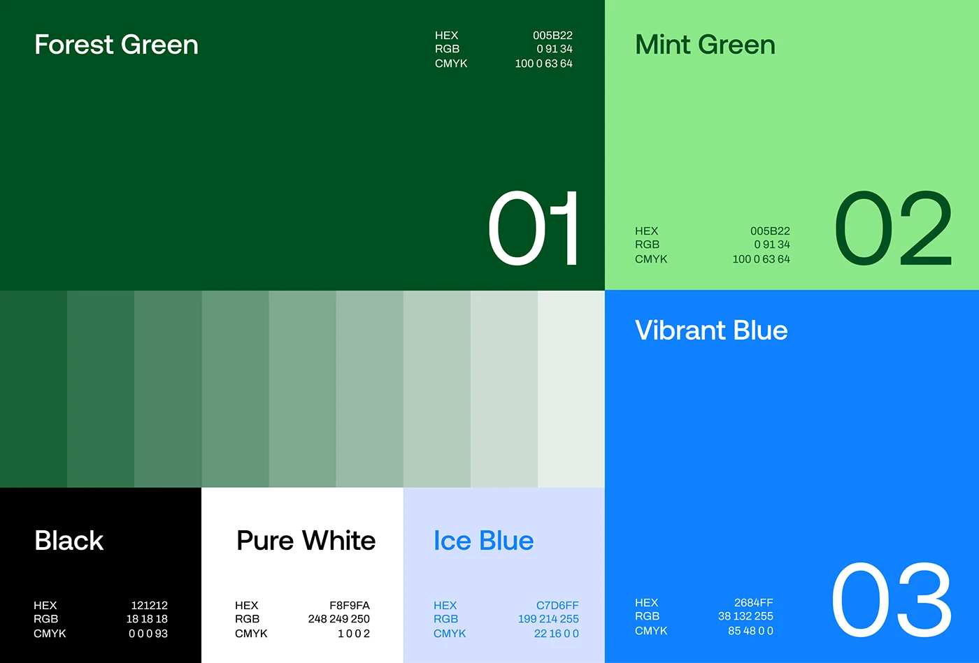
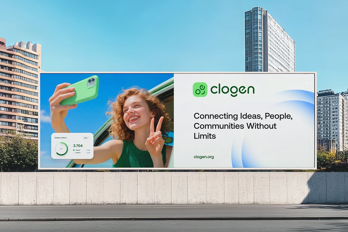
A confident green replaces the expected social-app blue, giving Clogen instant shelf presence on any app store or pitch deck, while a soft, rounded type system keeps the product feeling approachable at every touchpoint.
— Connection, designed to feel human.
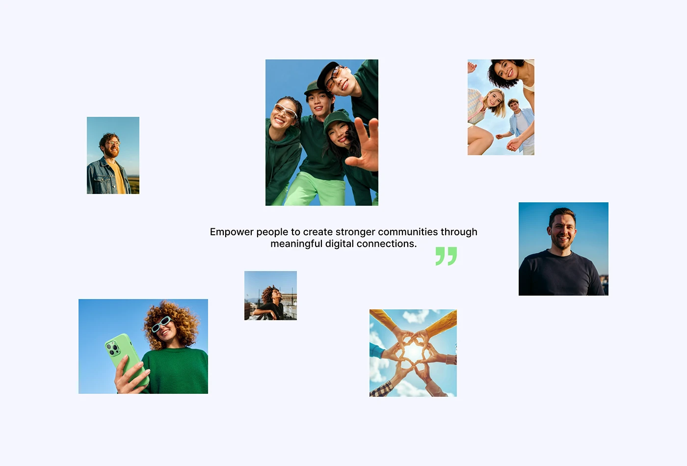
Social and community platforms compete in a visually saturated category — most defaulting to the same blues, the same rounded app icons, the same generic "connection" iconography. Clogen needed to feel distinct on a crowded app store shelf while staying instantly legible as a social product.
We positioned Clogen around warmth as a competitive advantage — leaning into a confident green and a rounded, human symbol to signal a platform built for real conversation, not algorithmic noise.
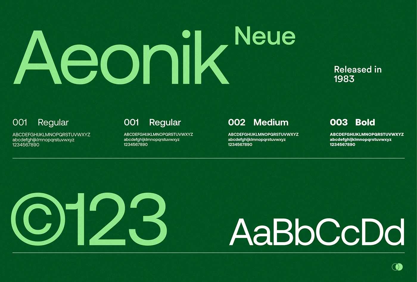
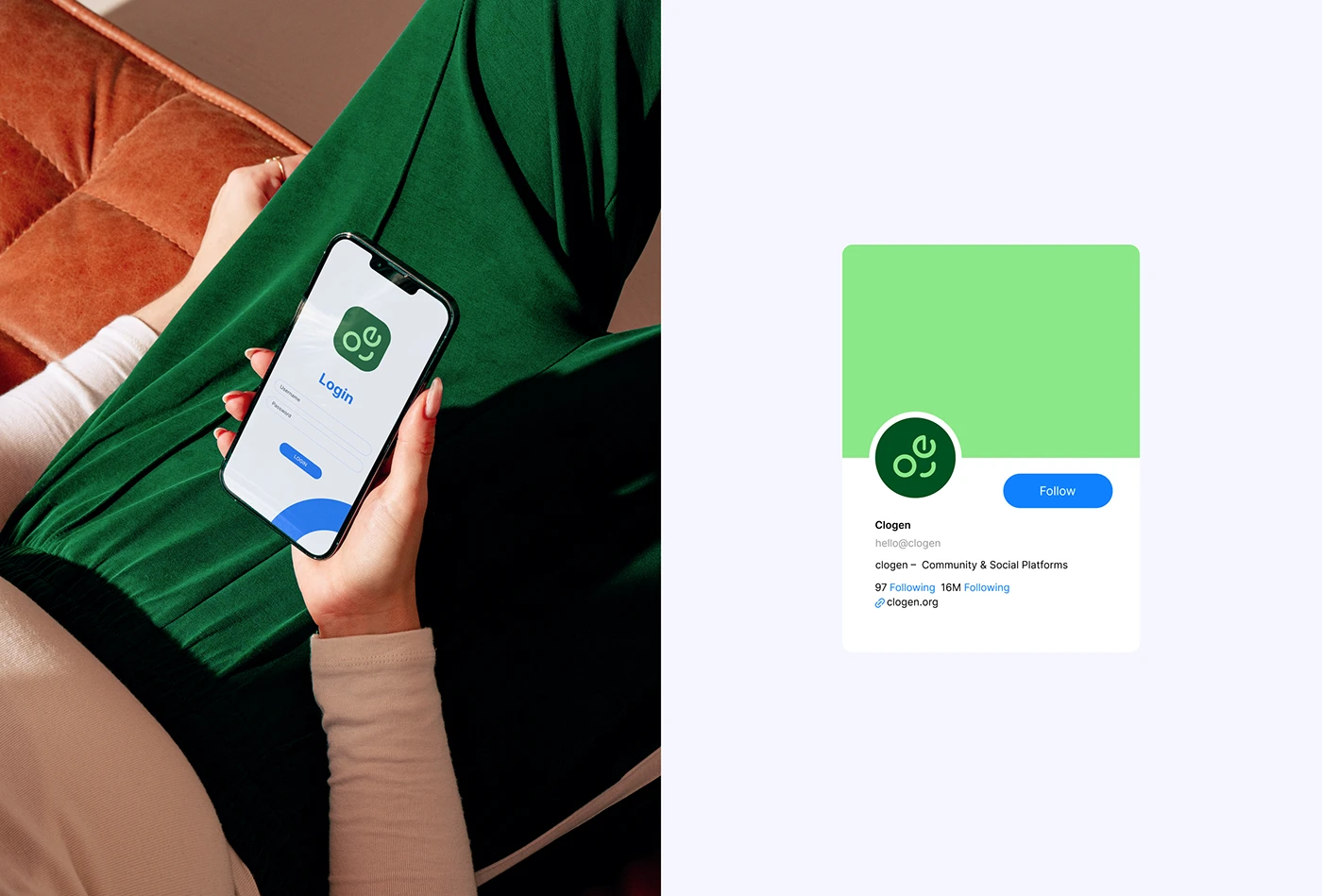
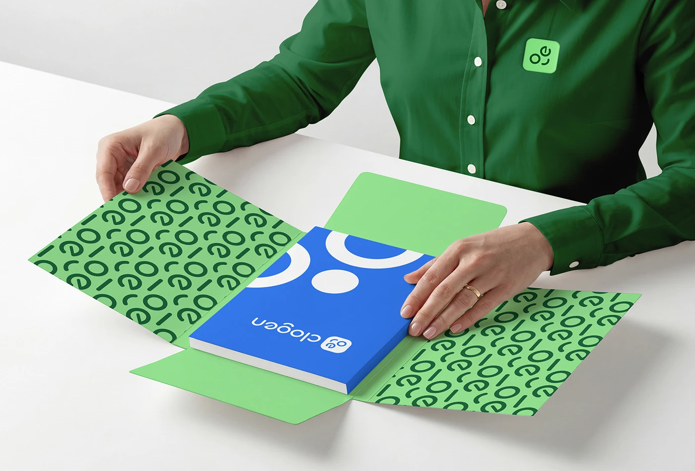
A rounded wordmark pairs with a symbol built from two overlapping conversational marks, rendered in a confident, optimistic green. The full system scales from a 16px favicon to full campaign environments without losing clarity.
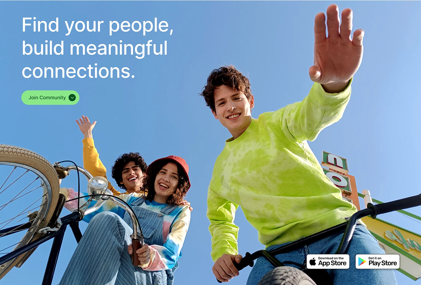
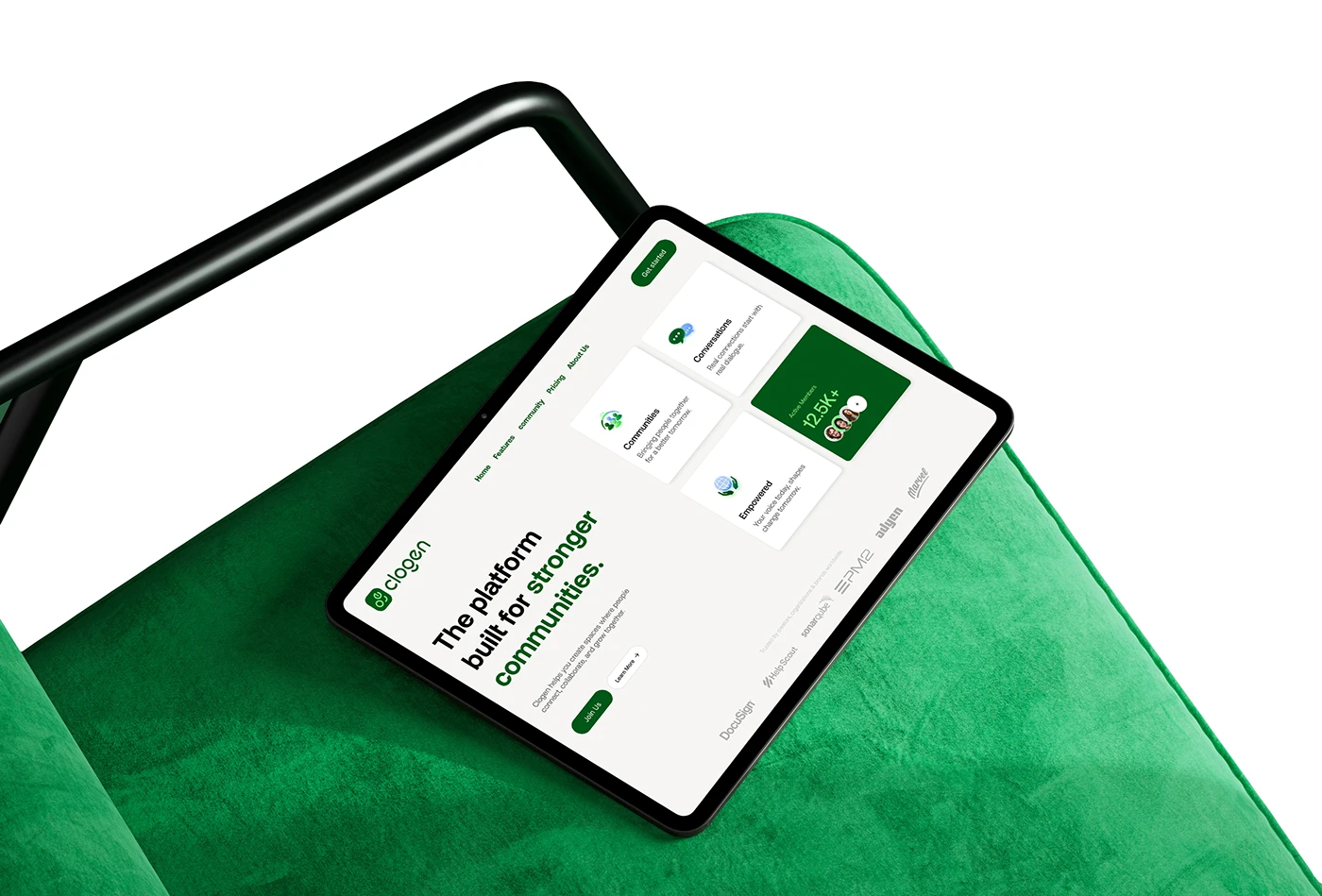
App interface
Marketing & social
Brand system

01 / 9 App interface.
Clogen now has a distinct visual position in a crowded category — a system built to carry the product from its earliest app-store listing through its next funding round.
We needed to look like a platform people could trust with their communities, not another cold tech product. Eternull nailed that balance immediately.
Founding Team