Maria Maria
A decade-old jewelry brand, rebuilt to finally match its own confidence.

We blend strategy, creativity, and technology to help brands grow, connect, and stand out in an ever-evolving digital world.




A nail studio identity built around confidence, warmth, and quiet precision.
Eternull Media
Abdul Hannan
Founder & Creative DirectorKlein
2024
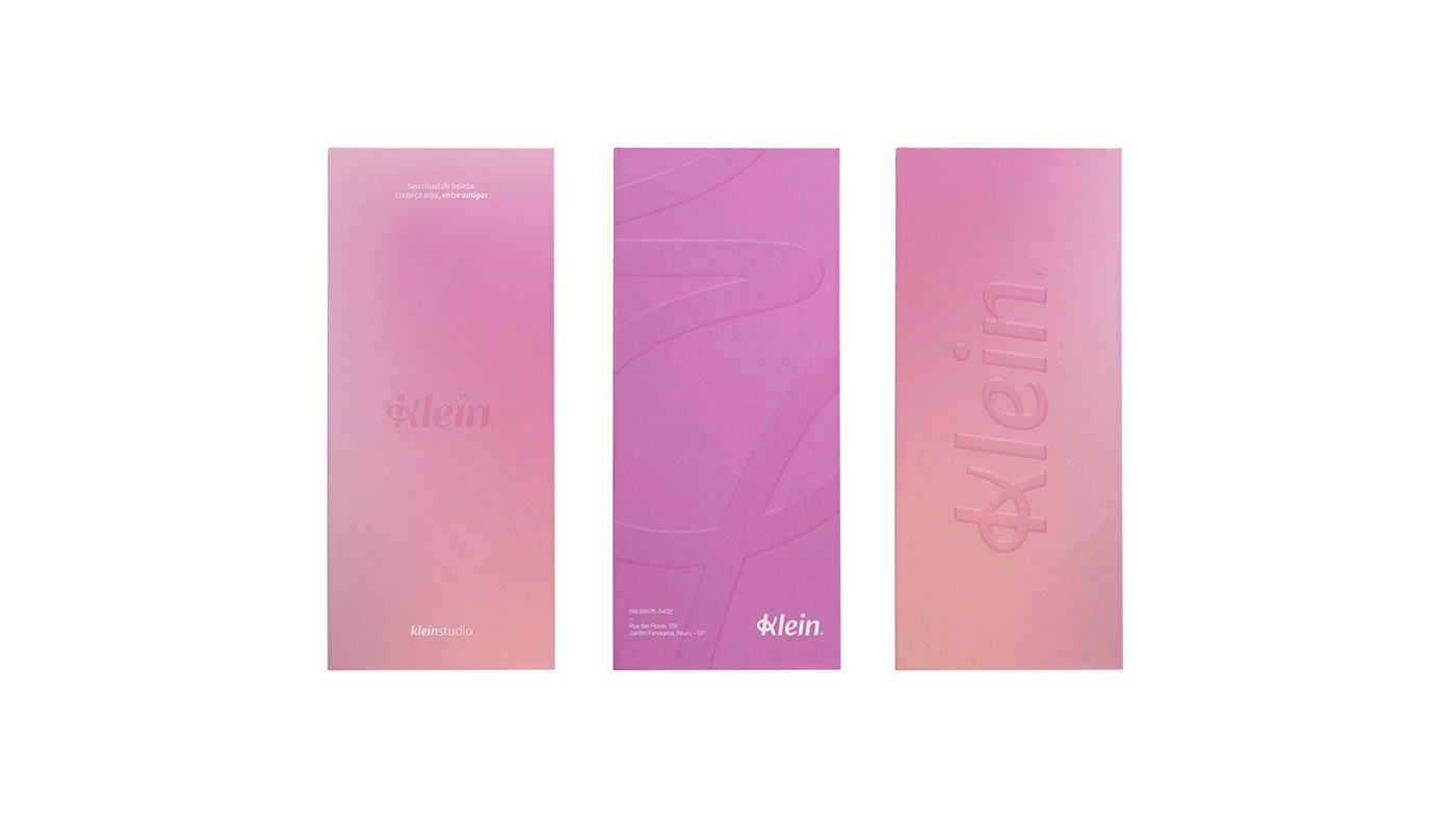
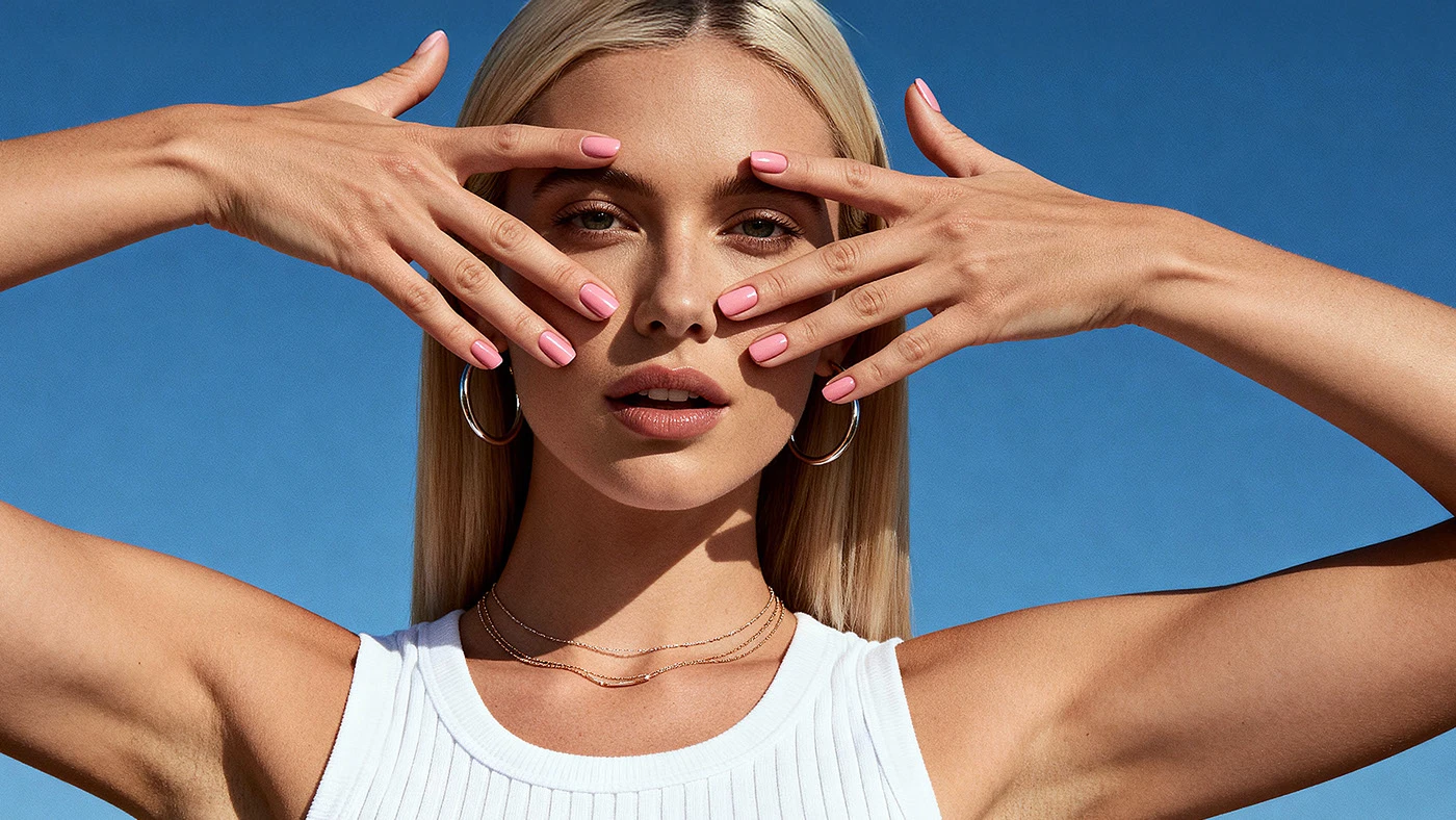
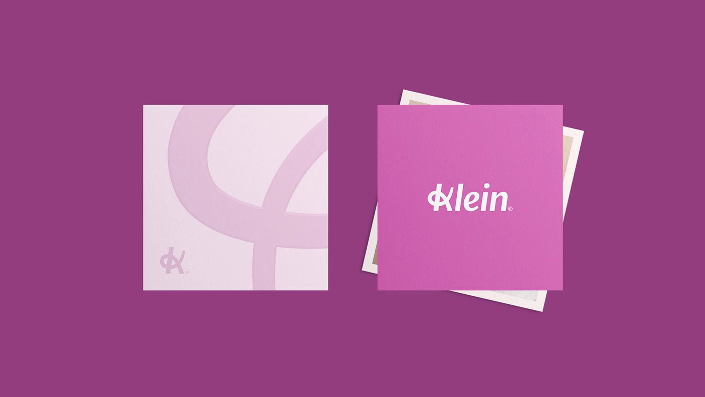
Klein is a nail studio built on care, not just service. The brand needed an identity that felt as considered as the manicures themselves — warm, precise, and unmistakably confident without leaning on cliche.
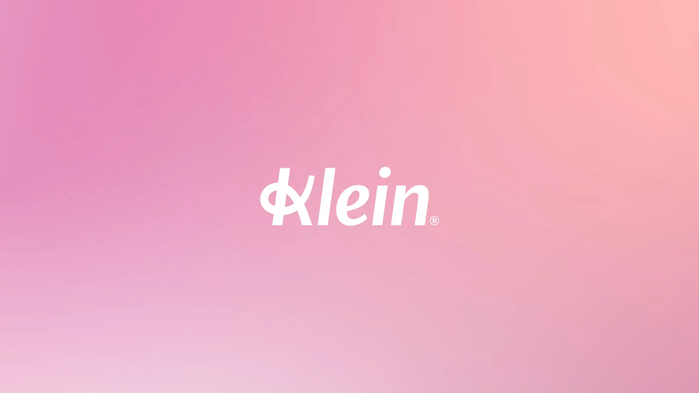
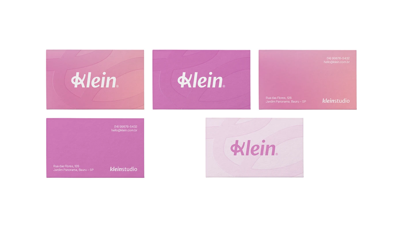
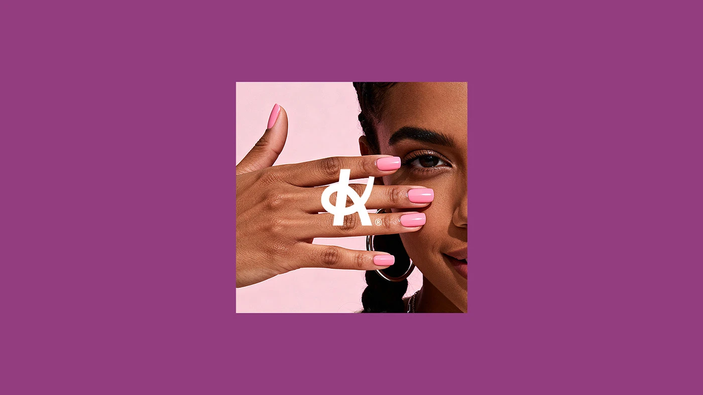
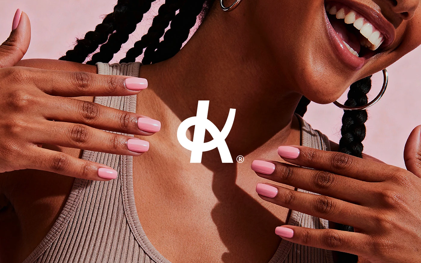
We built the identity around a monogram wordmark — two interlocking letterforms that read as both initials and a gesture, echoing the intimacy of hand-to-hand service. A blush-forward palette carries warmth without tipping into pastel cliche, paired with a confident, editorial sans that keeps the brand feeling premium rather than precious.
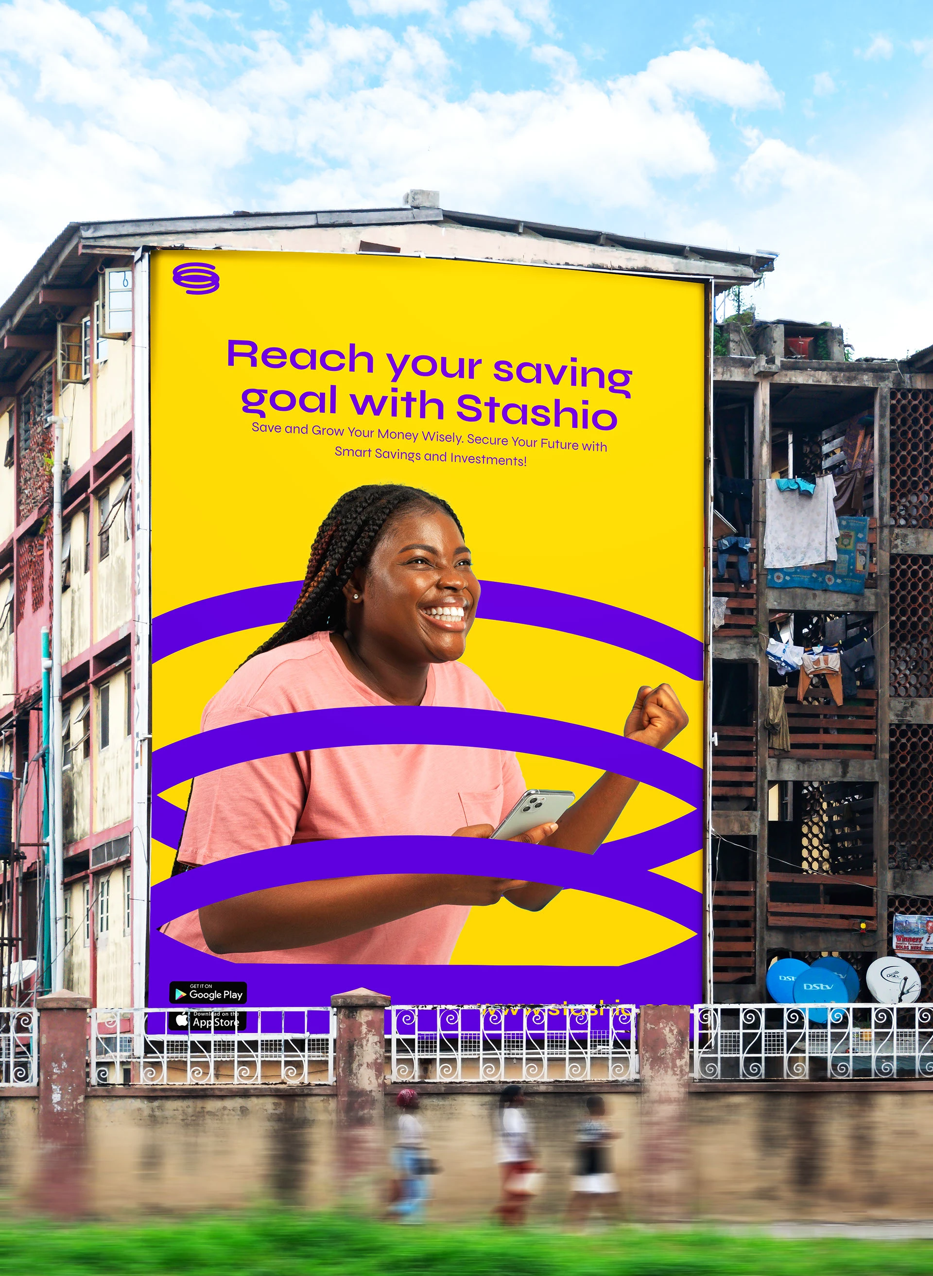
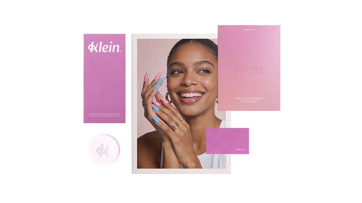
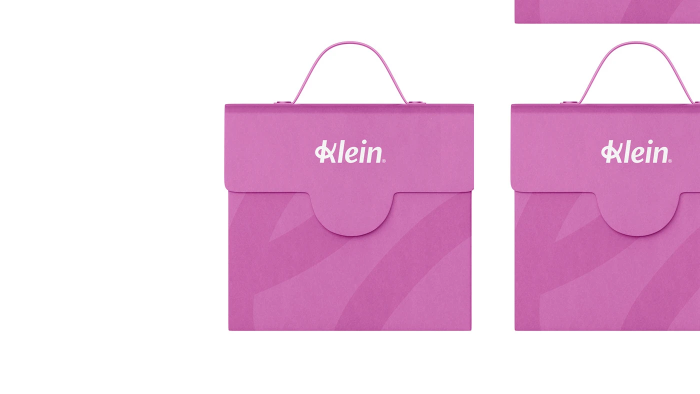
The system extends from packaging and product labels to outdoor and social — each touchpoint dressed in the same unmistakable pink, so a billboard, a bottle, and a Reel all read as Klein at a glance.
— An identity for the ritual of self-care.
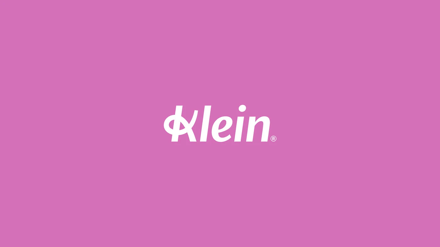
Klein needed to stand apart in a category crowded with sameness — nail studios that lean on generic pinks and stock manicure photography rarely differentiate. The challenge was building a mark distinct enough to own outdoor and social at a glance, while staying warm enough for an intimate, hands-on service.
We positioned Klein around a simple idea: care as craft. Every strategic decision — from the interlocking monogram to the tone of voice — reinforces that a visit to Klein is an act of attention, not a transaction.
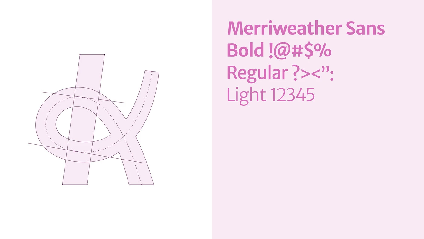
The wordmark pairs a custom monogram with a soft, rounded sans — confident at large sizes, legible at the scale of a product label. A tightly controlled palette of blush, magenta, and cream carries the brand across every surface without losing cohesion.
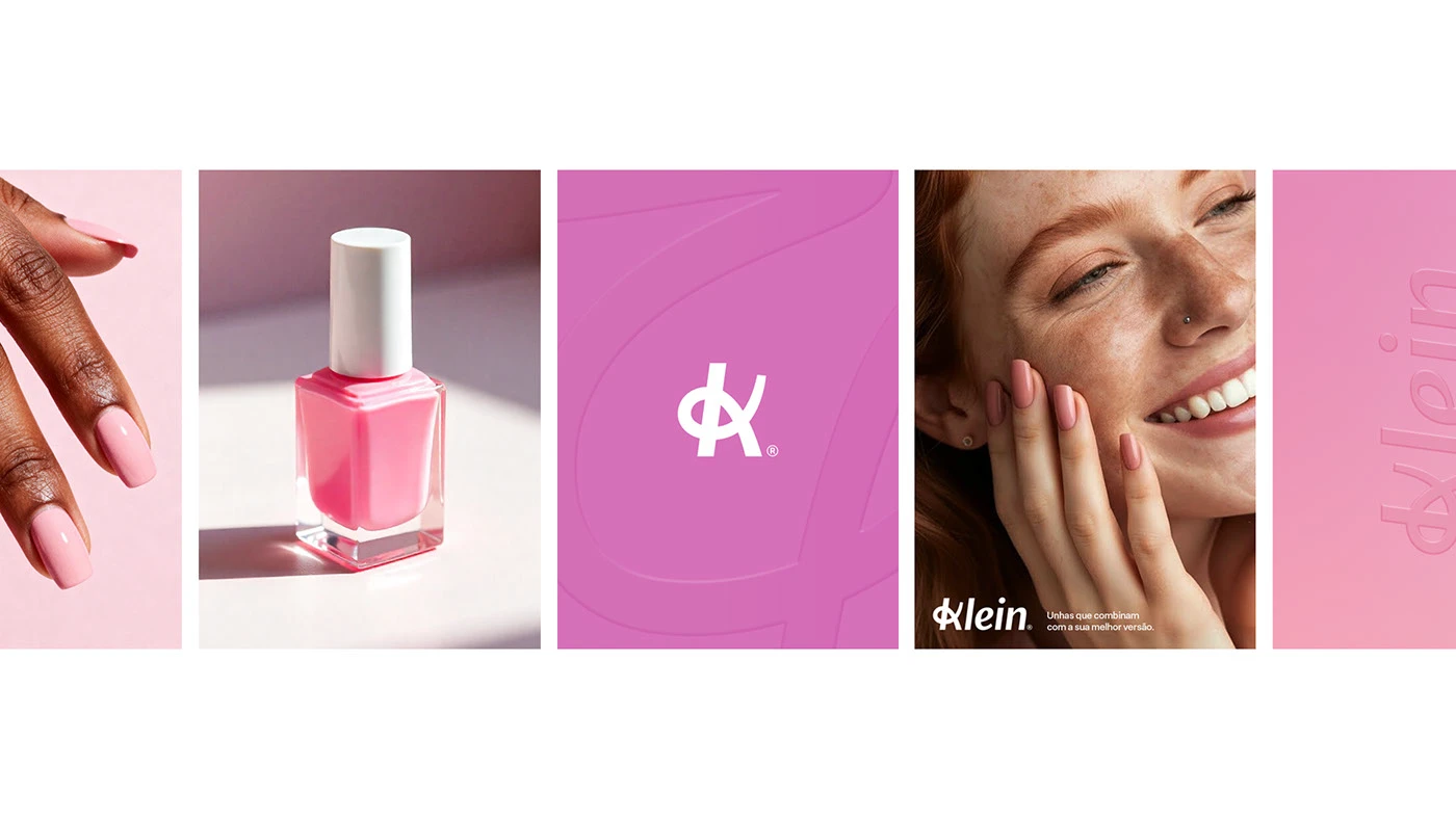
Packaging & product line
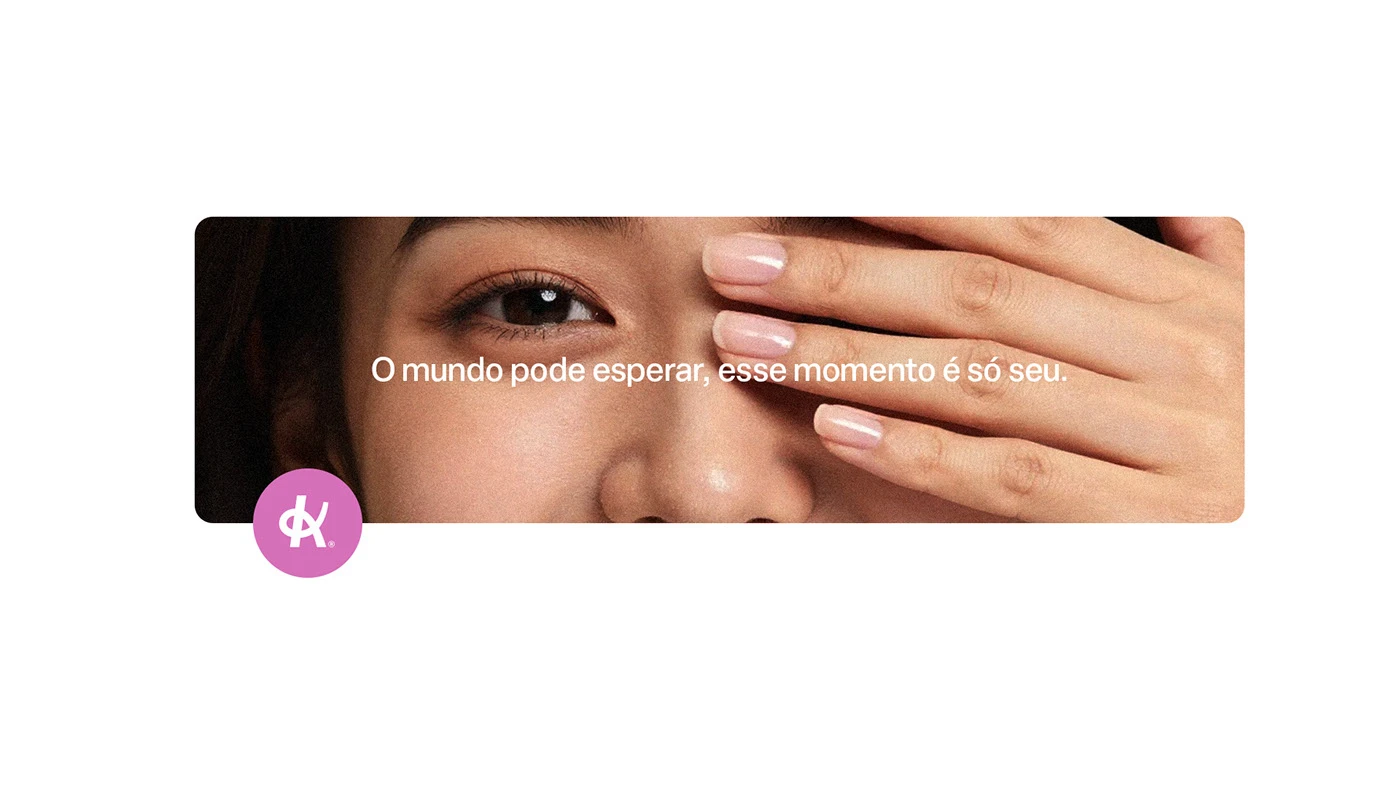
Campaign & social
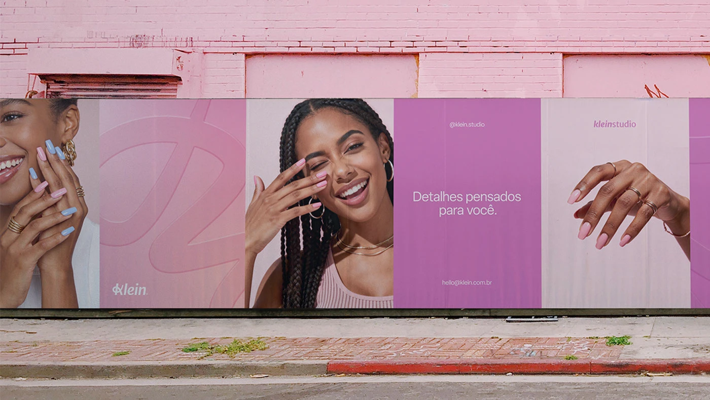
Outdoor & environmental
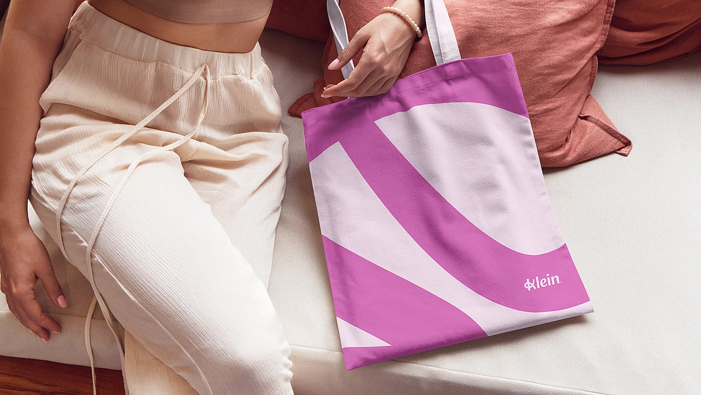
01 / 7 Product detail.
Klein now owns a visual identity as considered as the service itself — a system that reads clearly from a phone screen to a city block, and gives the studio a foundation to grow from a single location into a recognizable regional brand.
Eternull gave us a brand that finally looks like how our clients feel when they leave the studio - confident, put-together, seen. Bookings from Instagram alone are up since we relaunched.
Founder & Owner