
Klein
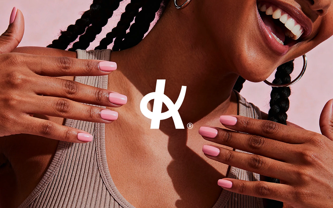
A nail studio identity built around confidence, warmth, and quiet precision.

We blend strategy, creativity, and technology to help brands grow, connect, and stand out in an ever-evolving digital world.





A decade-old jewelry brand, rebuilt to finally match its own confidence.
Eternull Media
Abdul Hannan
Founder & Creative DirectorMaria Maria
2024
Maria Maria is a semi-jewelry brand built on a simple belief: that self-care, worn daily, makes for a lighter life. Approaching its tenth year, the brand had never significantly invested in design — its communication no longer matched its ambition.
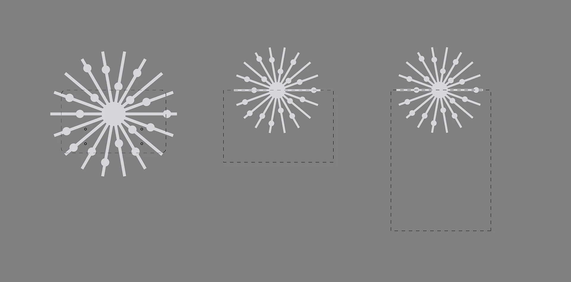
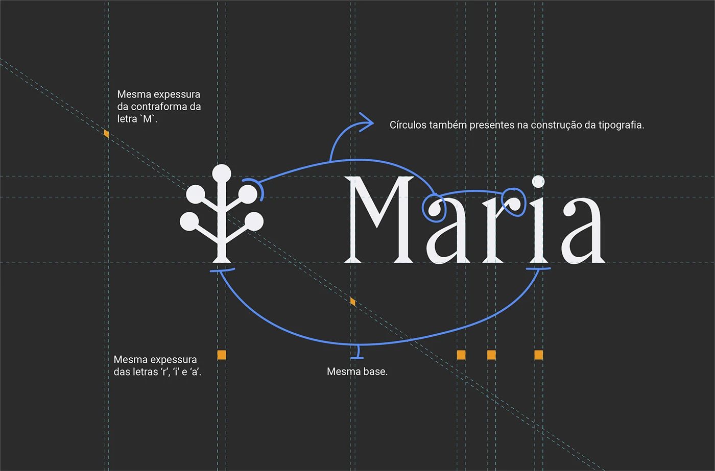
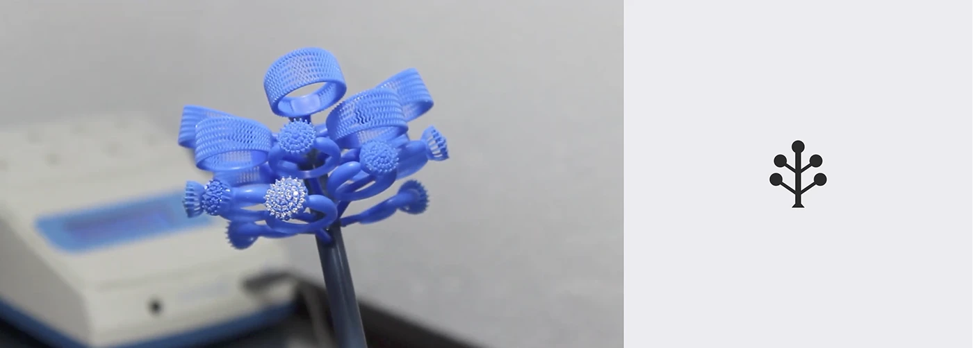
The rebrand needed to align strategy with visual language, giving Maria Maria a point of view strong enough to differentiate it in a market of look-alike jewelry brands. We anchored the system around a botanical monogram — a quiet symbol of growth and self-worth — rendered in a palette of warm neutrals and soft gold.
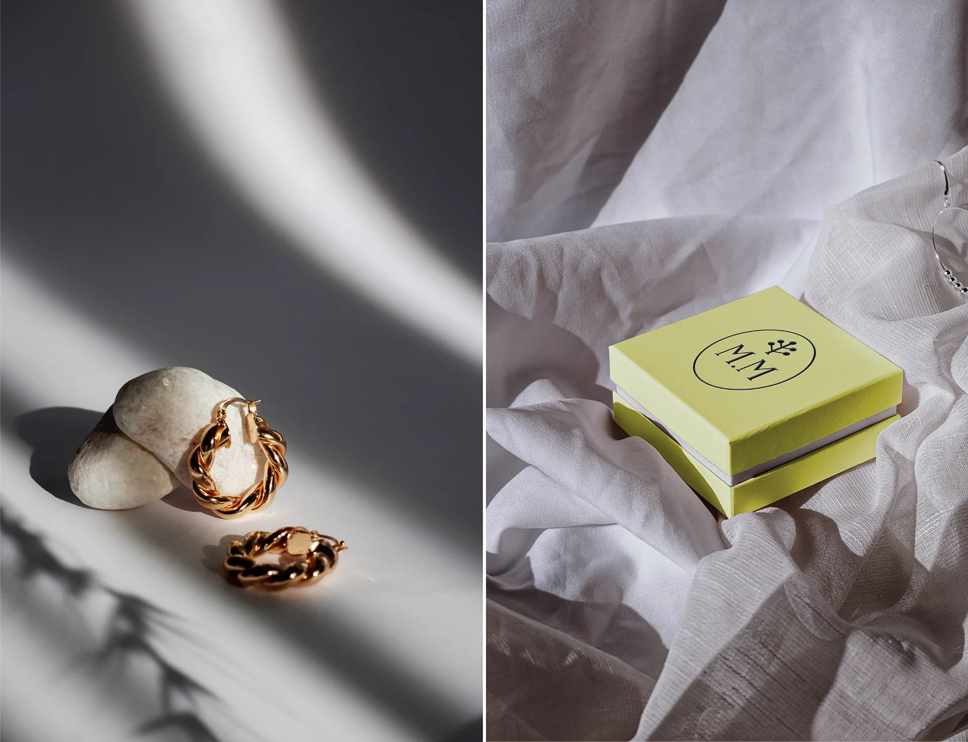
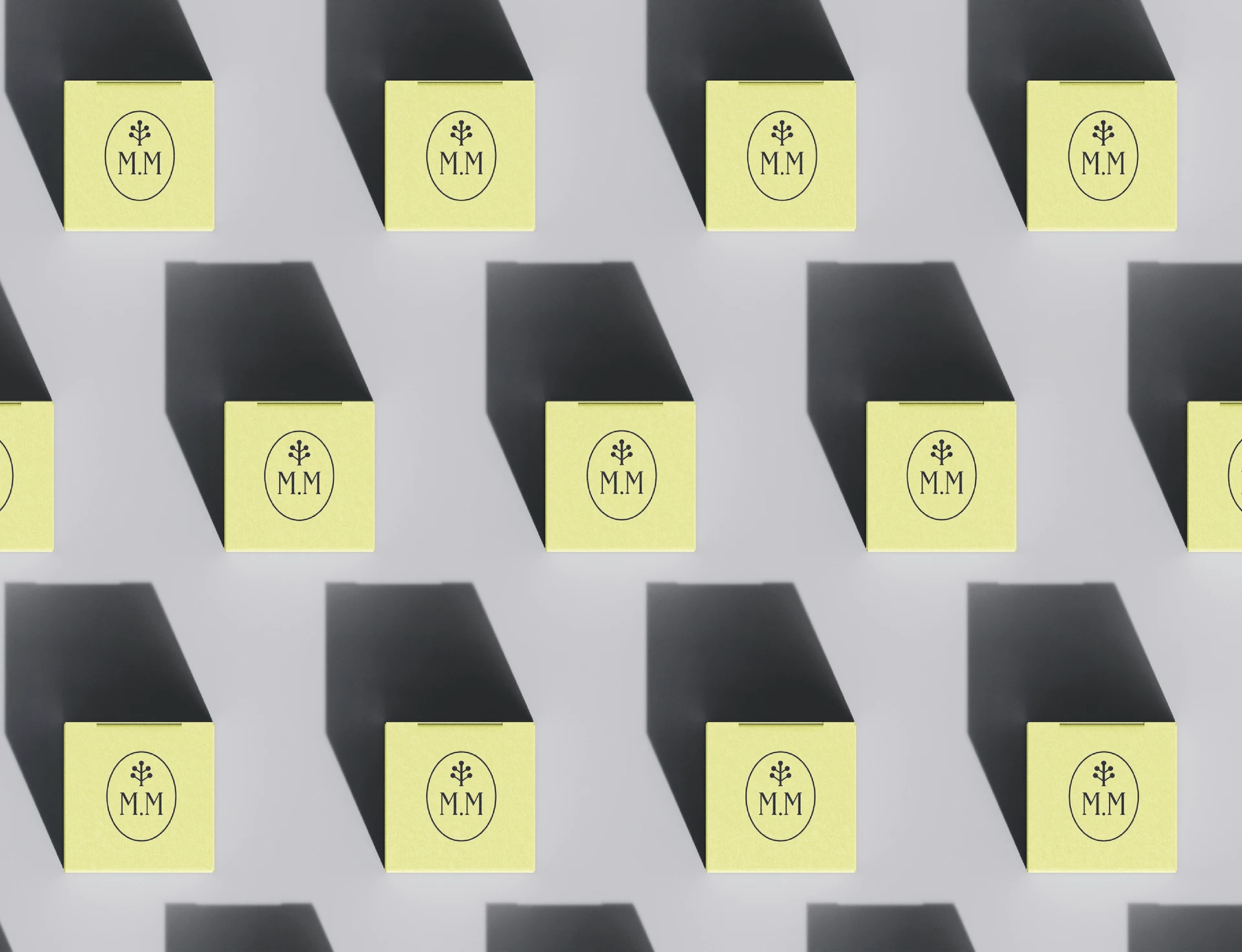
Every touchpoint, from the letterpress business card to the tissue-lined packaging, was rebuilt to feel earned rather than decorative — elegant, considered, and unmistakably grown-up.
— A decade of trust, finally given a visual language.
After ten years without a real design investment, Maria Maria’s communication had drifted from its essence. The brand had loyal customers but no visual equity — nothing that separated it from newer, louder competitors.
We repositioned Maria Maria around self-care as a daily ritual, not an occasional indulgence. That single idea shaped everything — a botanical monogram standing in for growth, a restrained palette standing in for confidence rather than excess.
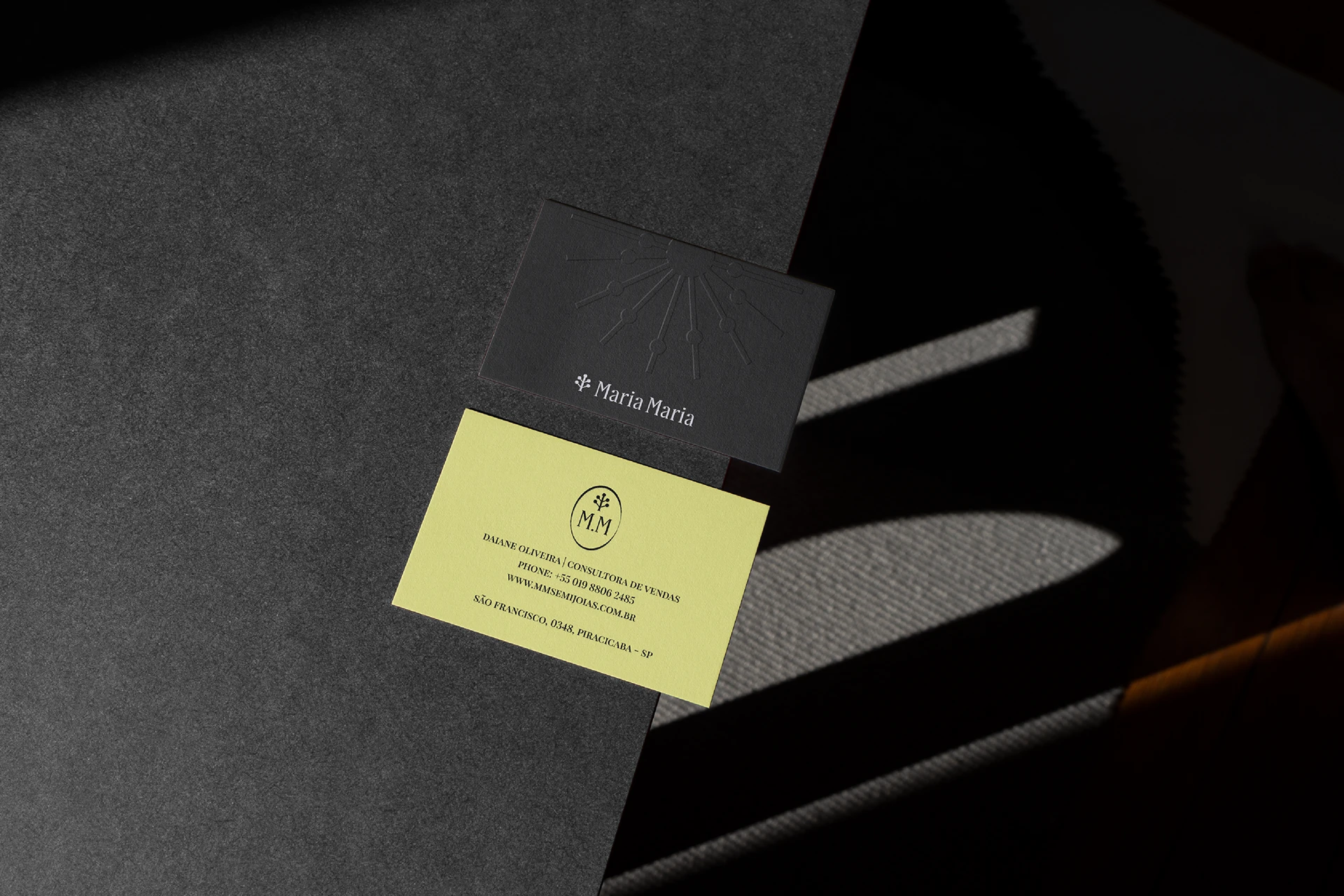
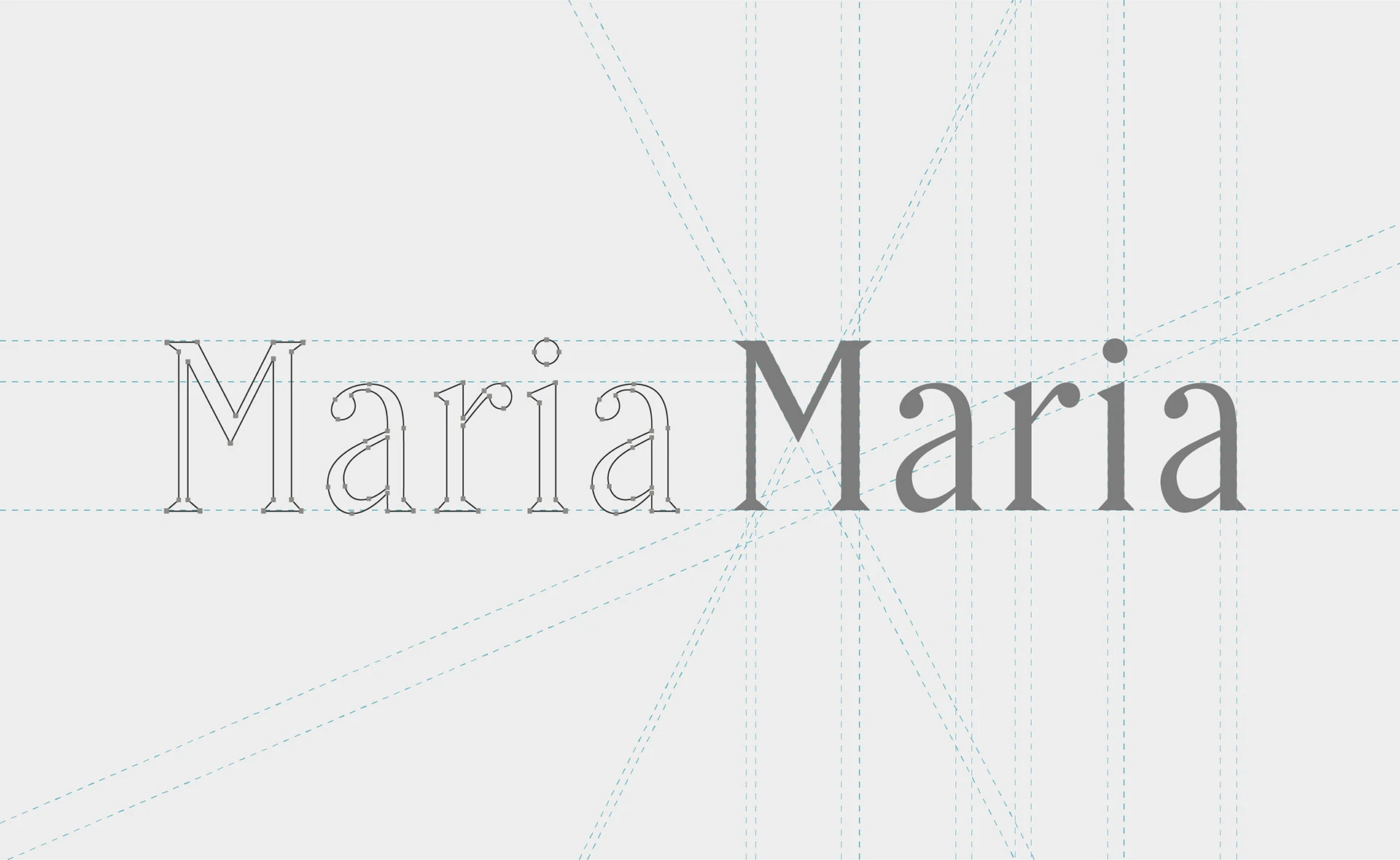
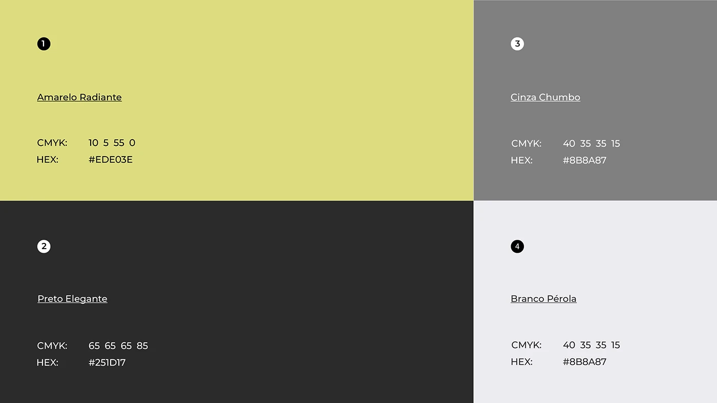
A botanical monogram anchors the system, paired with a refined serif for headlines and a quiet sans for supporting text. The palette leans on soft gold, cream, and near-black — elegant across foil stamping, letterpress, and embossed leather.
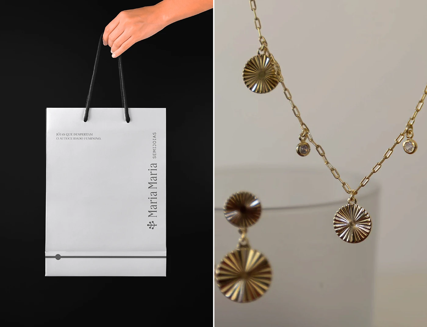
Packaging & unboxing
Stationery system
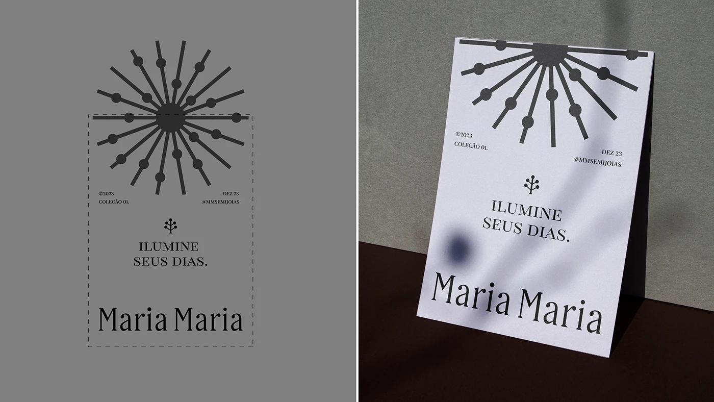
Product tags & labels
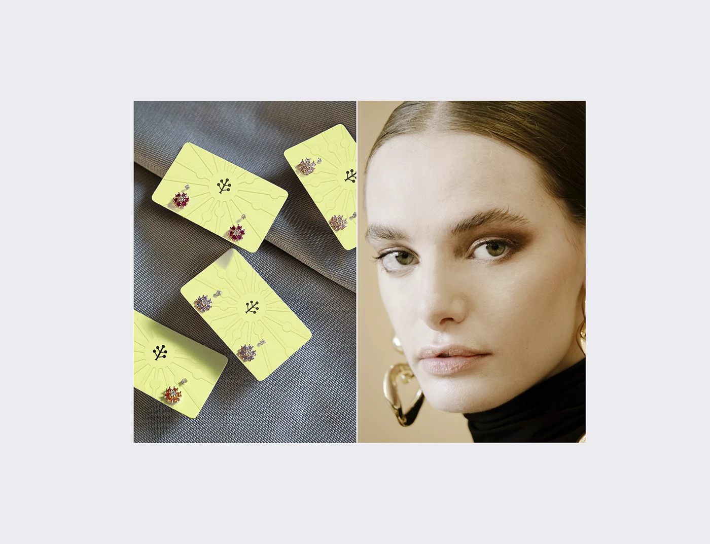
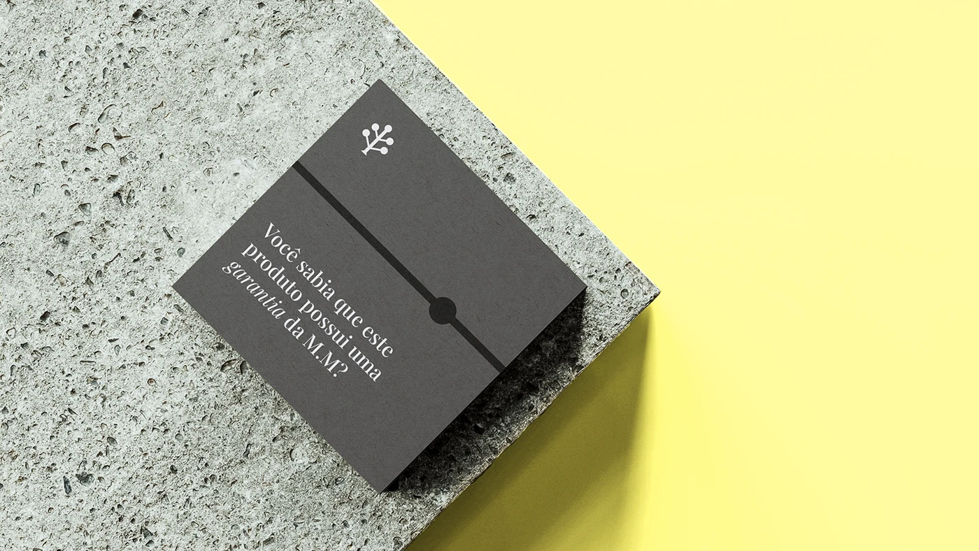

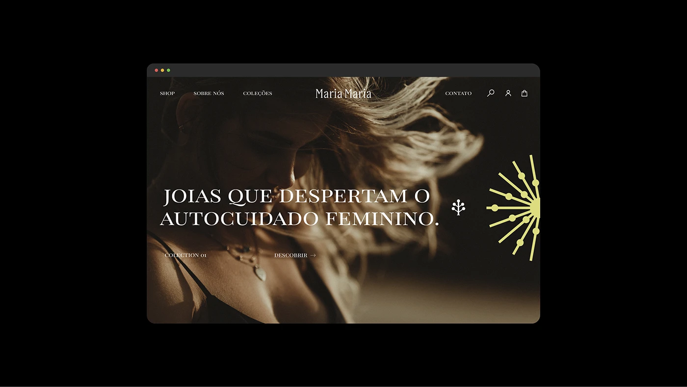
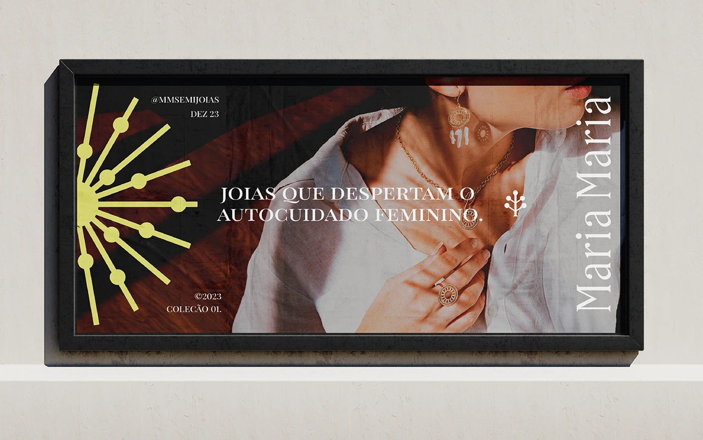
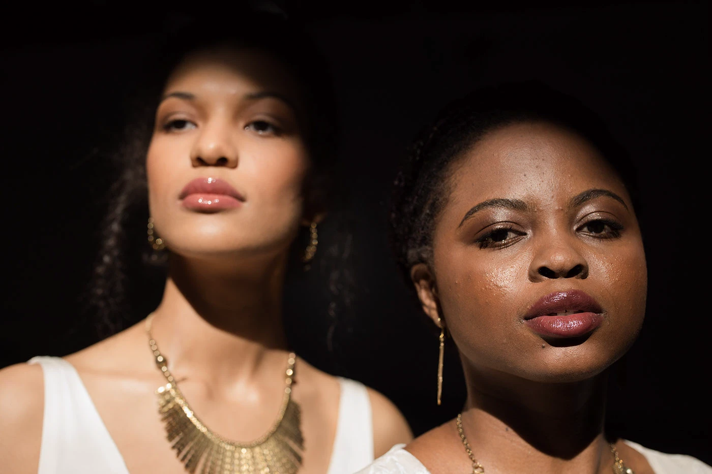
01 / 9 Product photography.
Ten years in, Maria Maria finally has an identity that matches the trust it took a decade to earn — a system built to carry the brand into its next chapter, not just repackage its past.
Eternull didn't just redesign our packaging - they gave language to something we'd always believed but never articulated. Customers now describe us the way we always hoped they would.
Founder