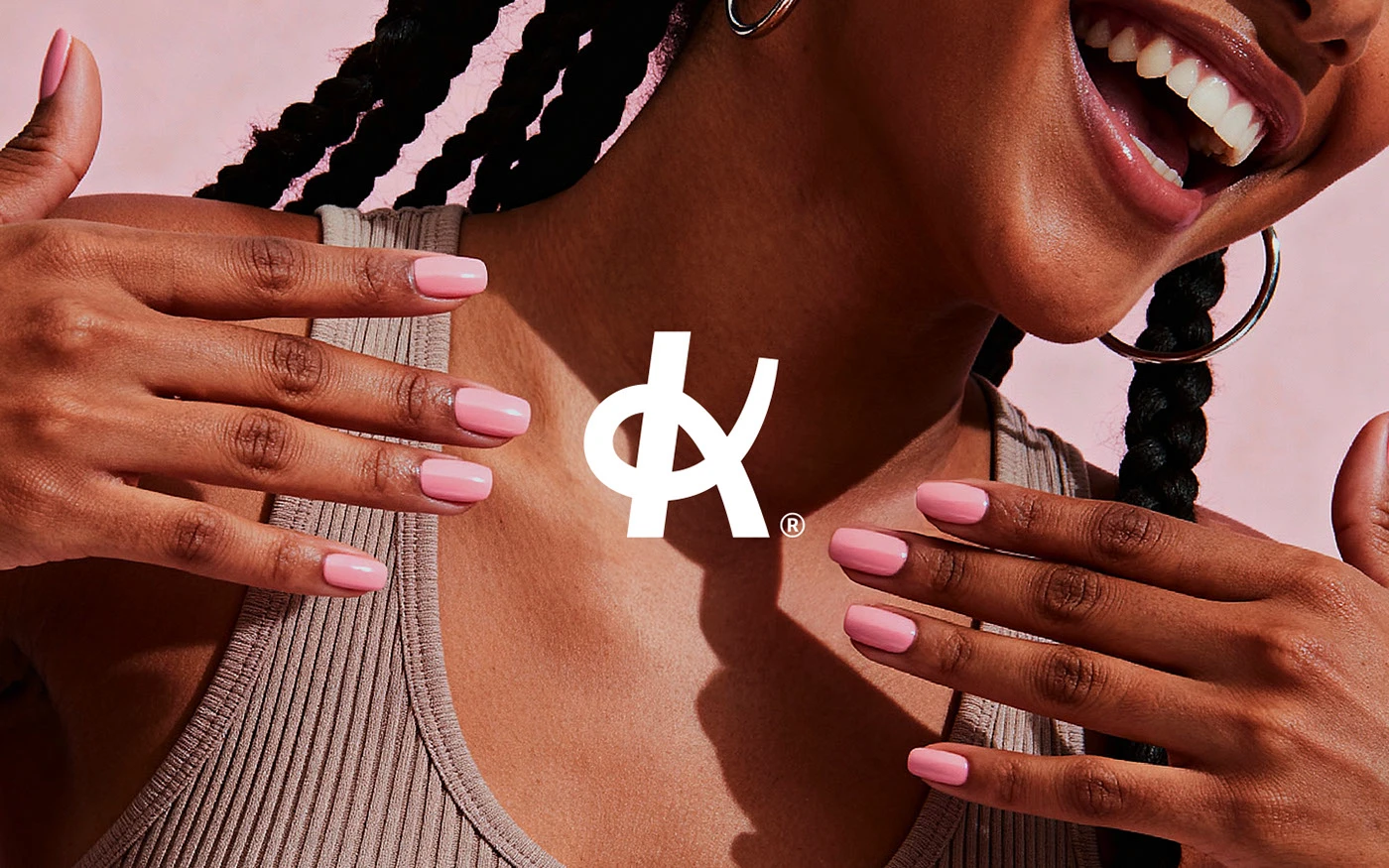
Klein
A nail studio identity built around confidence, warmth, and quiet precision.

We blend strategy, creativity, and technology to help brands grow, connect, and stand out in an ever-evolving digital world.




A food delivery identity built to feel like a cultural statement, not just an app.
Eternull Media
Abdul Hannan
Founder & Creative DirectorNextmeal
2025
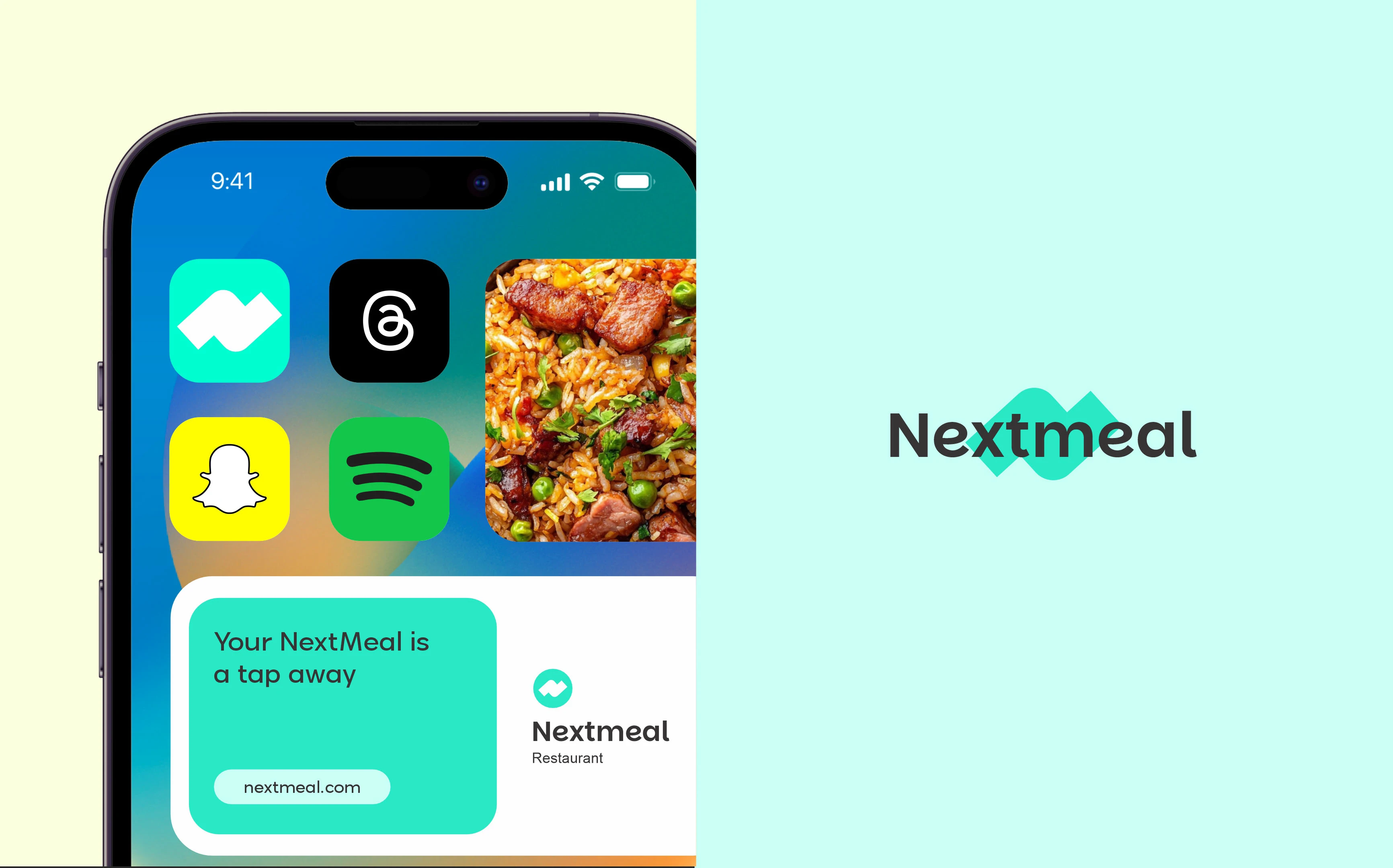
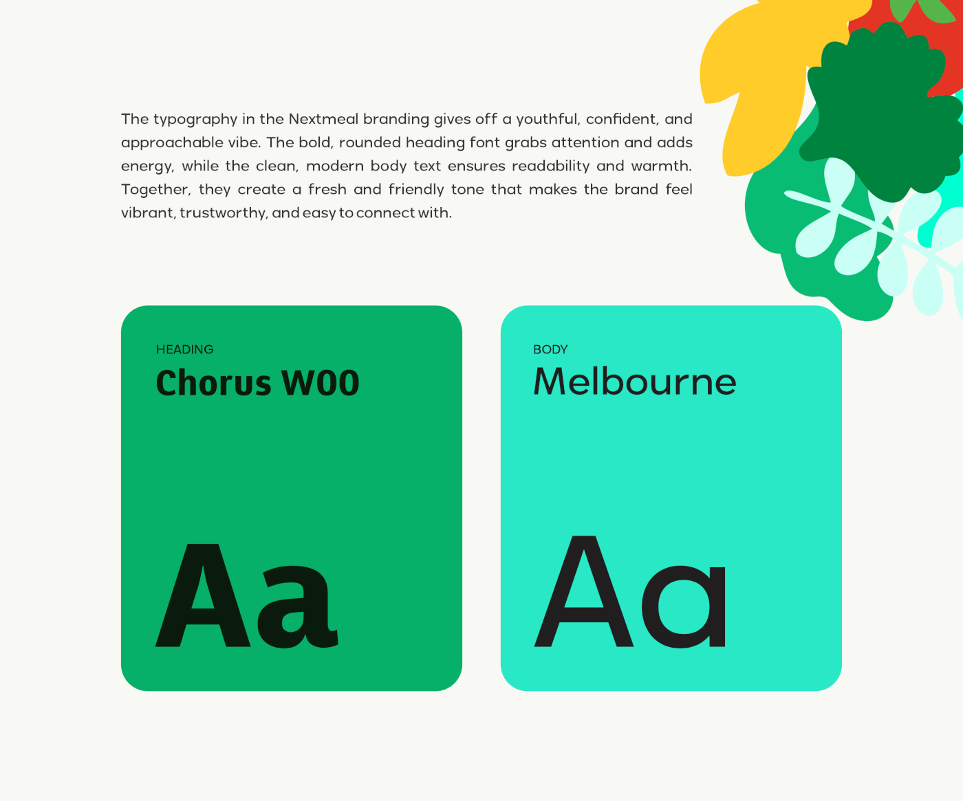
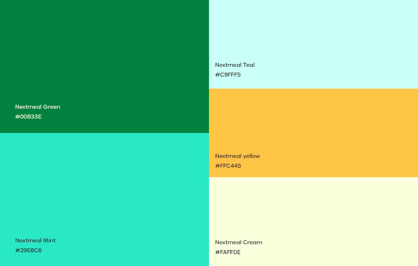
Nextmeal is more than a food delivery brand — it’s a cultural statement. Built for now, but designed to grow, Nextmeal isn’t just delivering food, it’s delivering relevance to an audience that expects both speed and personality.
The color palette does most of the emotional work: a rich, vital green for freshness, aqua and pastel teal for a playful modern edge, bright yellow for appetite appeal, and a soft cream to keep everything feeling clean and friendly rather than chaotic.
A rounded, confident wordmark and a simple directional mark — suggesting speed and delivery — complete a system built to feel as fast and fun on a phone screen as it does on a city billboard.
— Food delivery, delivering relevance.
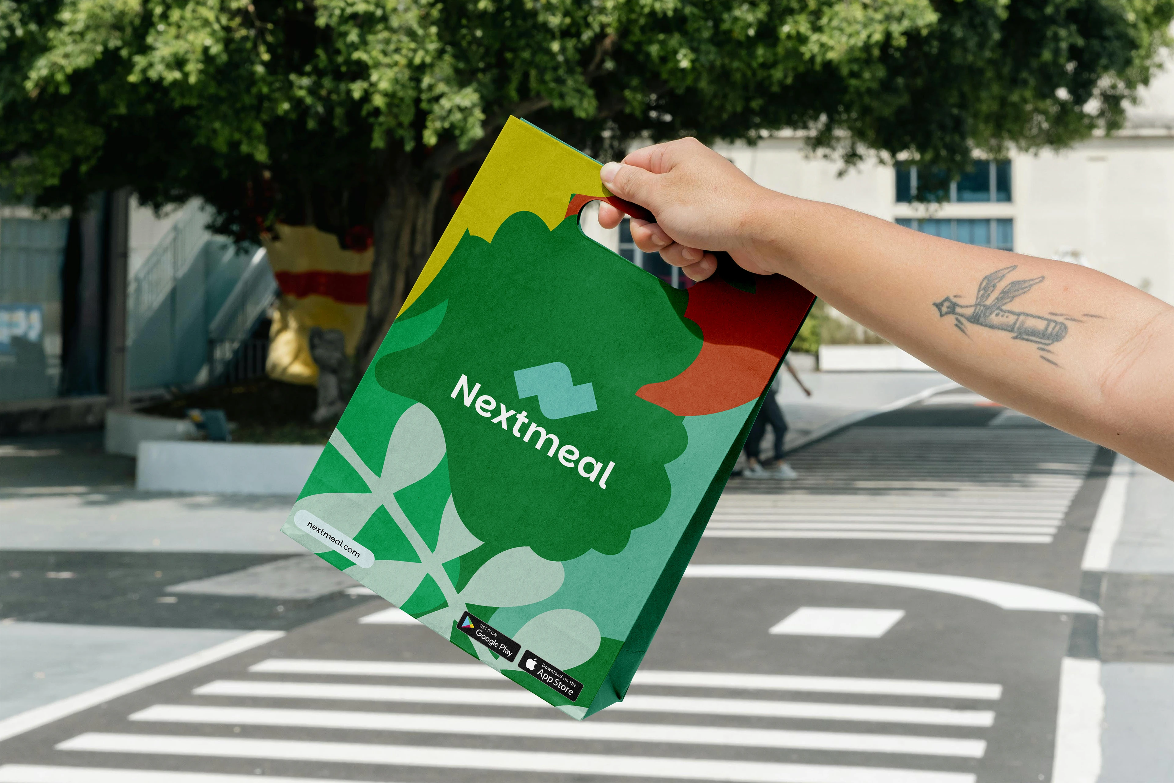
Food delivery is one of the most crowded, visually homogenous app categories — nearly every competitor defaults to similar reds, oranges, and generic fork-and-plate iconography. Nextmeal needed to feel culturally current and instantly recognizable in a single glance at a phone screen.
We positioned Nextmeal around cultural relevance — belonging to something colorful and current, not just ordering food. A vibrant, appetite-driven palette and a confident, rounded wordmark carry that energy across every touchpoint.
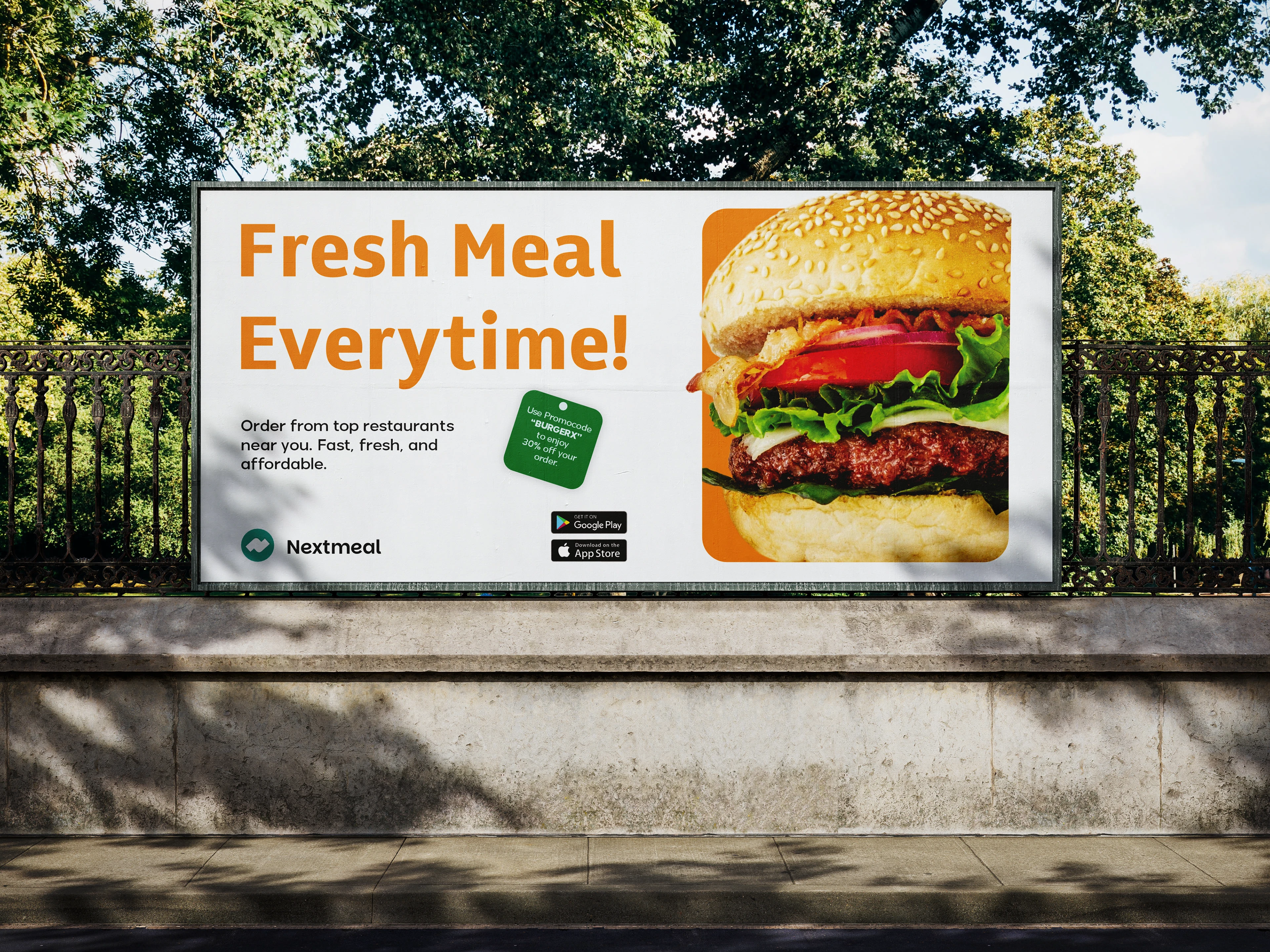
A rounded, confident wordmark pairs with a simple directional mark suggesting motion and delivery. The palette — rich green, aqua, pastel teal, bright yellow, and soft cream — keeps the brand feeling fresh, energetic, and unmistakably current.
App interface
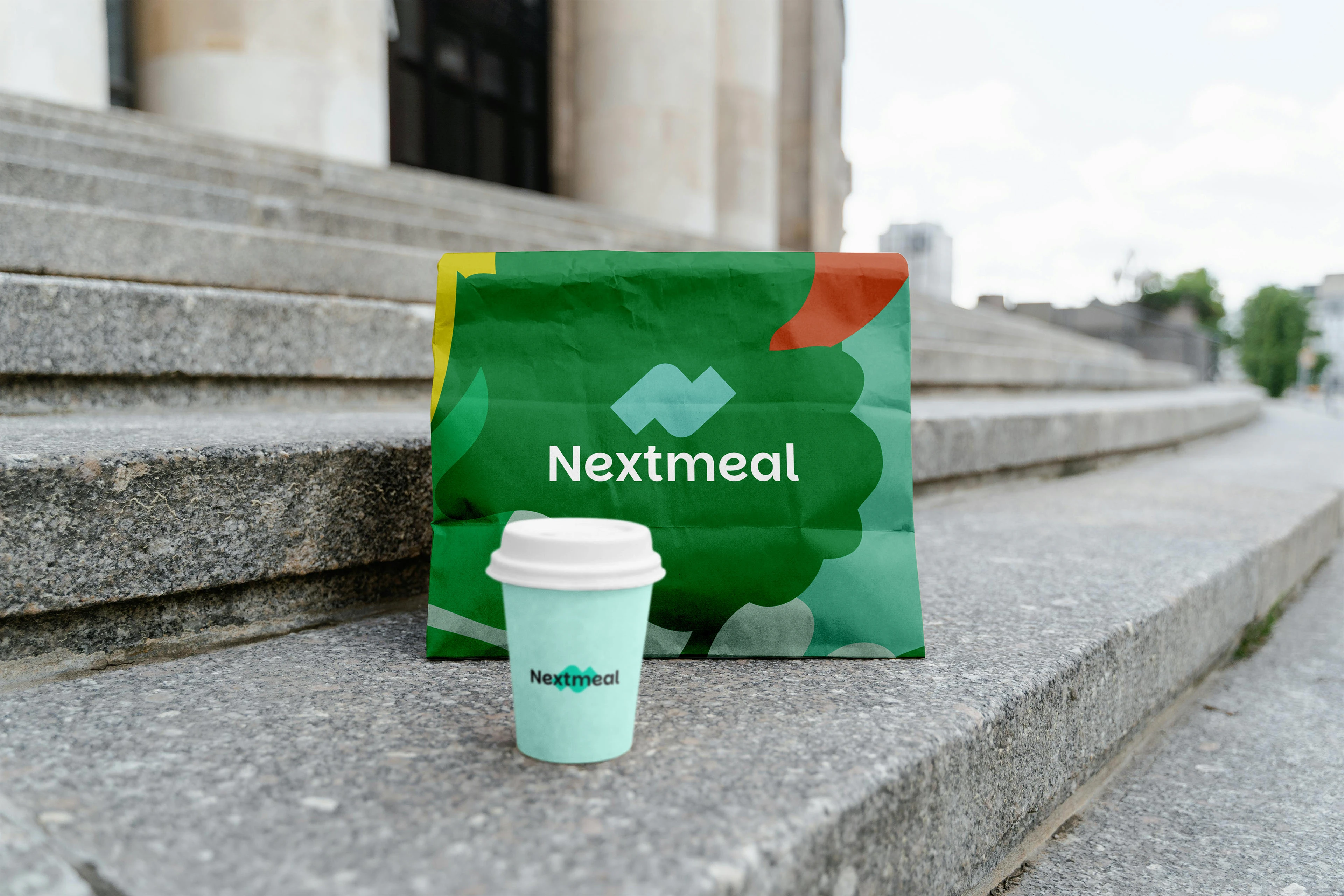
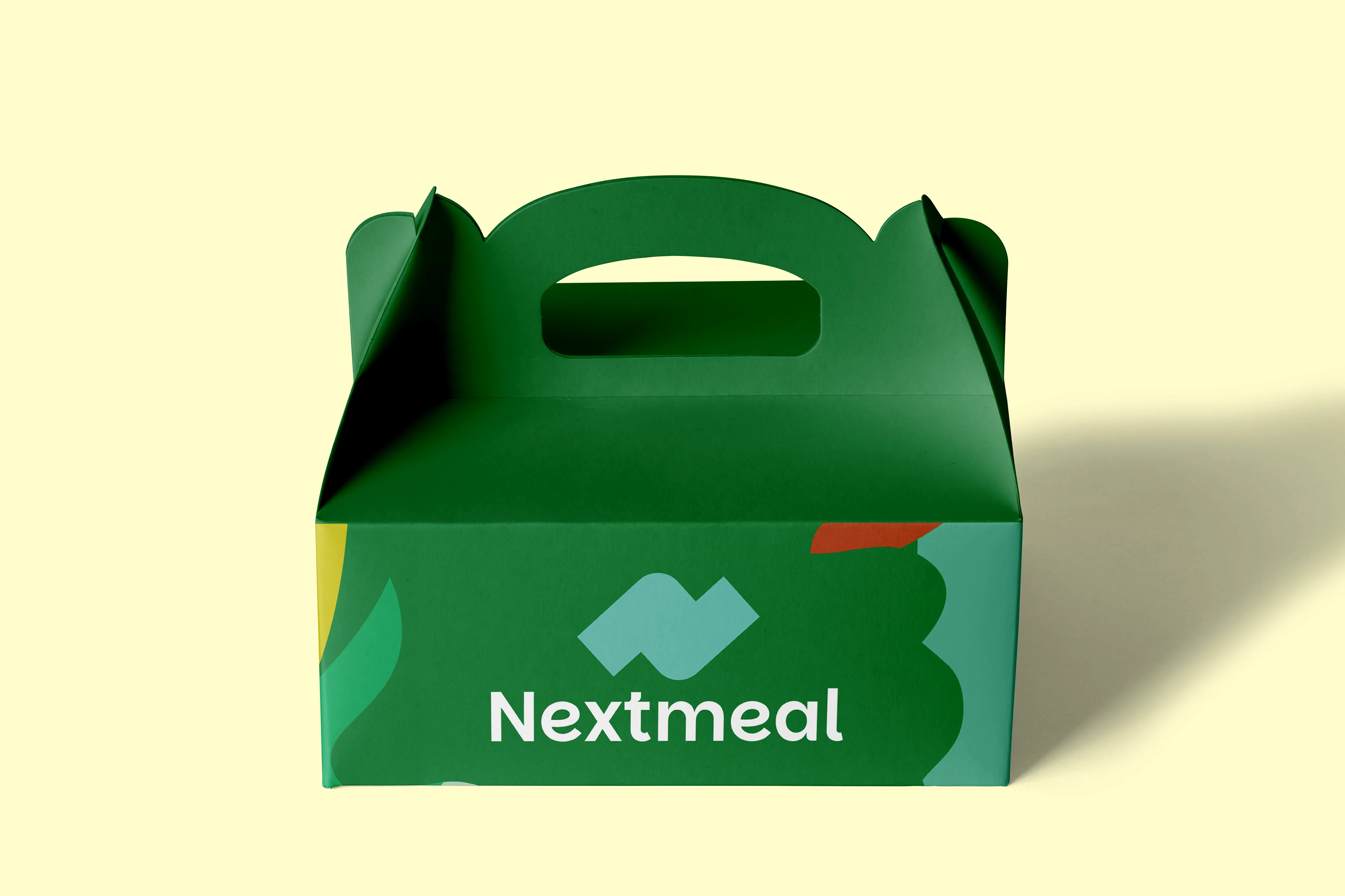
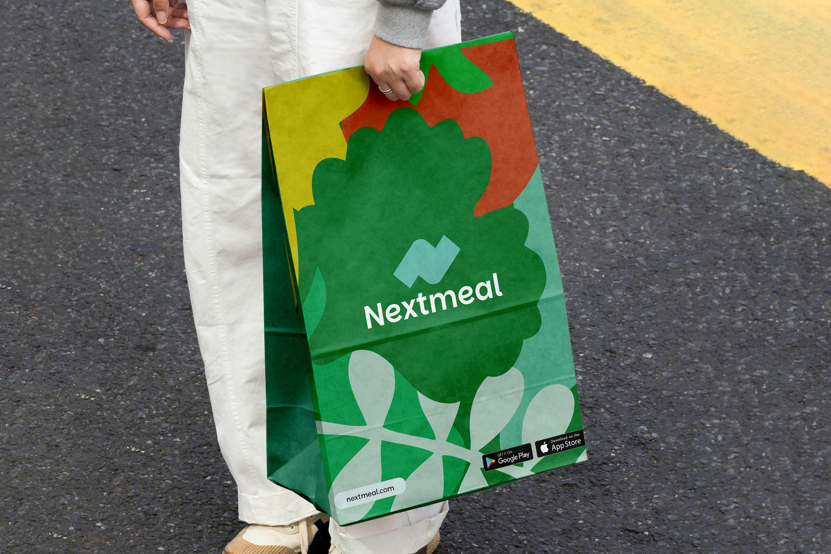
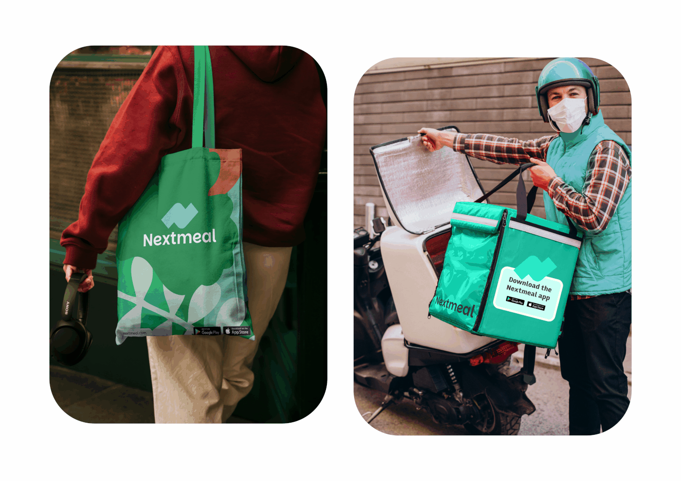
Packaging & delivery
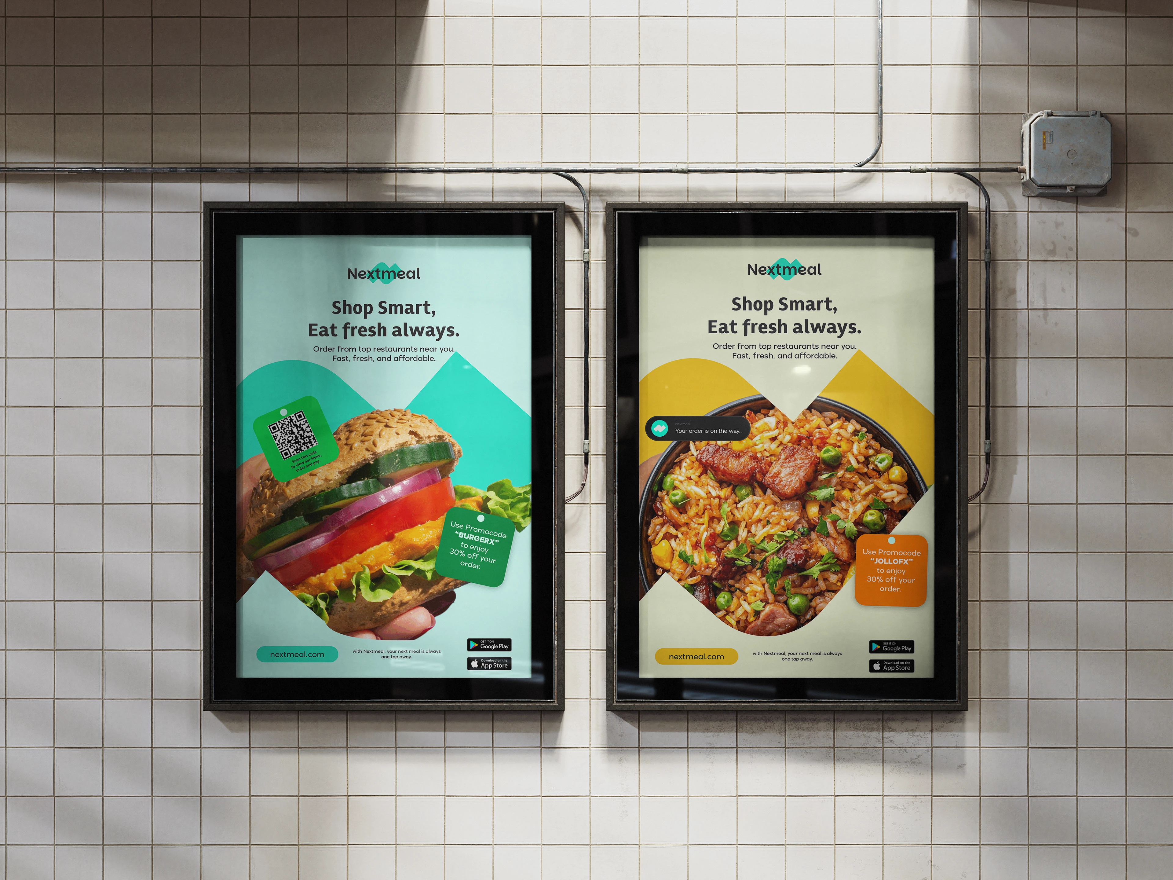
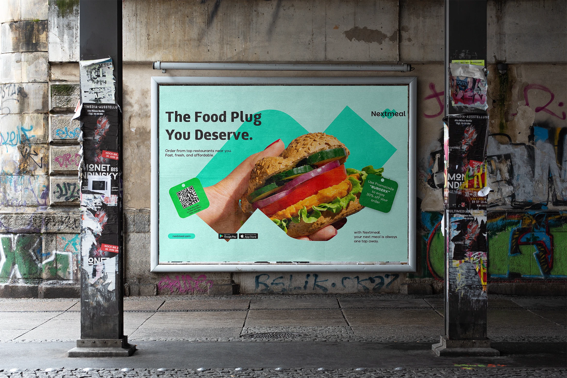
Outdoor & campaign
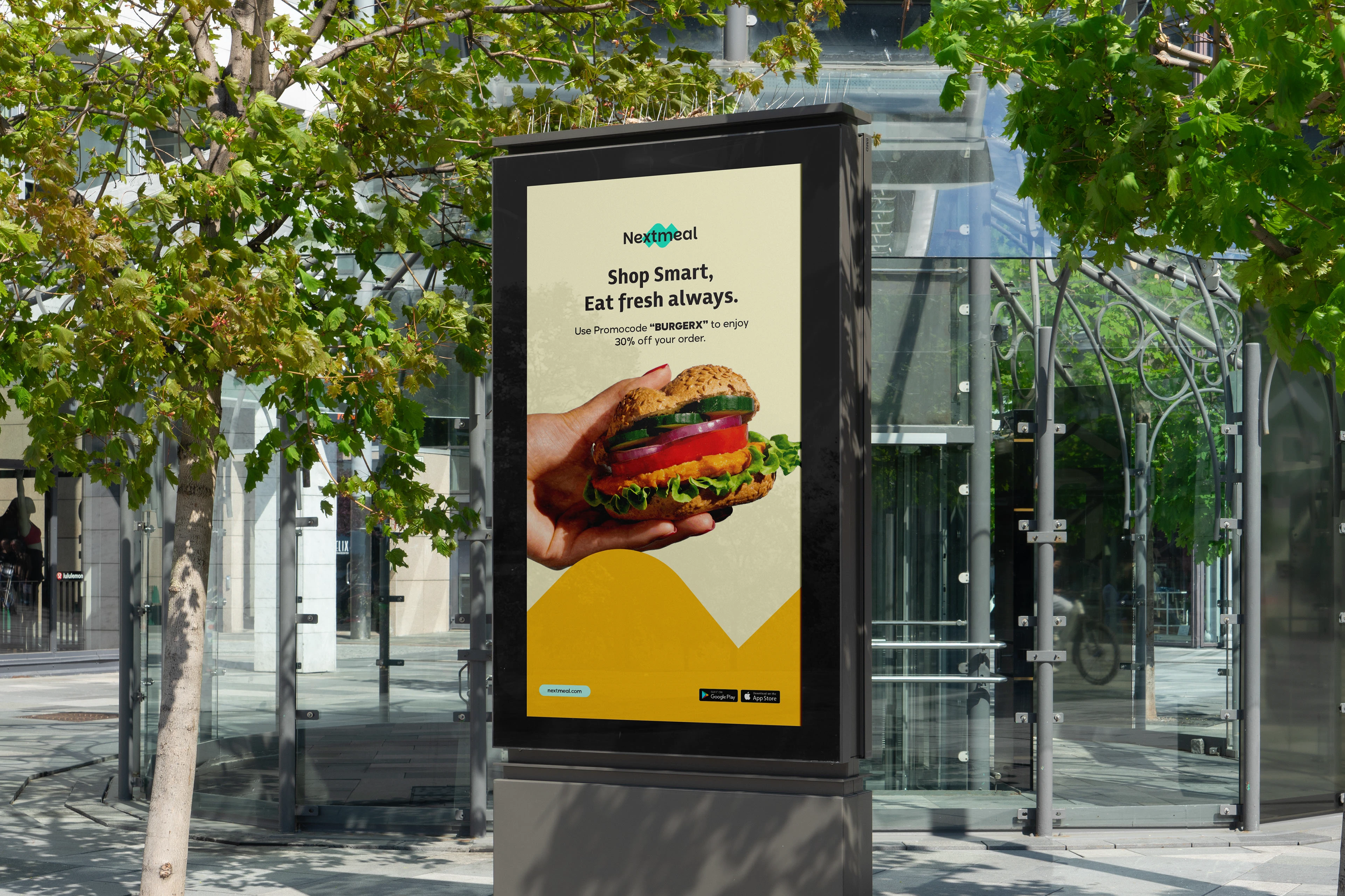
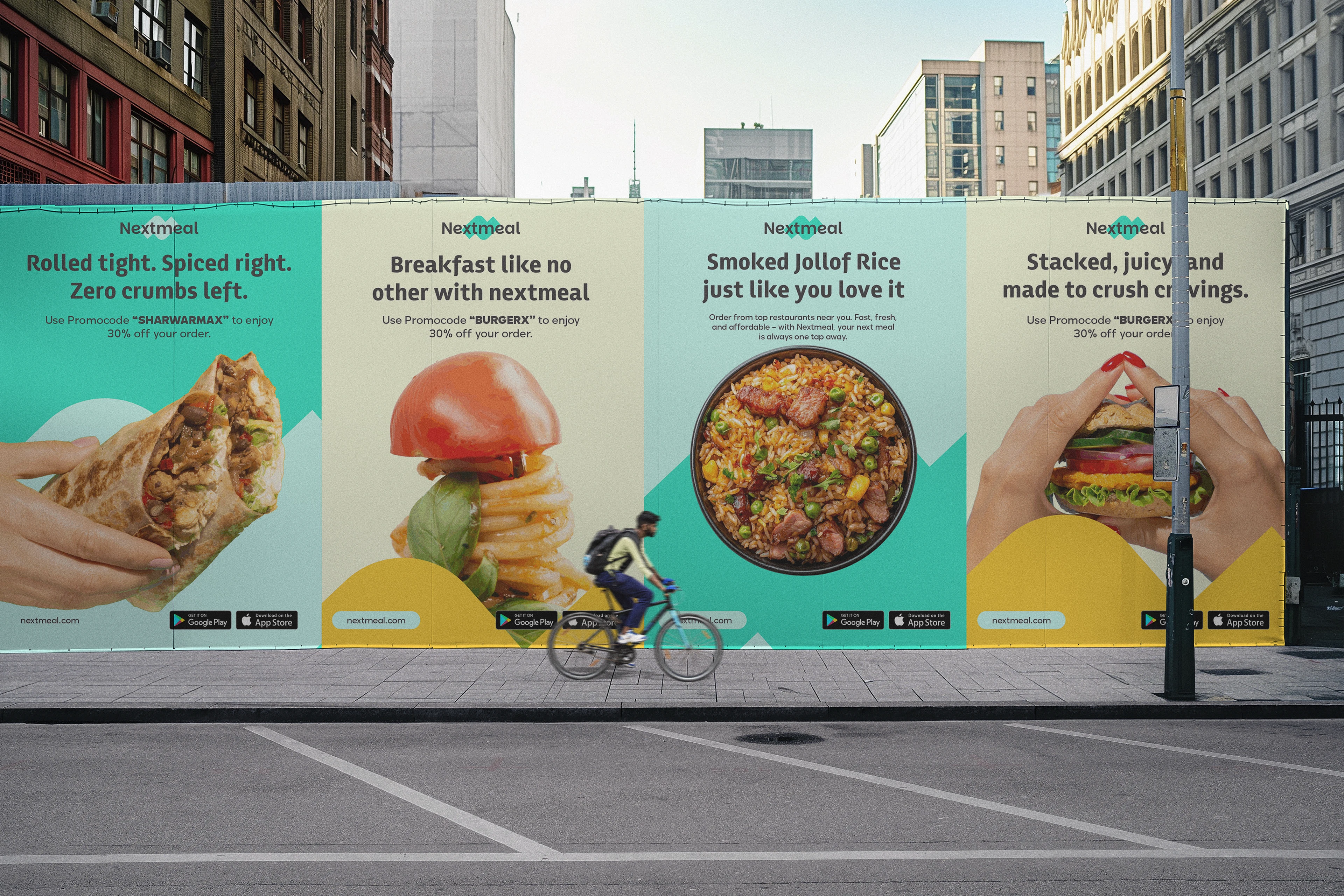
01 / 4 Campaign motion.
Nextmeal now has a visual identity built to compete for attention in the most crowded app category there is — one that feels less like a delivery utility and more like a brand people are proud to order from.
We wanted people to screenshot our app, not just use it. Eternull gave us a brand with enough personality that it actually happens.
Founding Team