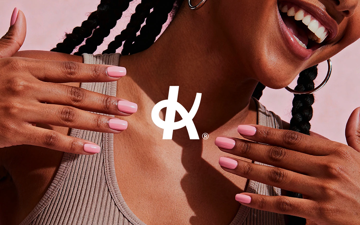
Klein
A nail studio identity built around confidence, warmth, and quiet precision.

We blend strategy, creativity, and technology to help brands grow, connect, and stand out in an ever-evolving digital world.




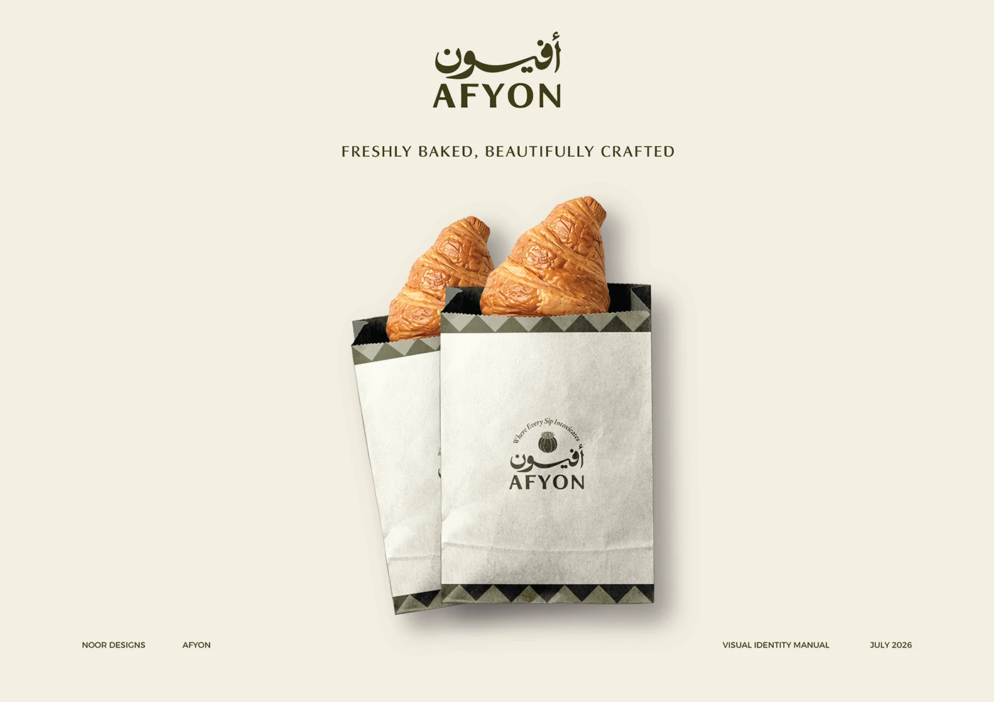
A visual identity for a specialty coffee and French pastry house in Najran.
Eternull Media
Abdul Hannan
Founder & Creative DirectorAfyon
2026
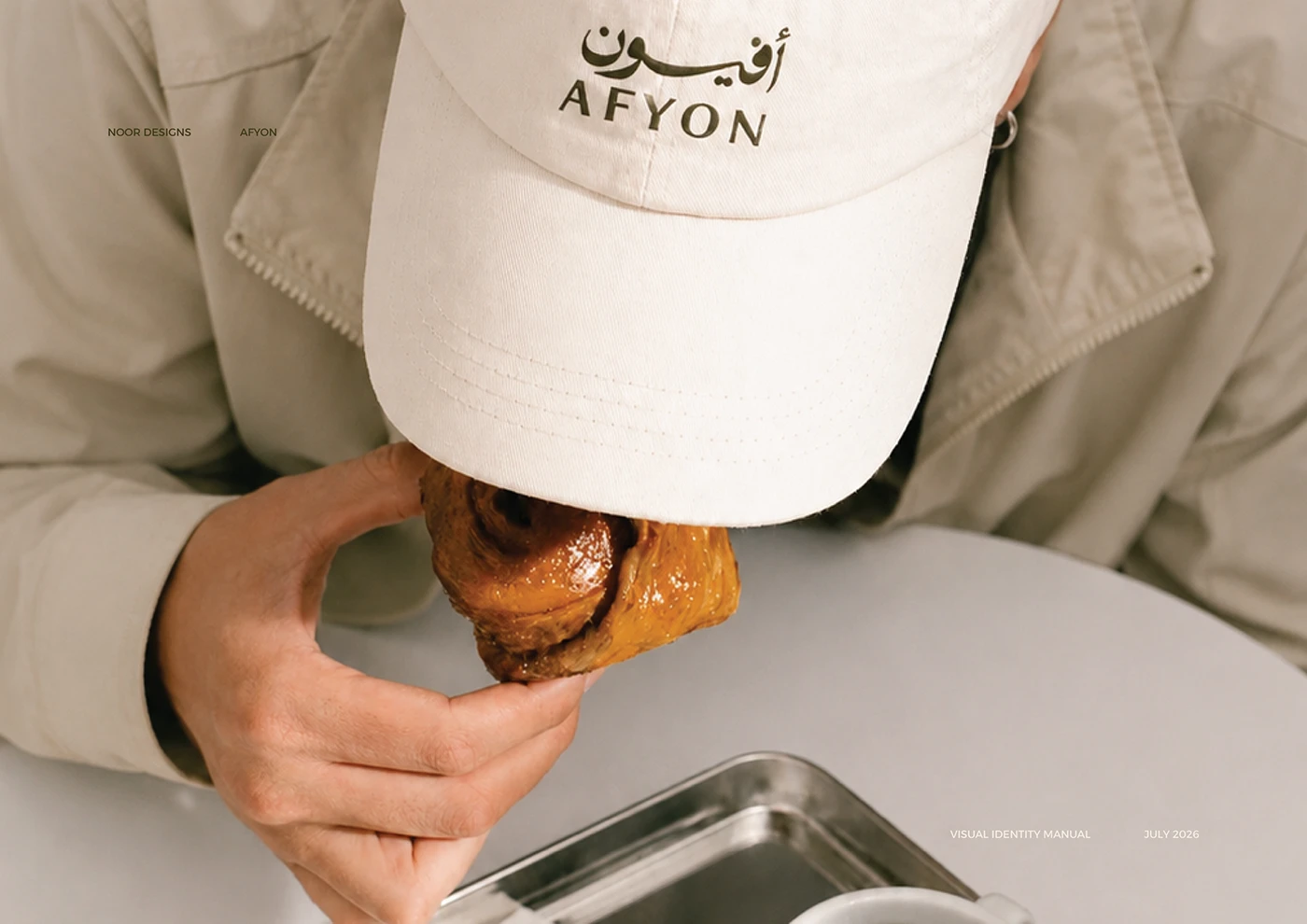
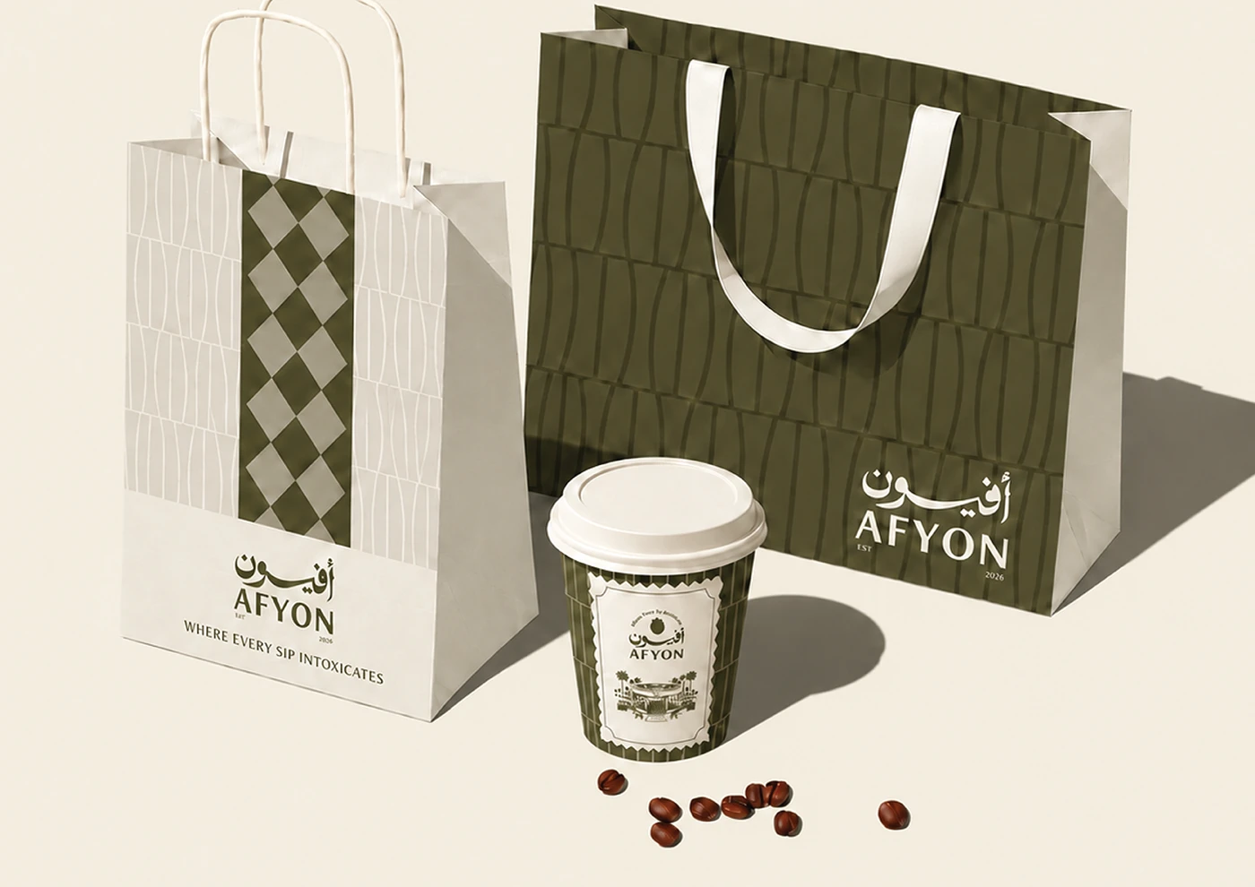
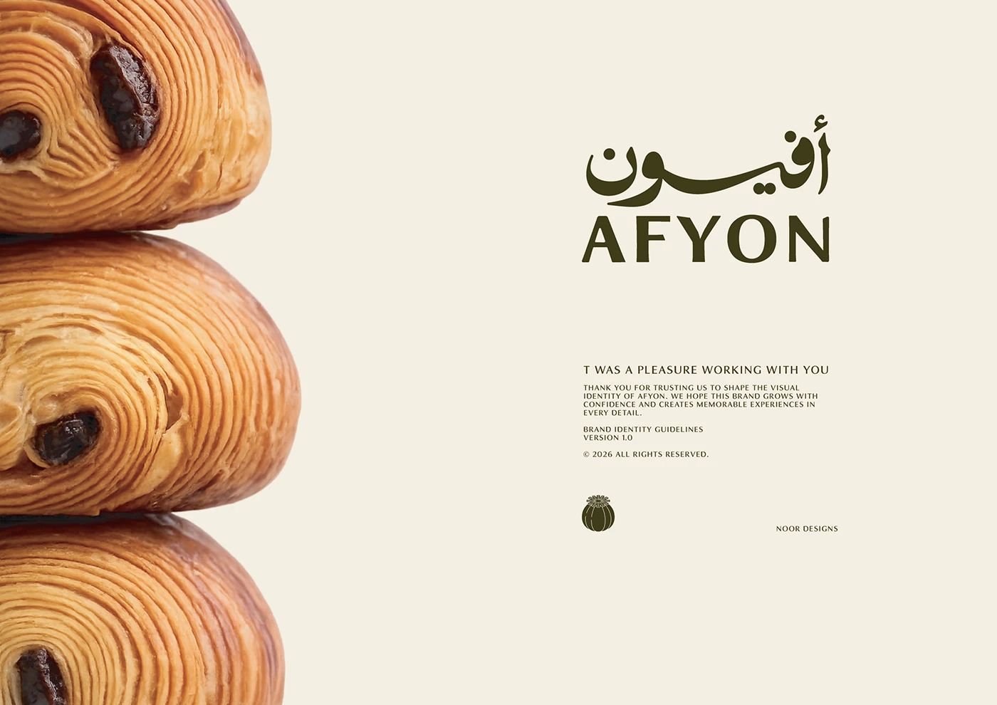
Afyon — from the Arabic أفيون, meaning poppy — combines specialty coffee and authentic French pastry, built to become the leading destination for both in Najran, where quality meets detail on every visit.
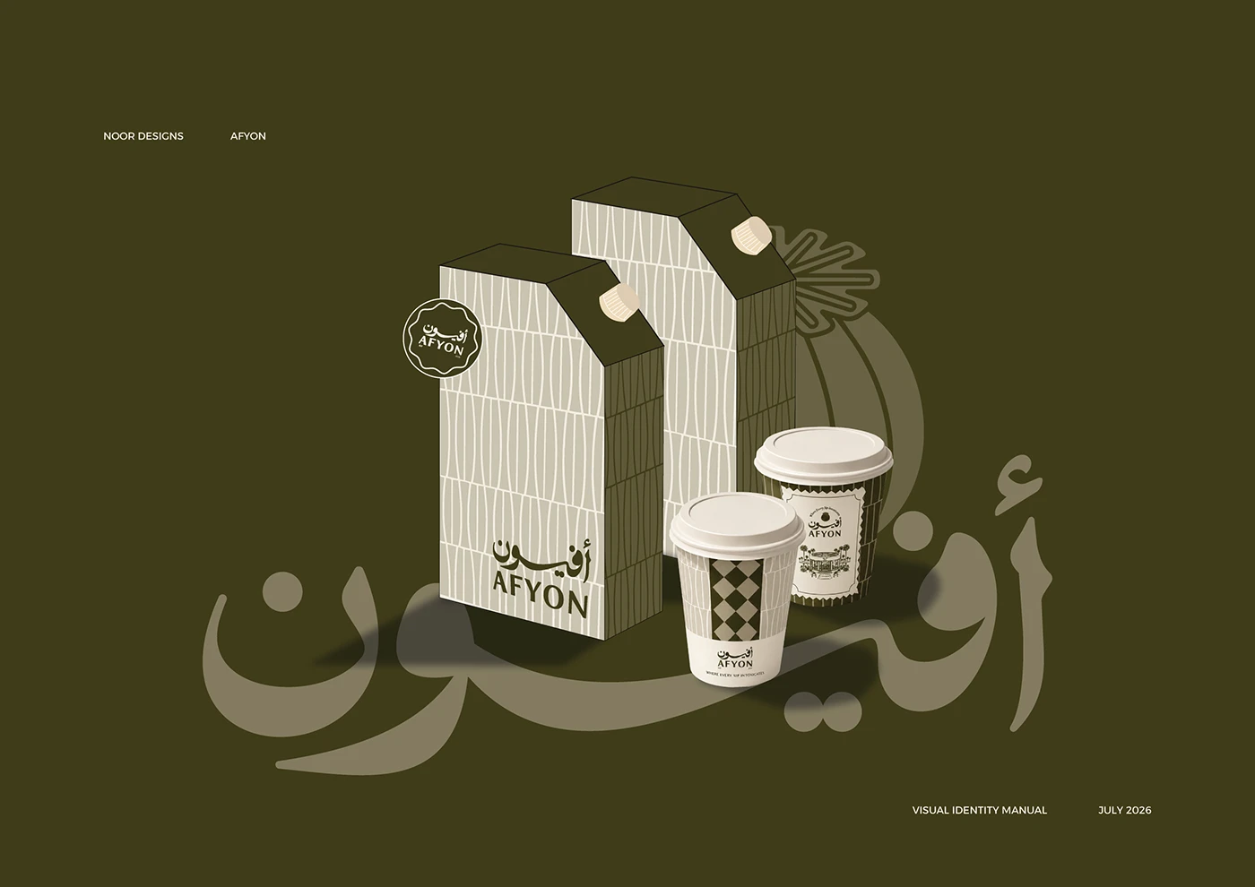
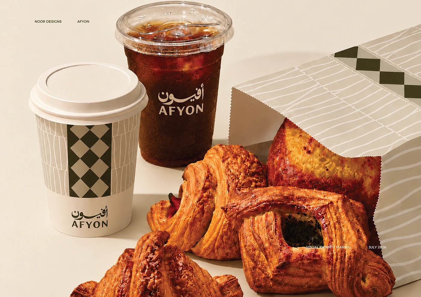
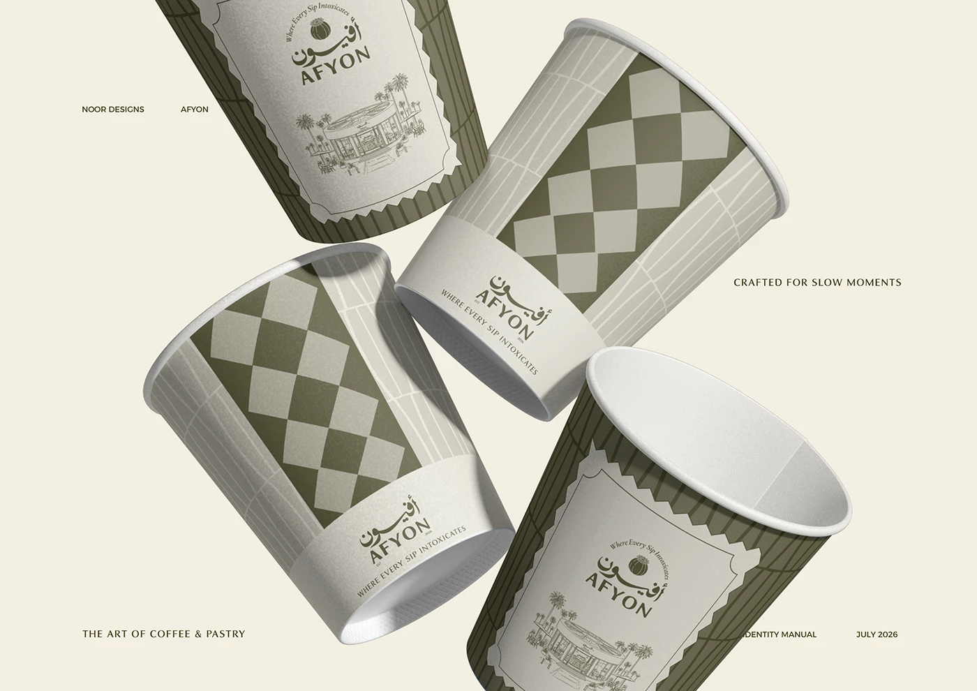
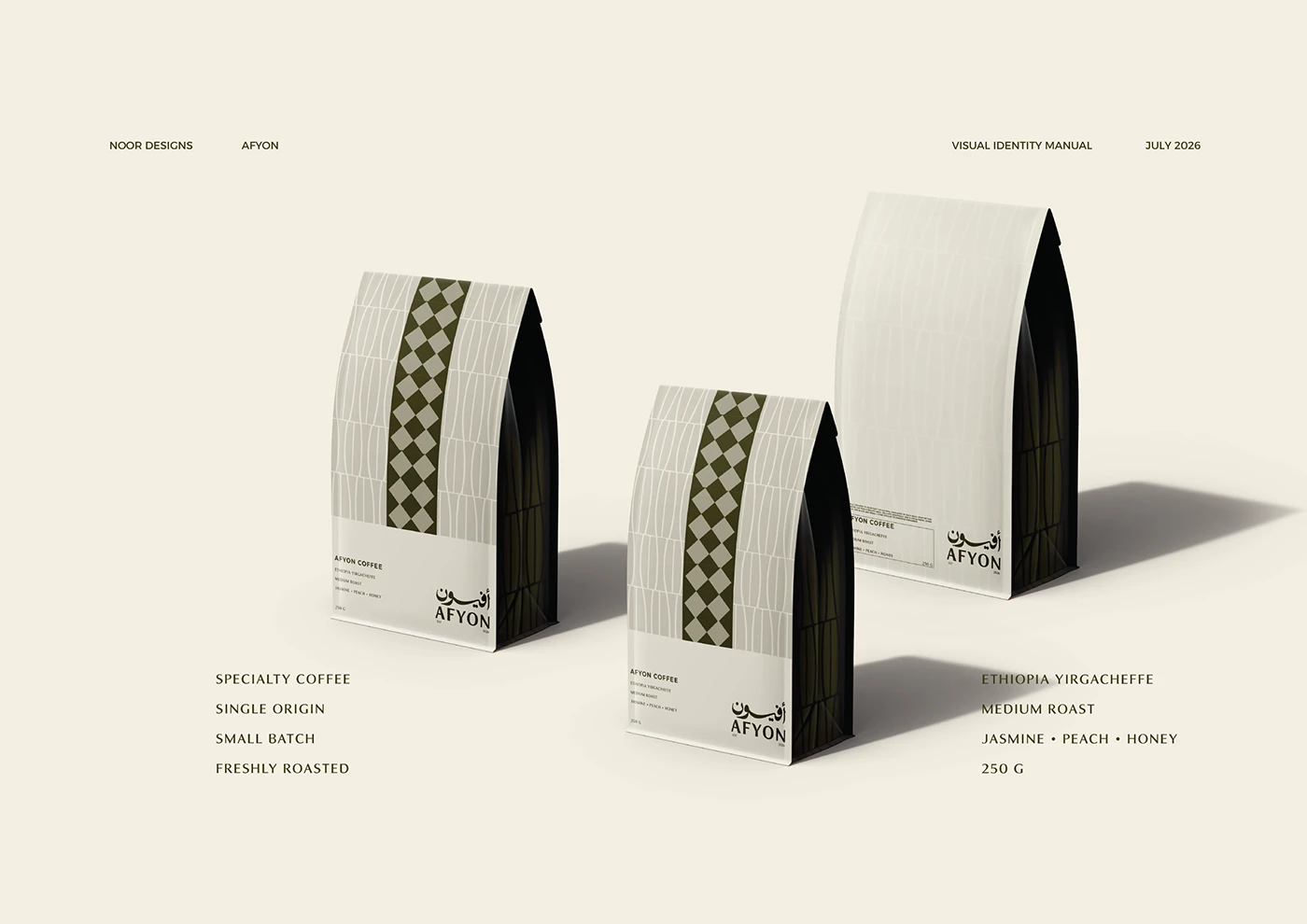
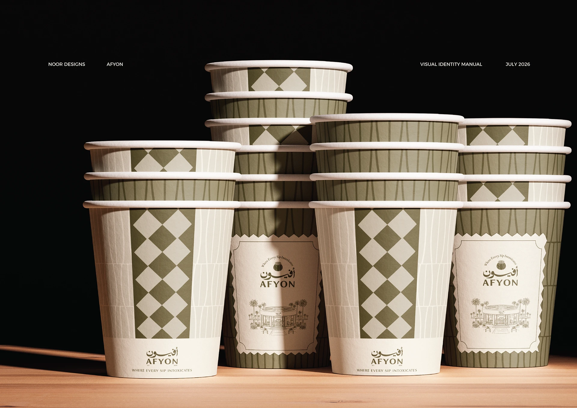
The name itself carries the brand’s intent: something intoxicating, habit-forming, worth returning for. We built the identity around a diamond lattice pattern and an olive-and-cream palette that reads equally at home on a to-go cup, a storefront awning, or a hand-drawn illustration of the cafe itself.
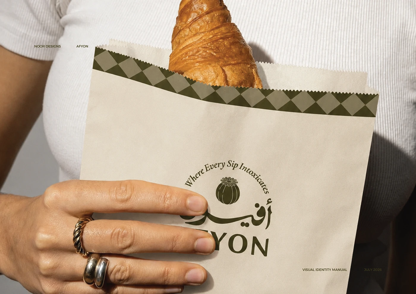
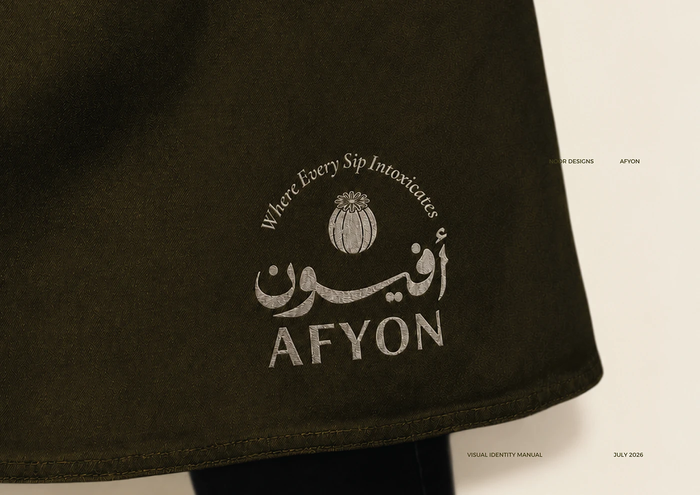
An Arabic and Latin logotype pairing anchors the system, giving Afyon a bilingual identity that feels native in both scripts — not translated, but genuinely bicultural from the ground up.
— Where every sip intoxicates.
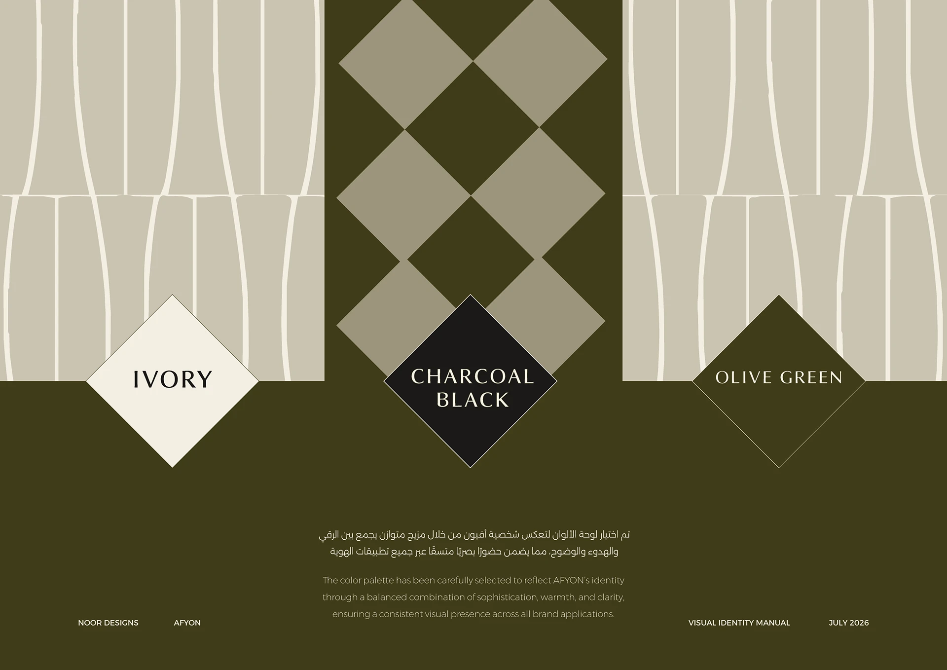
Cafe brands in the specialty coffee space often default to minimalist, interchangeable Scandinavian-style branding. Afyon needed an identity rooted in place — distinctly regional, bilingual, and memorable — without sacrificing the polish expected of a premium cafe.
We positioned Afyon around its own name — leaning into the poetic tension of "intoxication" as a metaphor for a habit-forming daily ritual. A custom lattice pattern, drawn from regional architectural motifs, gives the brand a distinct visual signature no competitor can claim.
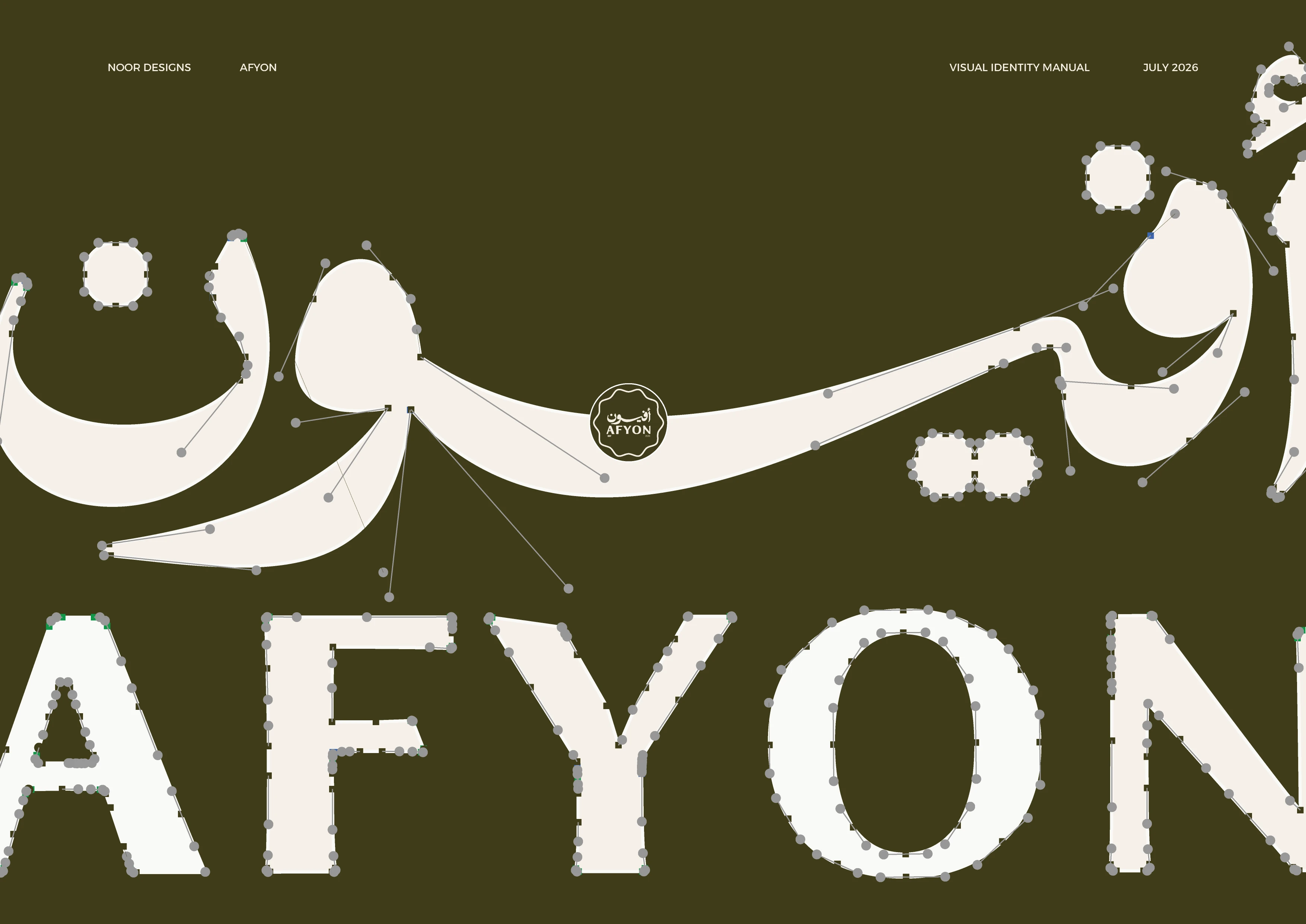
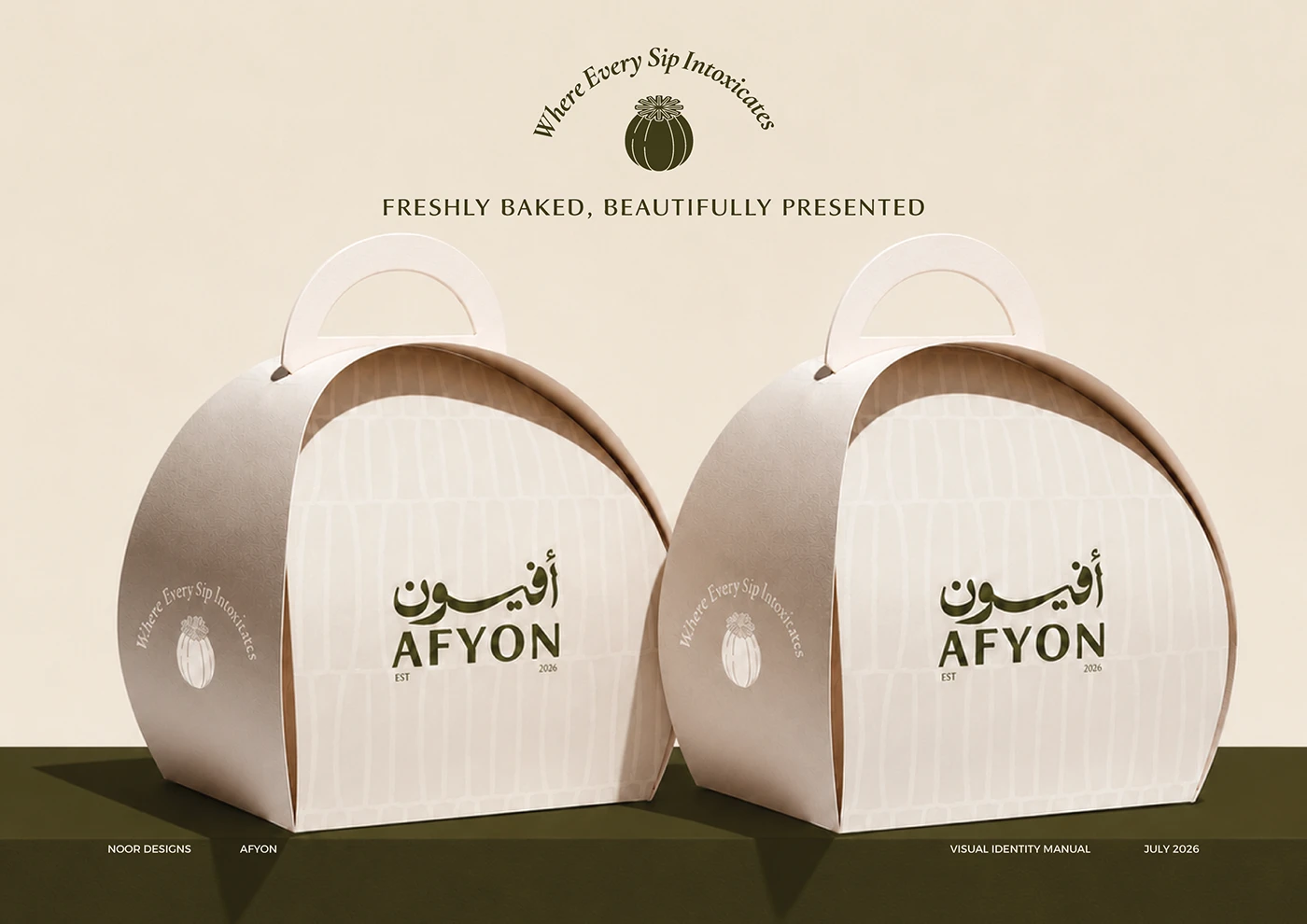
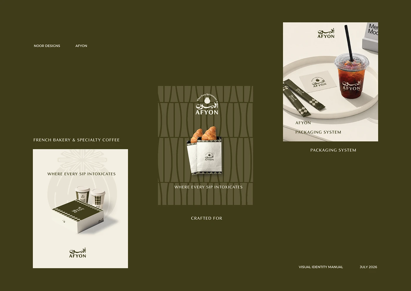
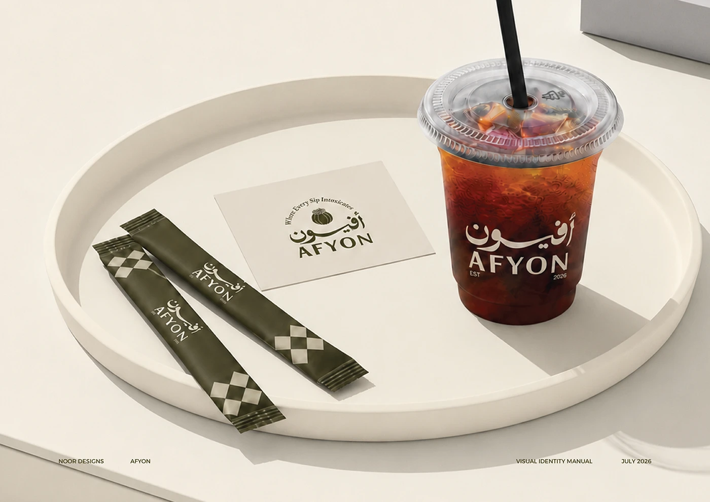
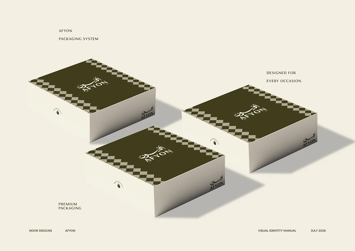
A bilingual logotype pairs Arabic calligraphy with a confident Latin wordmark, framed by a hand-drawn illustration of the cafe itself. A custom diamond lattice pattern, olive and cream palette, and a fine-line illustration style complete the system.
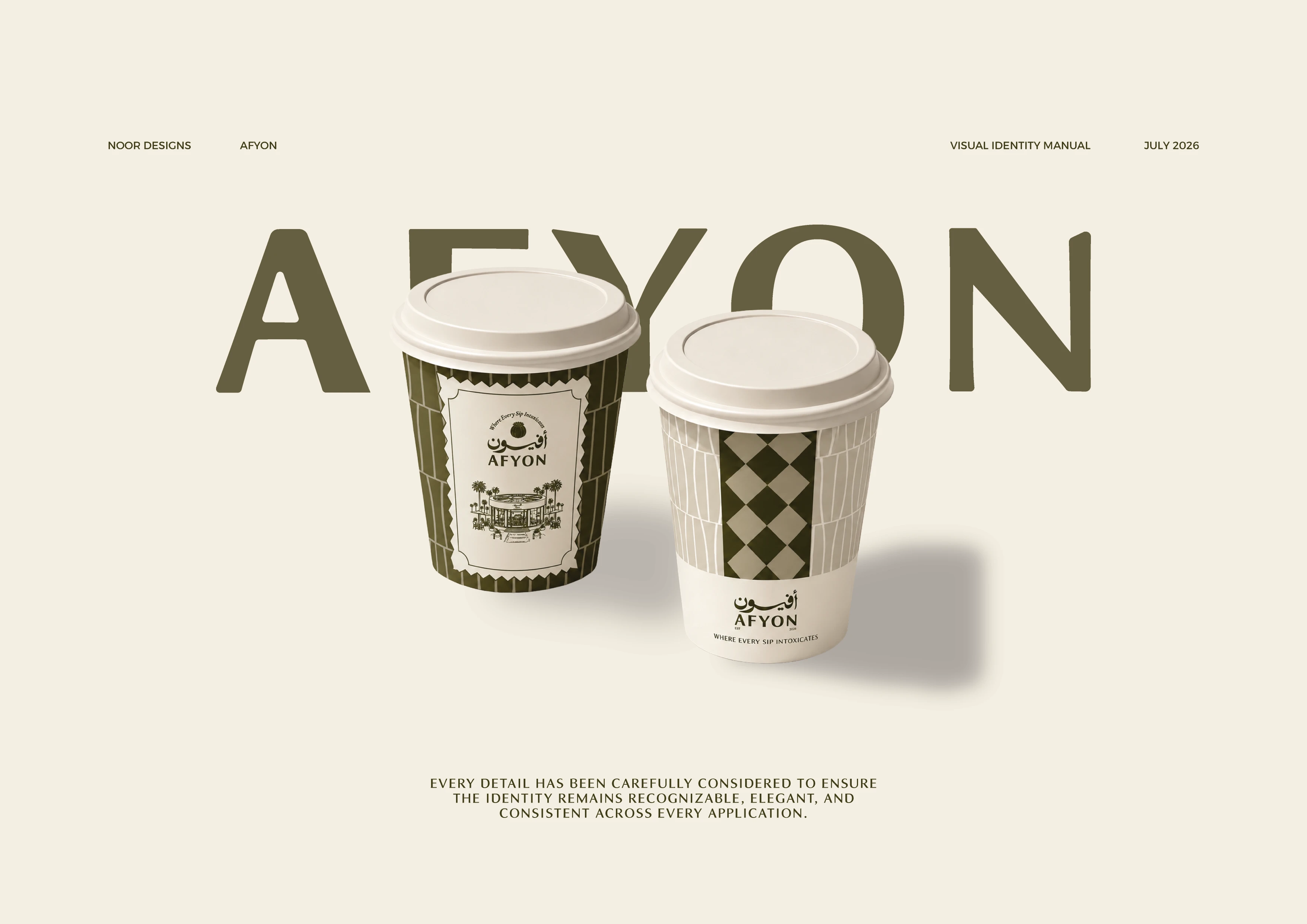
Cup & packaging system
Signage & storefront
Print & stationery
01 / 9 Interior application.
Afyon now has a bilingual identity as distinctive as its name — a system built to make the brand instantly recognizable across Najran, from the cup in your hand to the sign above the door.
Eternull gave us something no other cafe here has - an identity that feels like it belongs to this city specifically, not one borrowed from somewhere else.
Founder