
Klein
A nail studio identity built around confidence, warmth, and quiet precision.

We blend strategy, creativity, and technology to help brands grow, connect, and stand out in an ever-evolving digital world.





A clean, trustworthy identity for an organic grocery brand built on freshness and access.
Eternull Media
Abdul Hannan
Founder & Creative DirectorGrenmart
2024
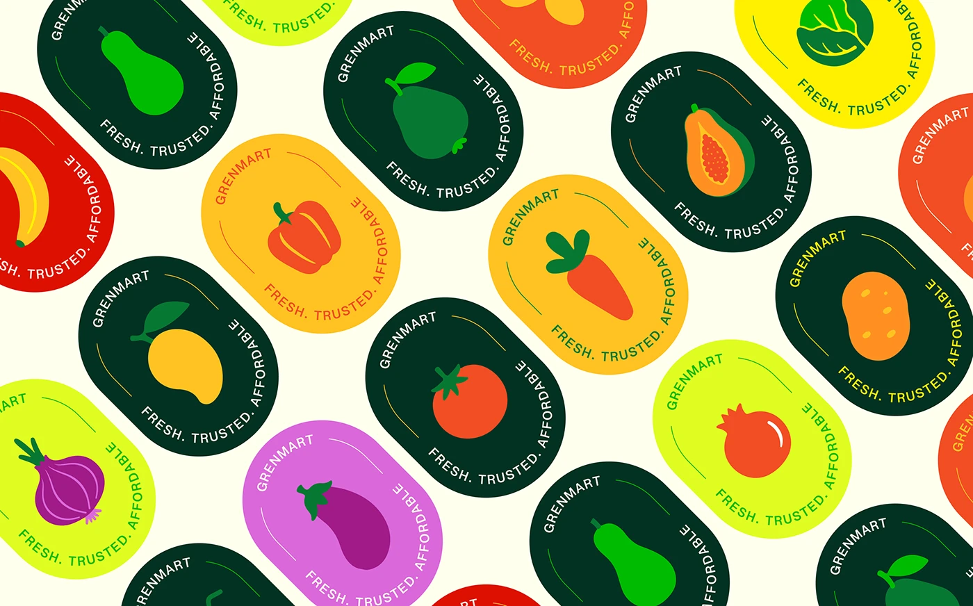
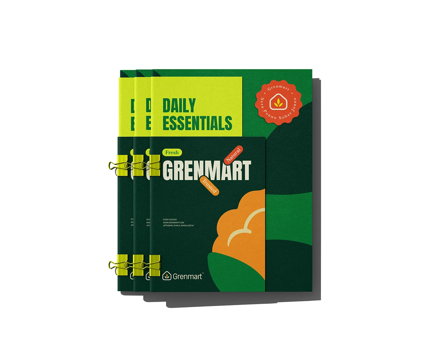
Grenmart is a trusted organic food and grocery brand delivering fresh vegetables, natural products, and premium daily essentials — built on trust, freshness, and accessibility for both retail and wholesale customers.
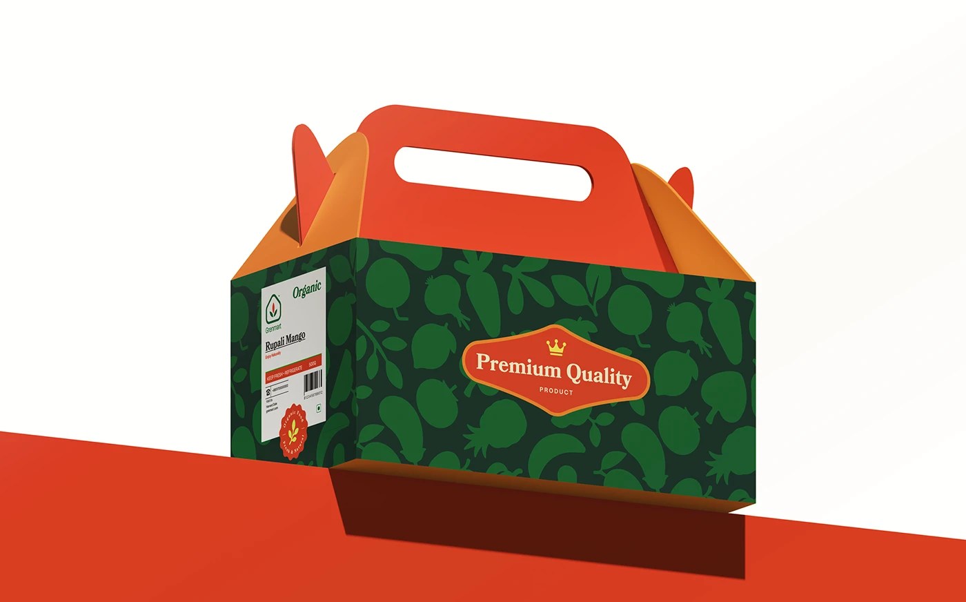
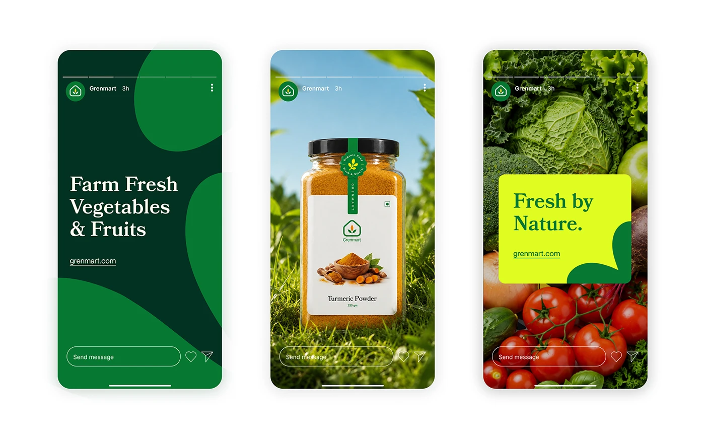
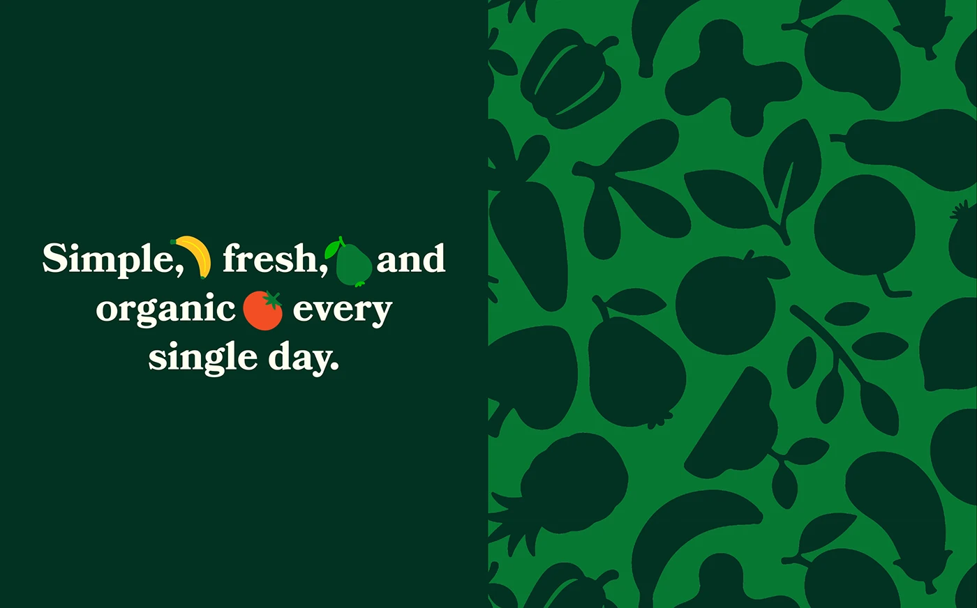
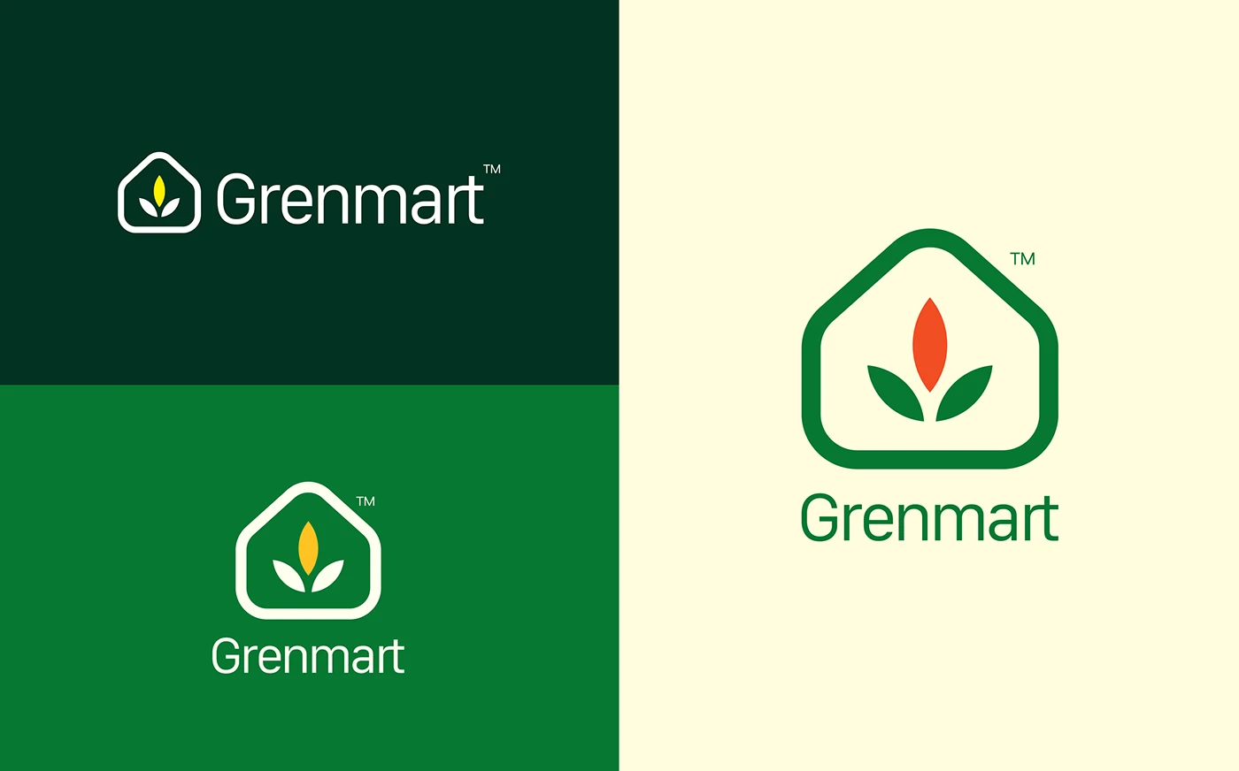
The identity needed to feel clean and modern without losing the warmth of real, fresh food. We built the system around a leaf-formed wordmark accent and a bright, appetizing palette of greens, yellows, and warm orange — distinct from the muted, earthy tones most organic brands default to.
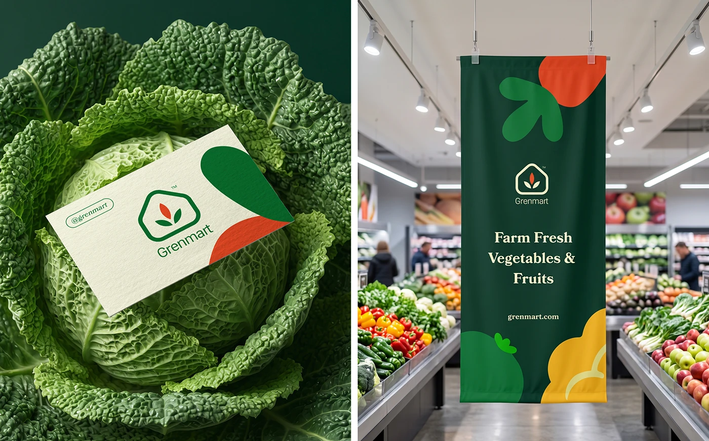
The result is a system that works as hard on a wholesale carton as it does on a retail shelf — consistent, legible, and unmistakably fresh at every scale.
— Freshness, made instantly legible.
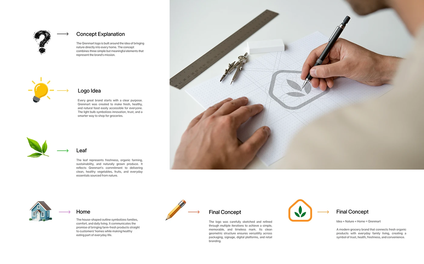
Organic and grocery brands often default to muted earth tones that blend into every other "natural" product on the shelf. Grenmart needed to look fresh and trustworthy while standing out at retail and holding up across a large, varied product line.
We positioned Grenmart around accessible freshness — a brand that makes healthy, natural food feel welcoming rather than precious. A bright, appetizing palette and a friendly leaf mark carry that promise across every package.
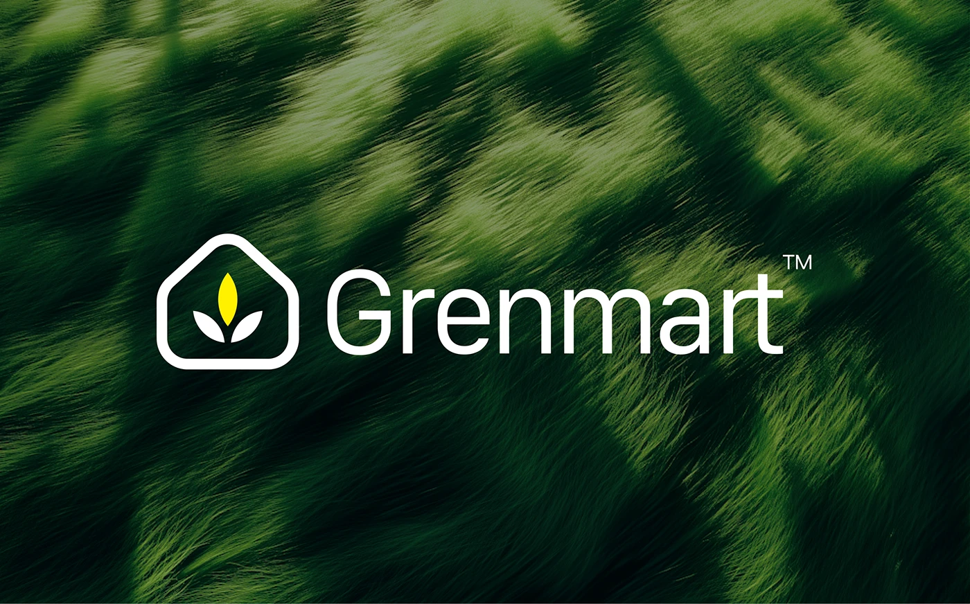
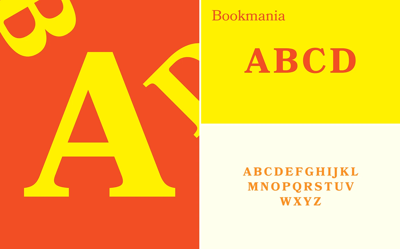
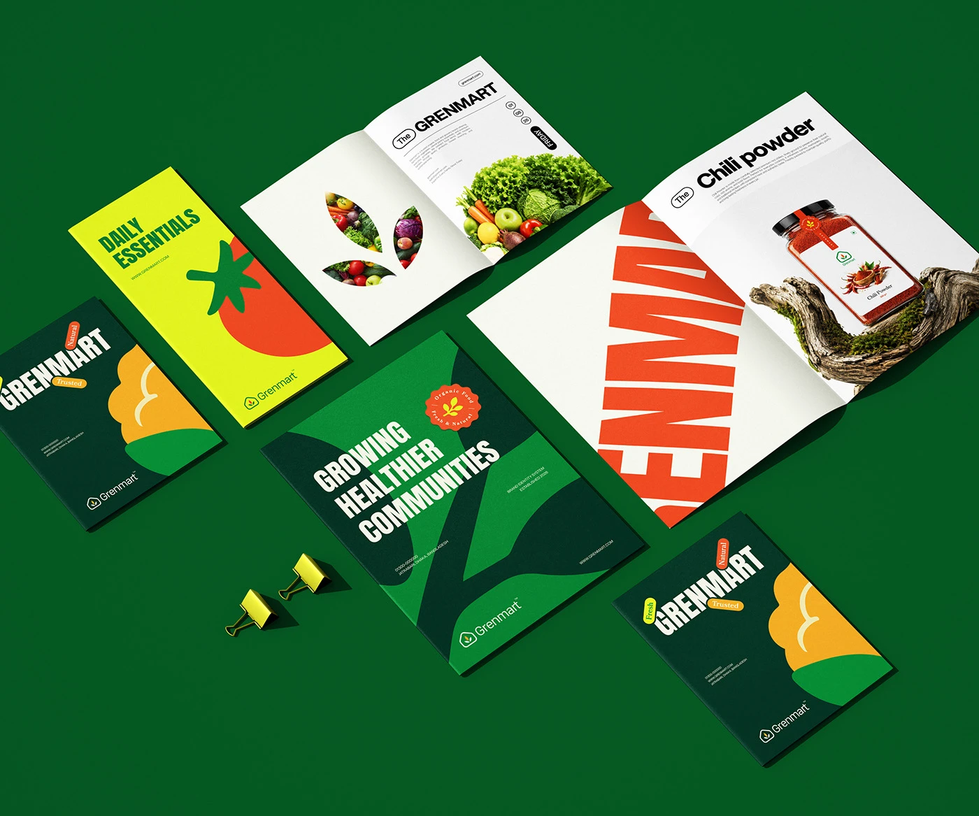
A confident wordmark pairs with a leaf-formed accent mark, rendered across a bright palette of greens, yellow, and warm orange. The system is built modularly, so new products can join the catalogue without new design decisions.
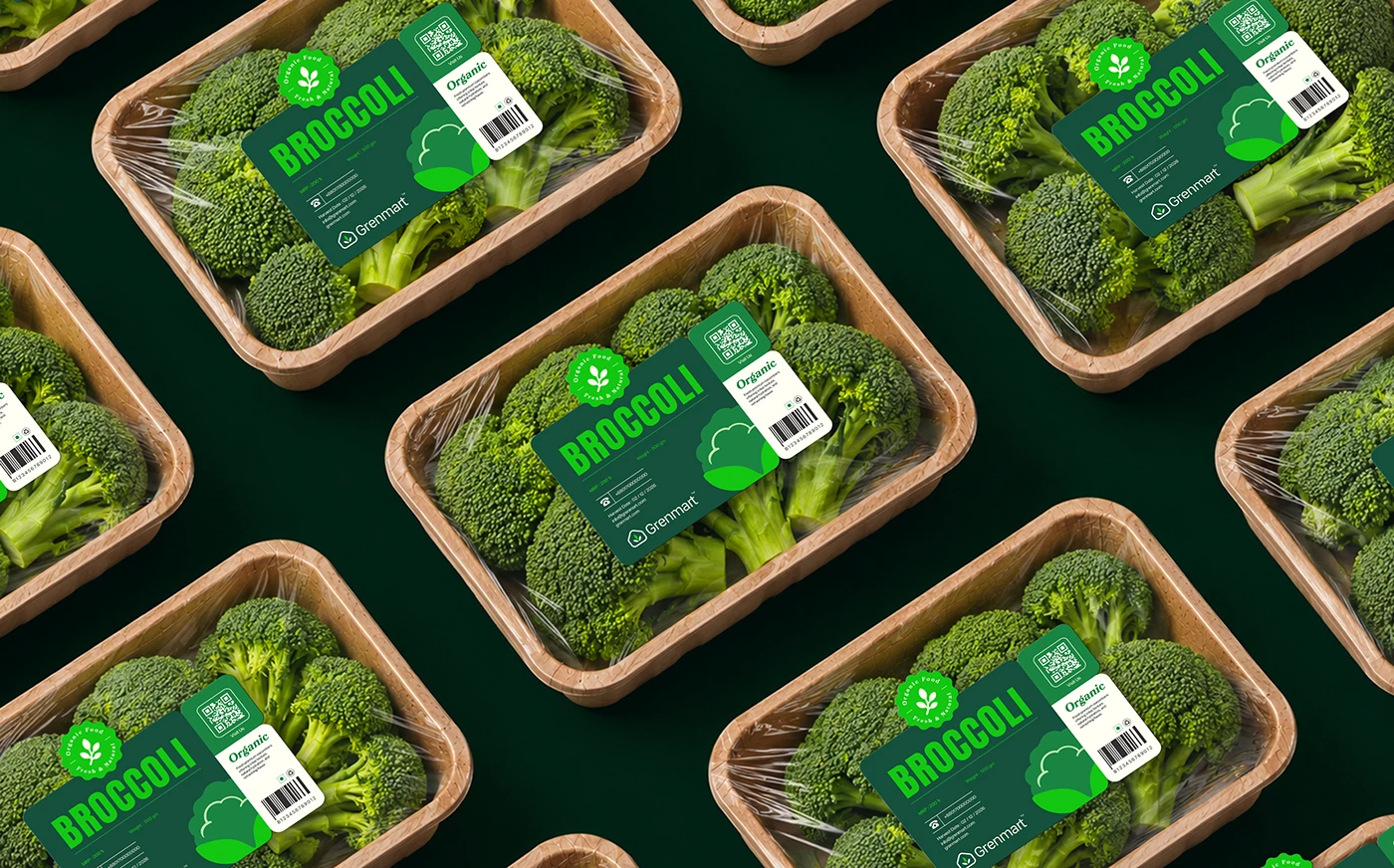
Packaging system
Retail & wholesale
Print collateral

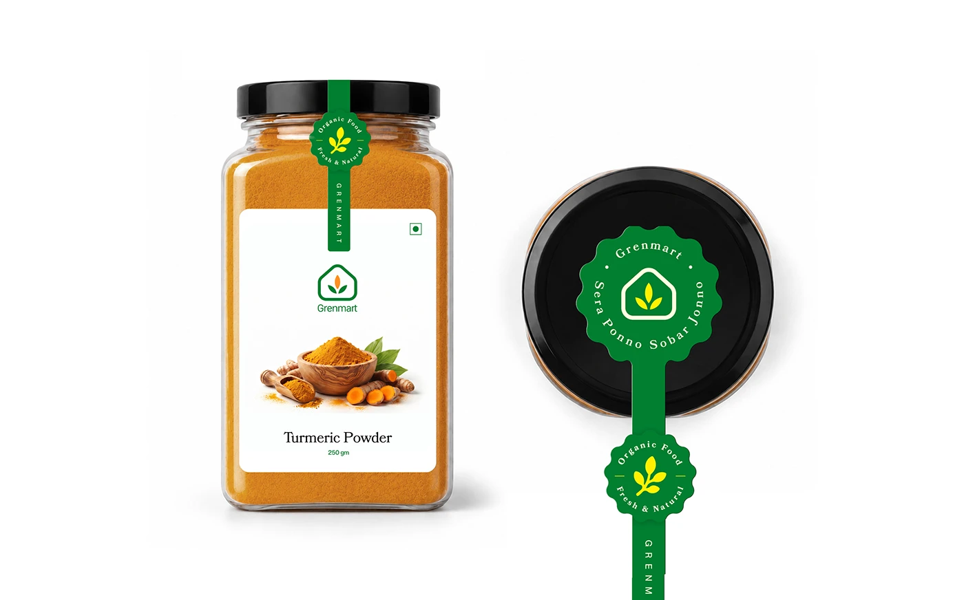
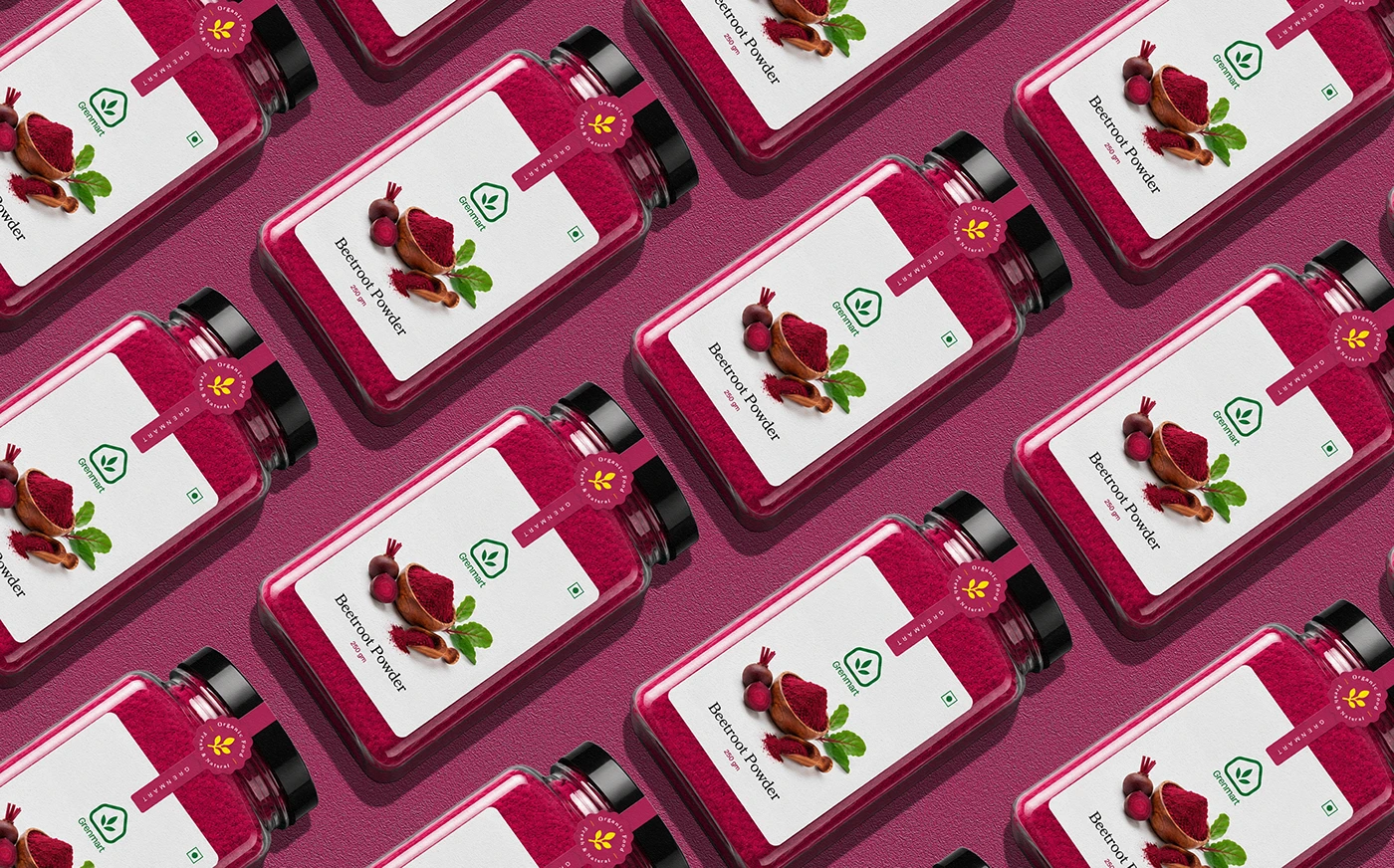
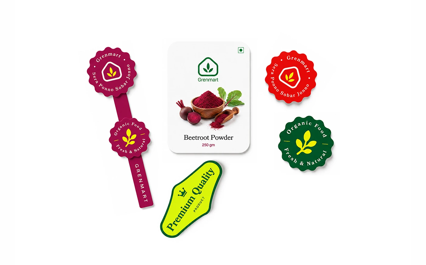
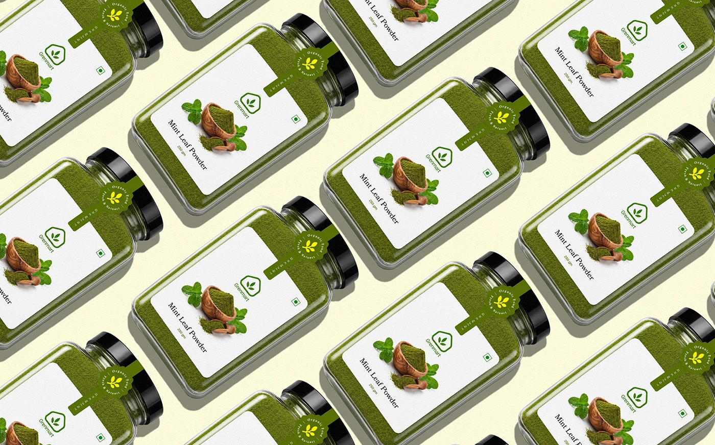
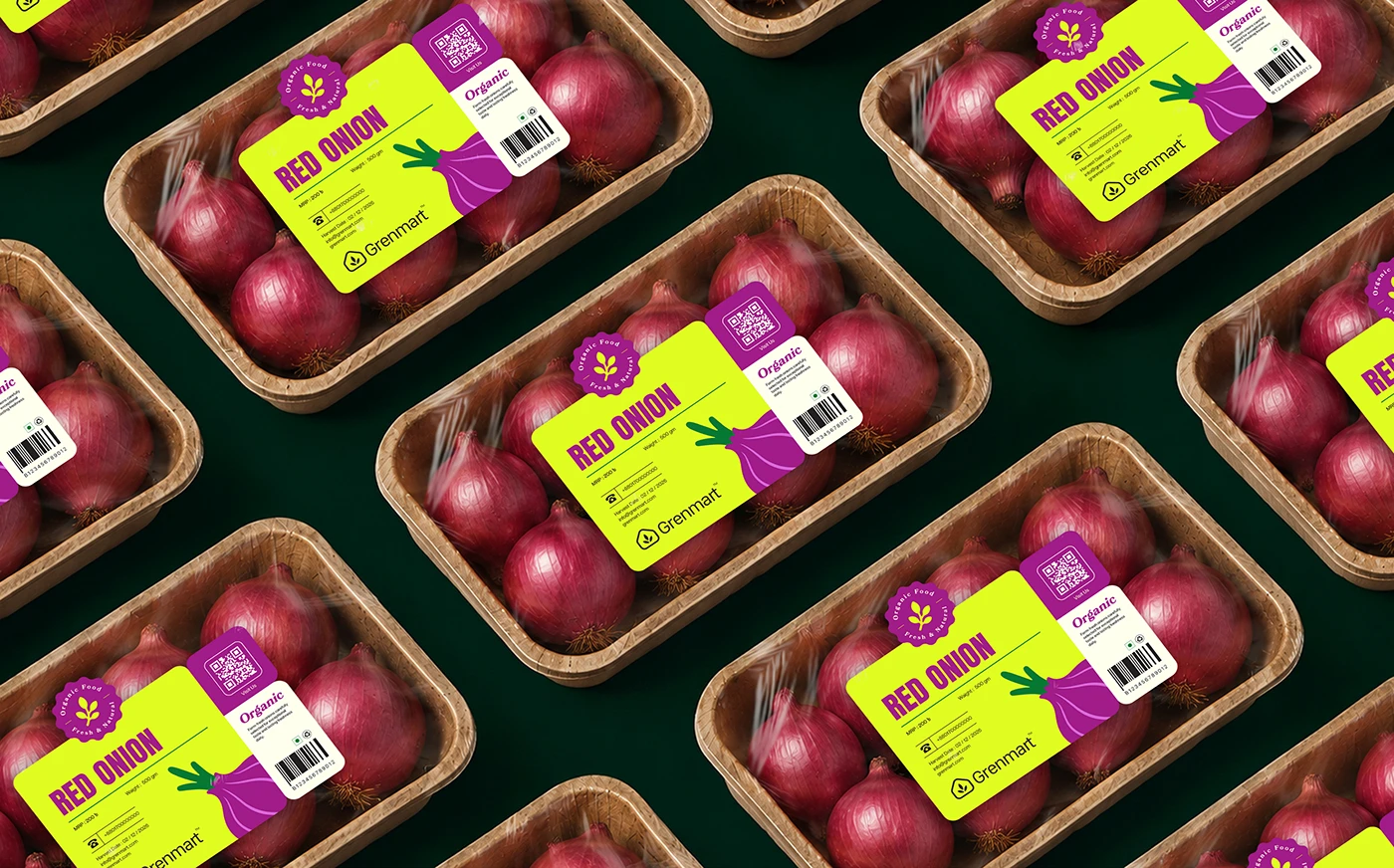
01 / 9 Packaging detail.
Grenmart now has a packaging and identity system built to scale — one that reads as fresh and trustworthy whether it is meeting a shopper at the shelf or a buyer in a wholesale meeting.
Every new product used to mean new design decisions. Now our packaging system just works, no matter how fast the catalogue grows.
Brand Team