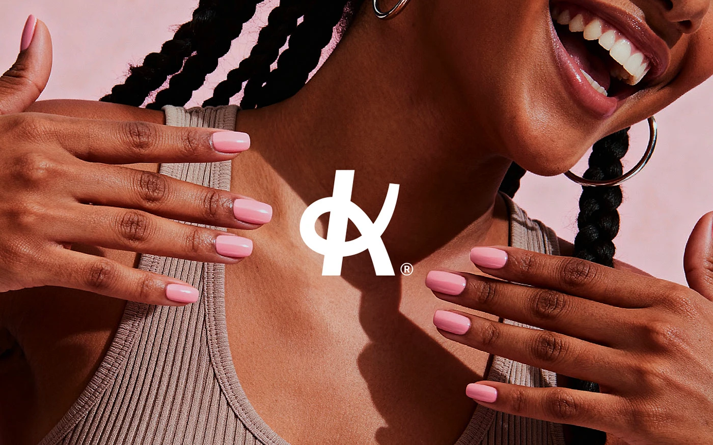
Klein
A nail studio identity built around confidence, warmth, and quiet precision.

We blend strategy, creativity, and technology to help brands grow, connect, and stand out in an ever-evolving digital world.




A visual identity for a community-driven fitness platform built on shared momentum.
Eternull Media
Abdul Hannan
Founder & Creative DirectorSeekly
2026
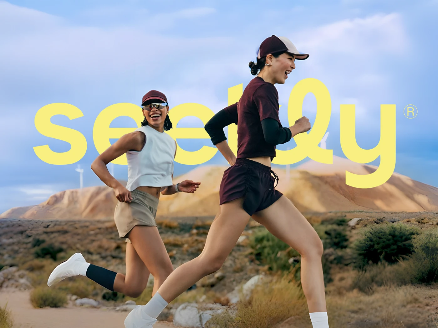
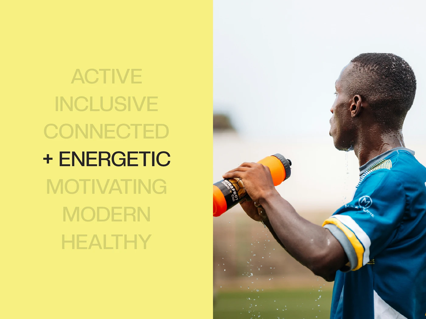
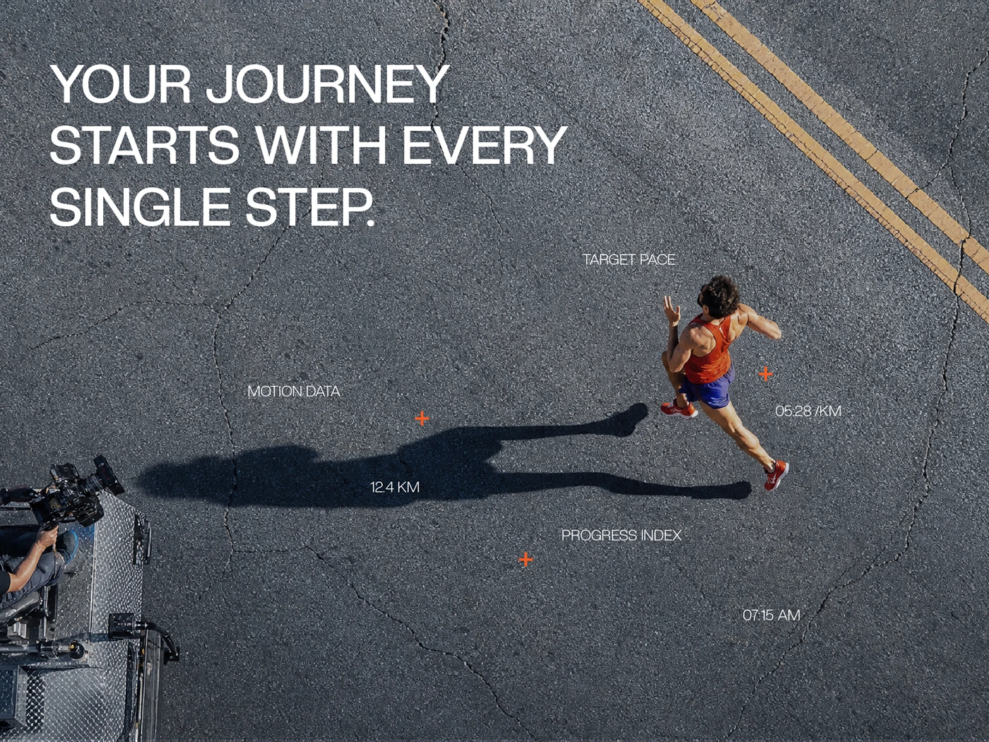
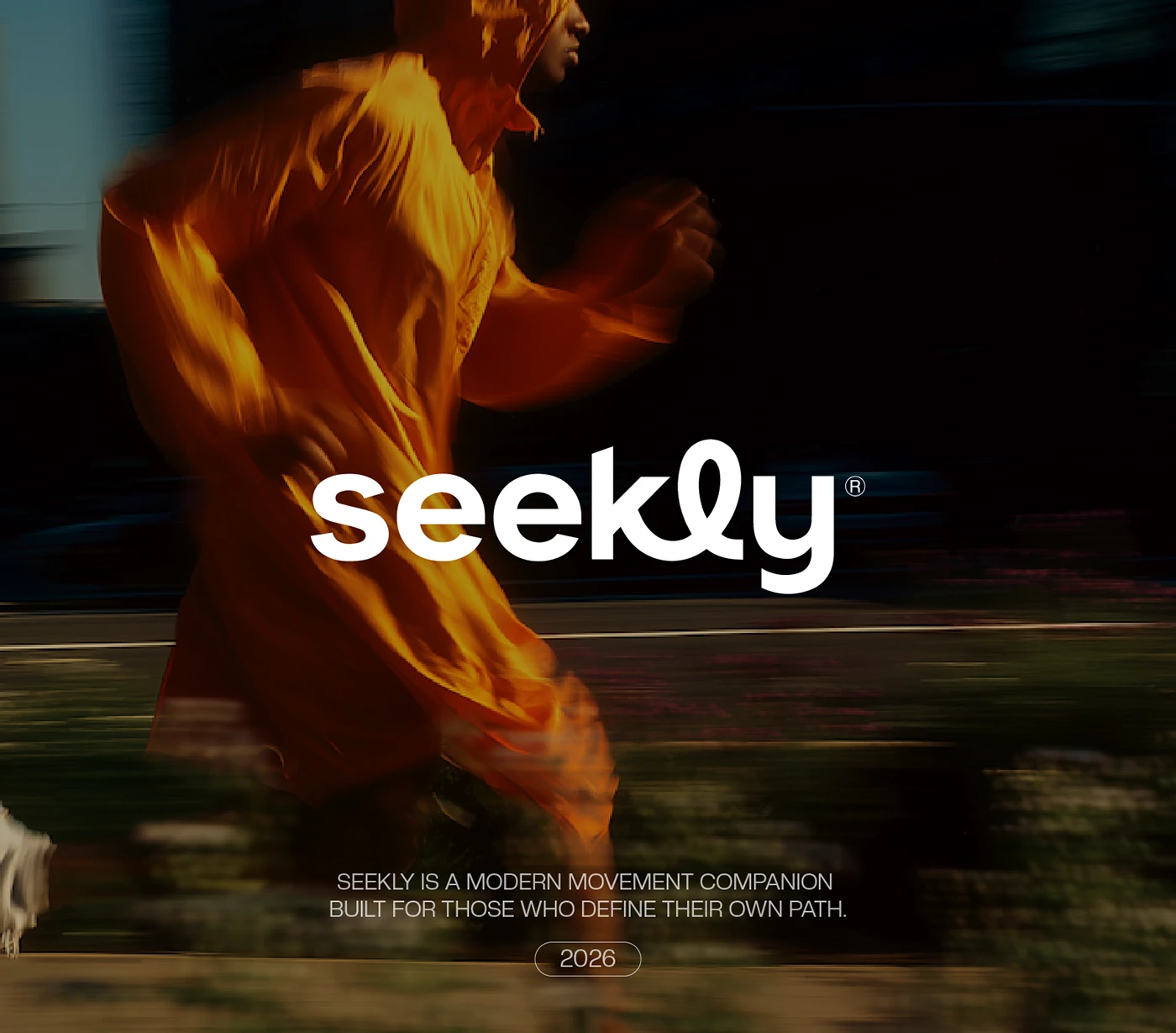
Seekly is a premium community-based fitness and wellness platform designed to inspire active living and mindful health awareness — built on the philosophy that vitality is best pursued together, not alone.
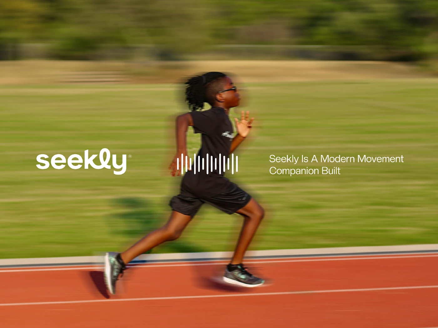
Whether it’s jogging, walking, or running, Seekly brings people together to build healthier habits through daily movement. The identity needed to capture motion and momentum without falling into generic gym-brand cliches of aggression and intensity.
We built the wordmark around a looping, continuous letterform — literally never lifting the pen — paired with a warm, sunset-toned palette that trades cold gym intensity for something more human: consistency, and the quiet confidence of showing up.
— Momentum, built together.
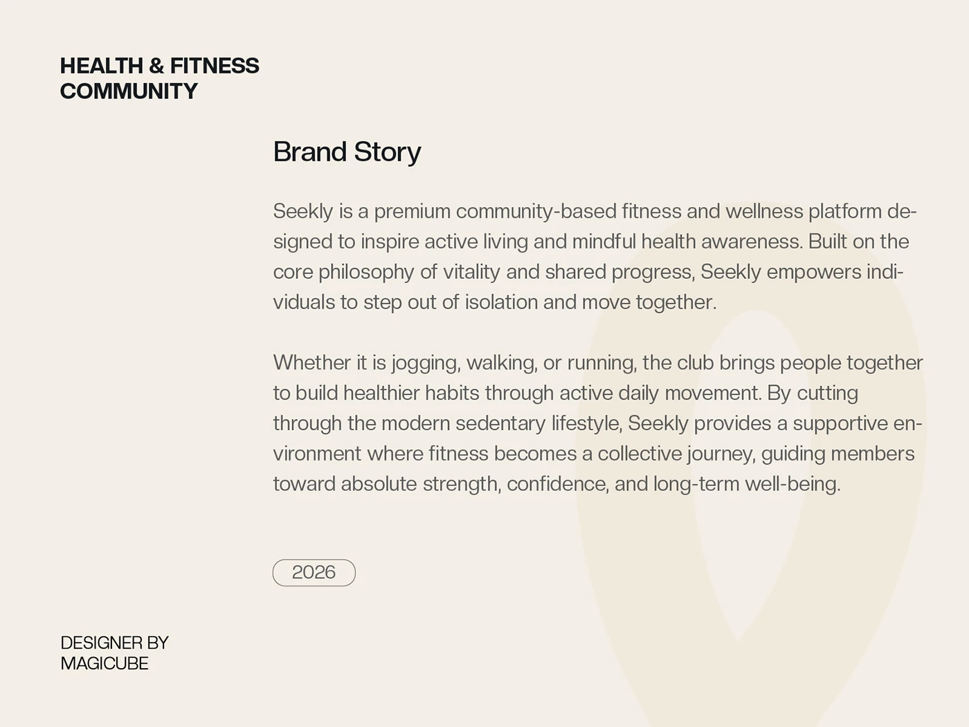
Fitness brands default to a narrow visual language: aggressive type, high-contrast black and red, intensity as the only emotional register. Seekly needed to stand for something different — consistency and community — without looking soft or low-energy.
We positioned Seekly around shared momentum — the idea that showing up together, consistently, beats sporadic intensity alone. A looping wordmark and warm, sunset palette carry that promise across every touchpoint.
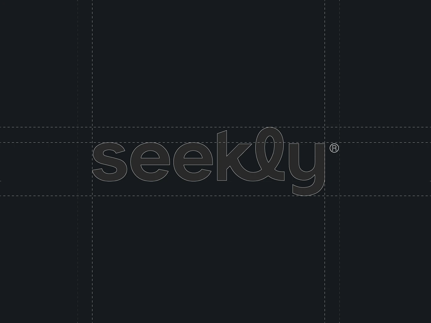
A continuous, looping wordmark anchors the system — drawn without lifting the pen, echoing the brand’s belief in uninterrupted momentum. A warm palette of amber, rust, and cream carries the energy of movement without resorting to gym-brand aggression.
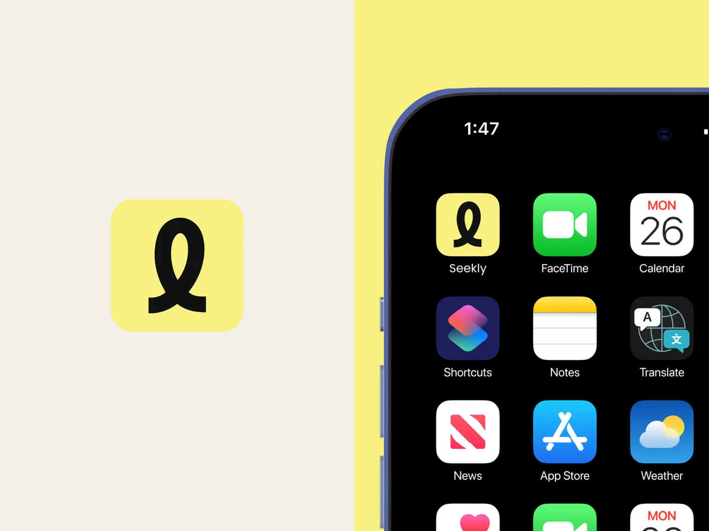
App interface
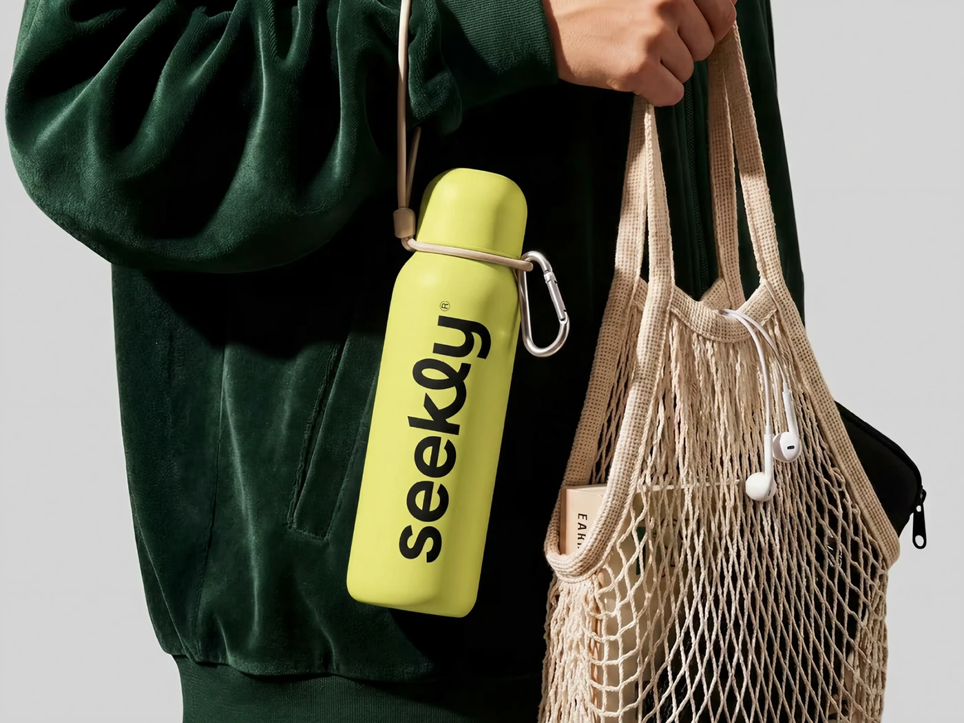
Apparel & event kit
Campaign & social
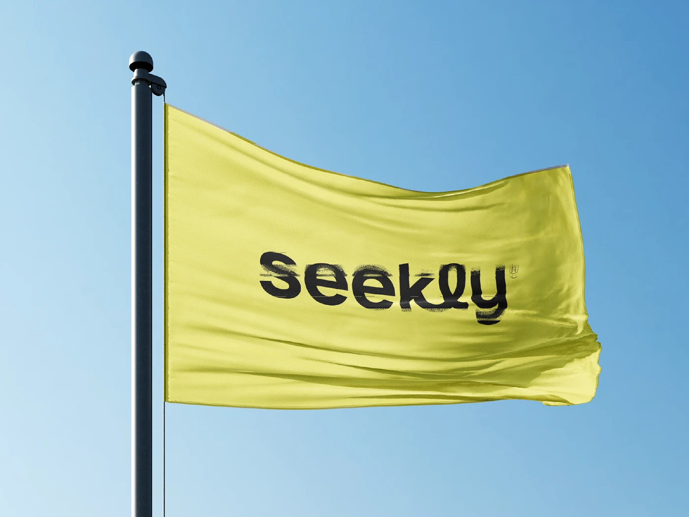
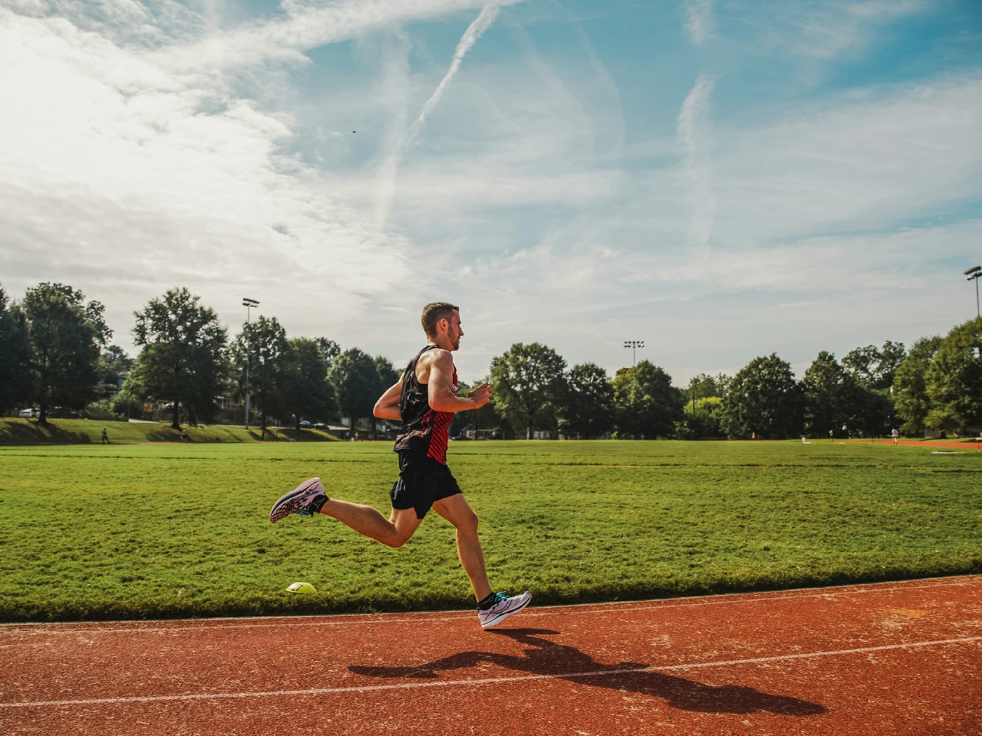
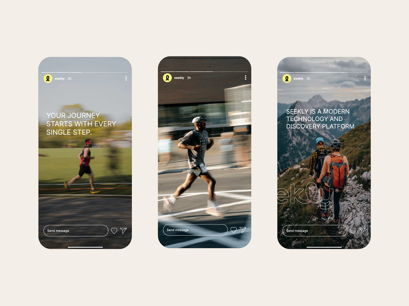
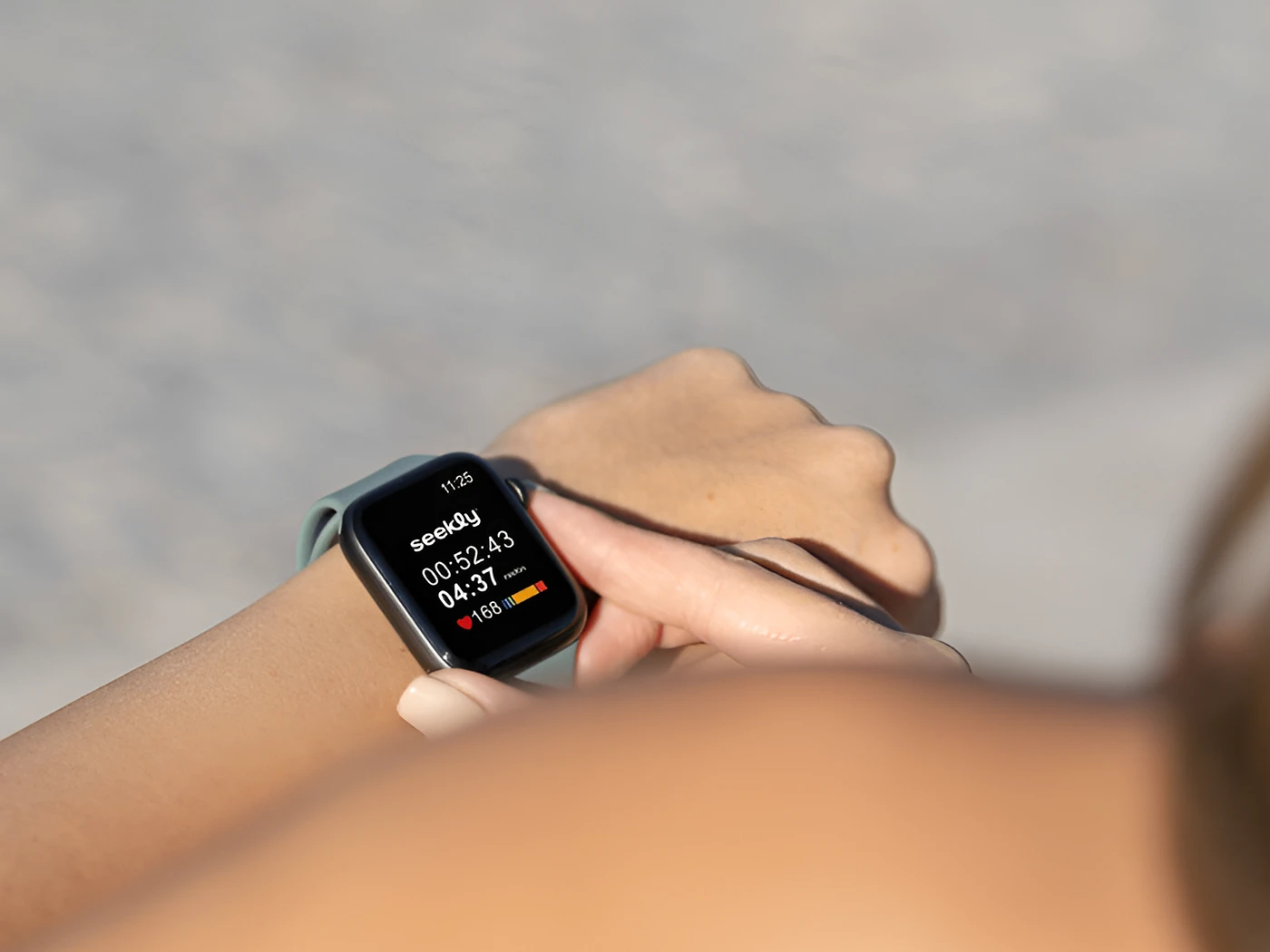
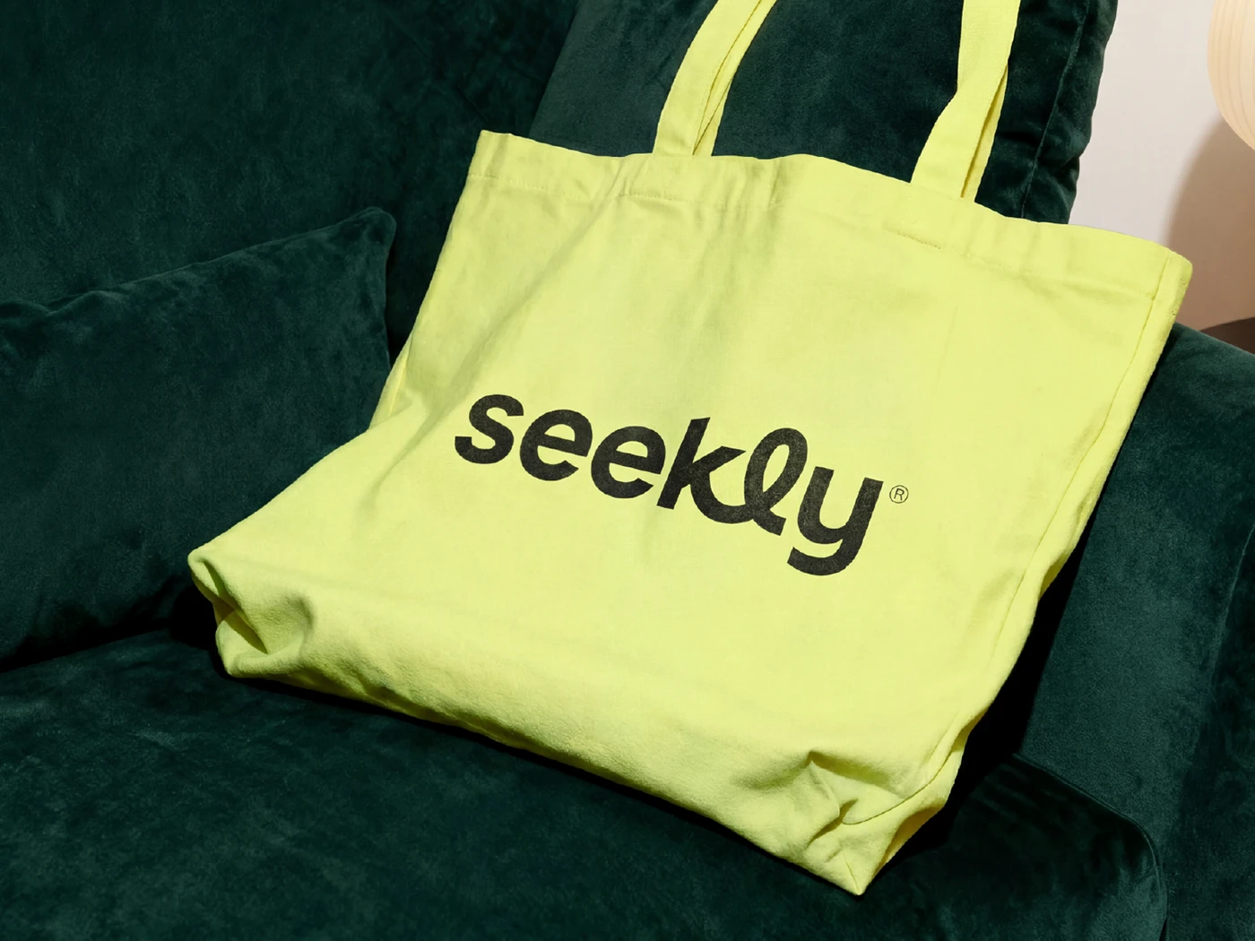
01 / 6 Apparel detail.
Seekly now has an identity built for community, not competition — a system that carries the same warmth from the app icon to the finish line of a group run.
Every other fitness brand we looked at felt like it was shouting at us. Eternull gave us something that feels like it's running beside you instead.
Founding Team