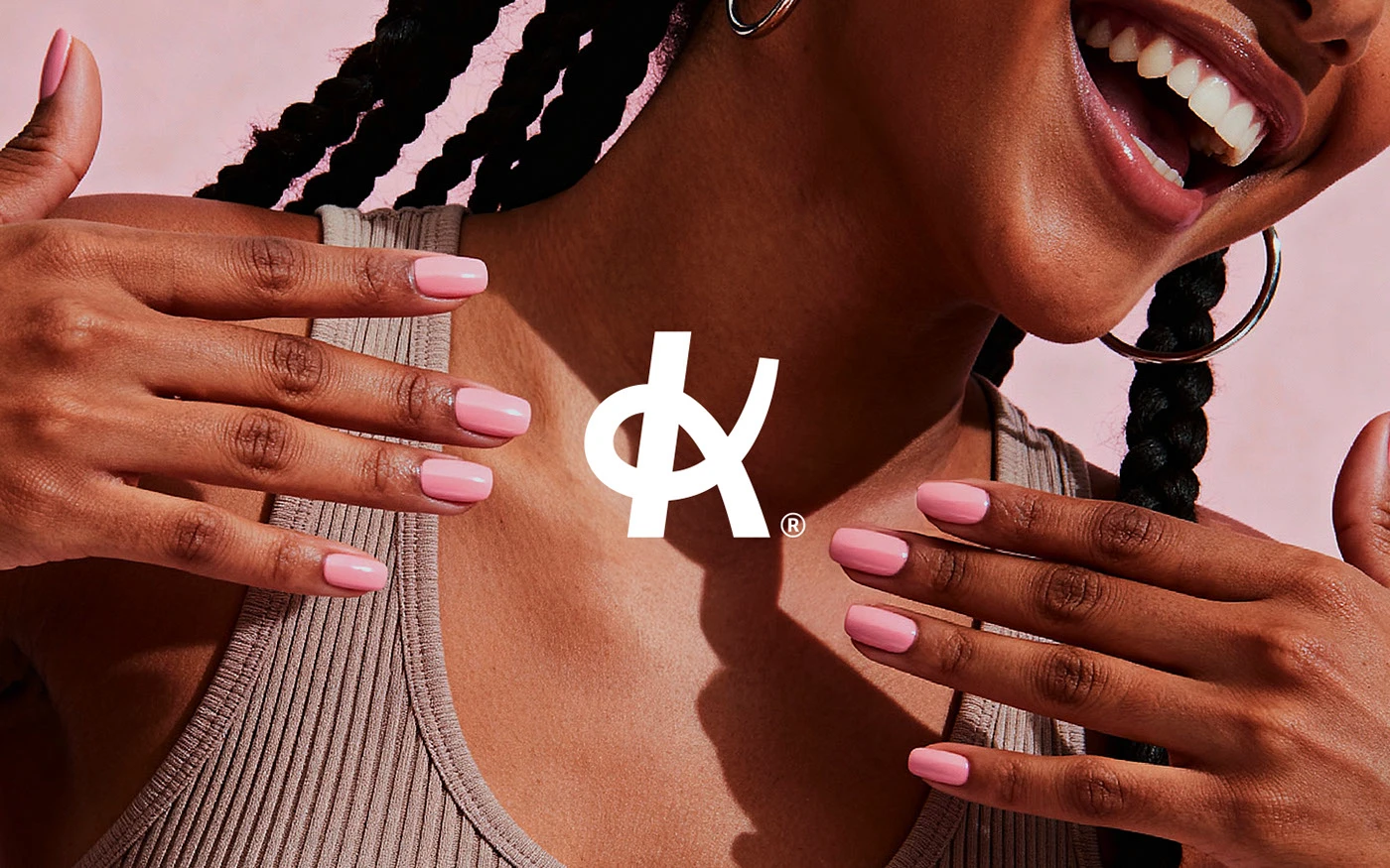
Klein
A nail studio identity built around confidence, warmth, and quiet precision.

We blend strategy, creativity, and technology to help brands grow, connect, and stand out in an ever-evolving digital world.





A confident, human identity for a ride-hailing platform built around trust.
Eternull Media
Abdul Hannan
Founder & Creative DirectorMOVA
2025
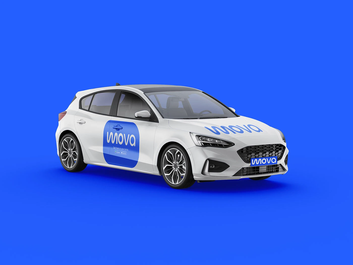
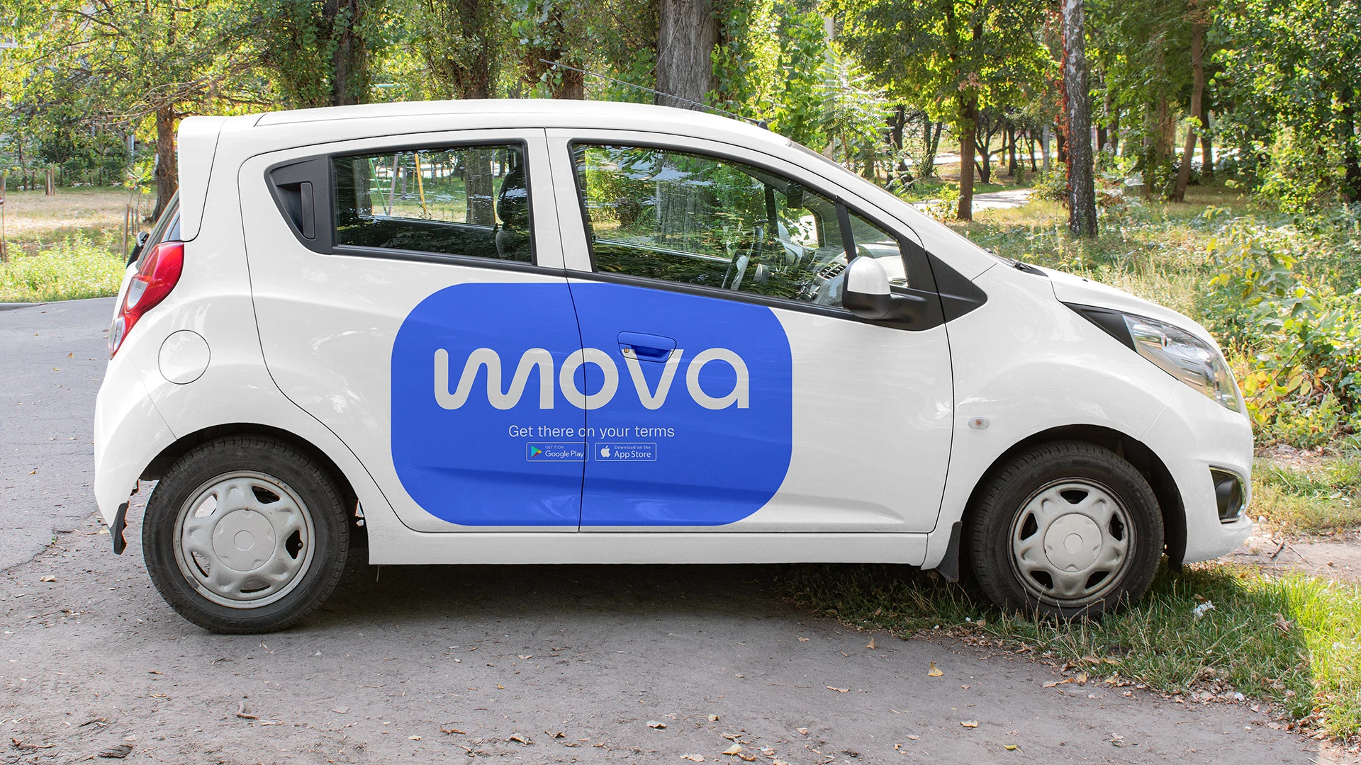
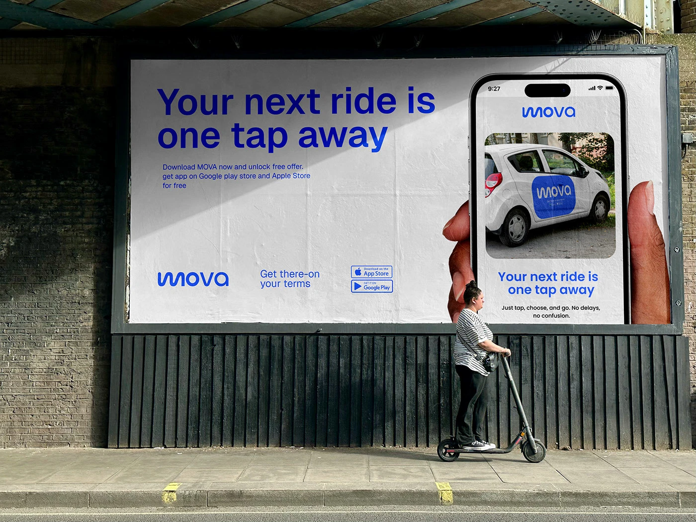
MOVA is a next-generation ride-hailing platform built on the belief that transportation should be simple, safe, and designed around the real needs of real people — standing apart not by shouting louder, but by delivering smarter, more human experiences.
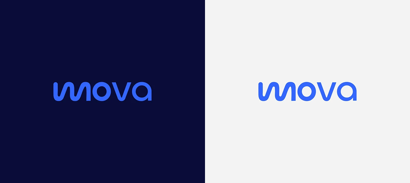
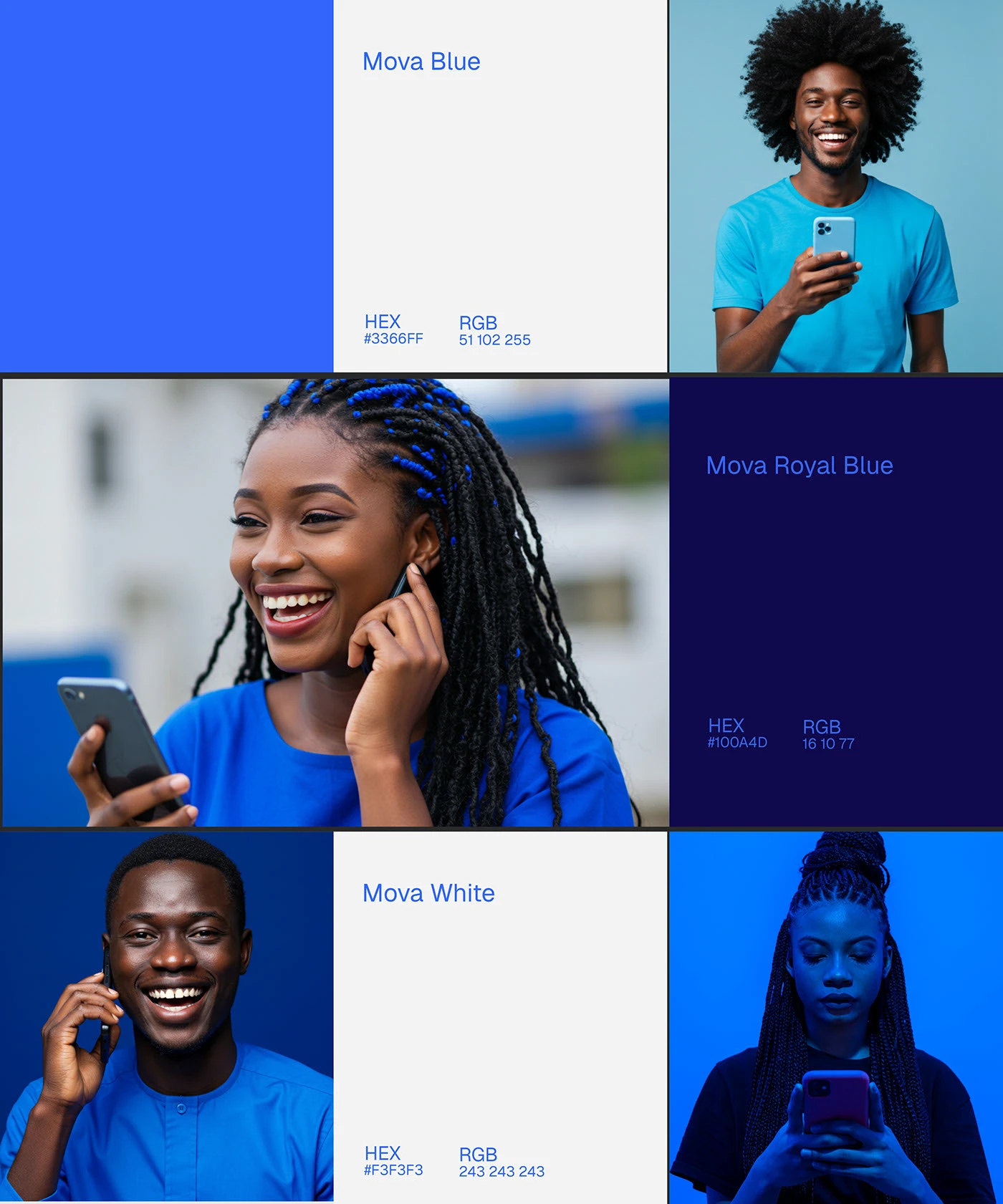
In a category of identical apps, the identity needed to feel confident and quietly powerful rather than loud. We built the system around a bold wordmark and a deep, trustworthy blue — a color choice that signals reliability without falling into the sterile corporate-tech register most mobility apps default to.
Every touchpoint, from the in-app interface to street-level campaign photography, was designed to put riders’ real lives at the center — not abstract route lines and generic city skylines.
— Where every ride feels right.
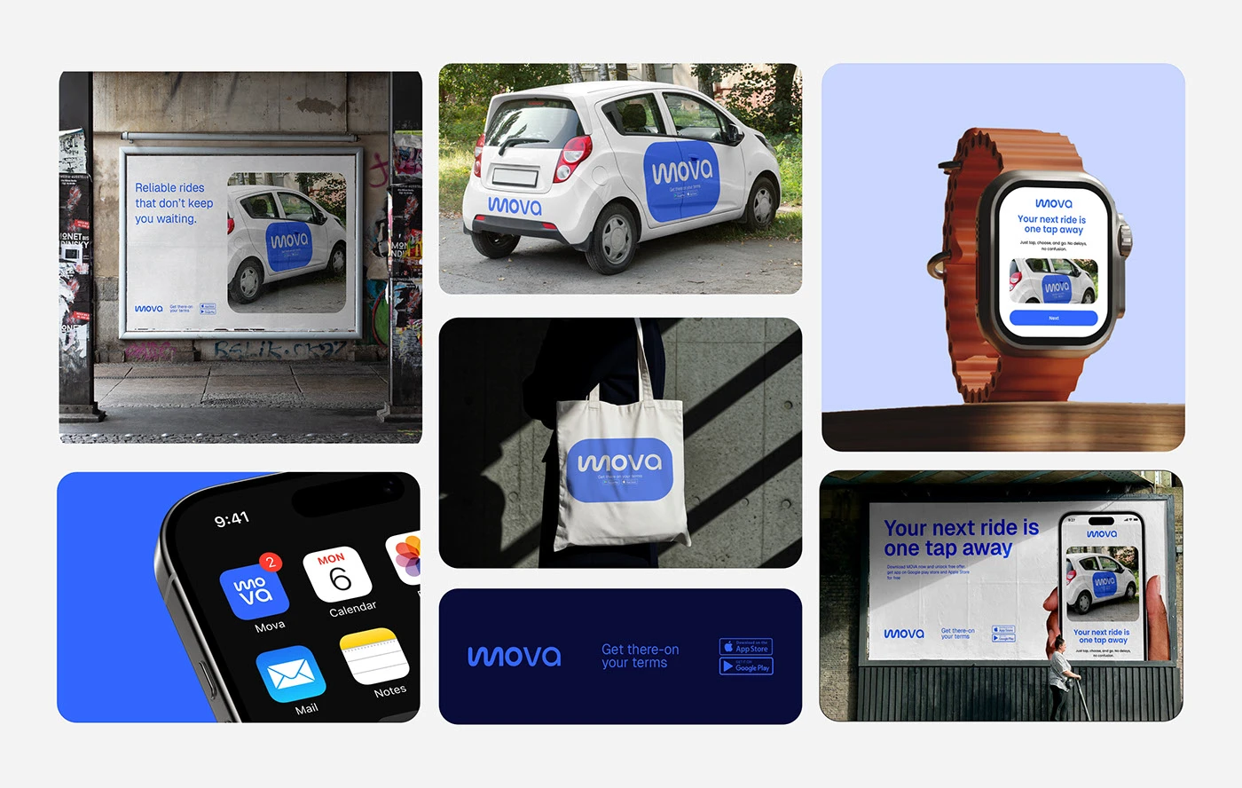
Ride-hailing apps are visually interchangeable — most default to similar blacks, yellows, and abstract route-line iconography. MOVA needed to feel distinct and trustworthy at a glance, in a category where trust is the entire product.
We positioned MOVA around quiet confidence — a platform that earns trust through consistency, not marketing volume. A bold wordmark and a deep, reliable blue carry that promise from the app icon to the street.
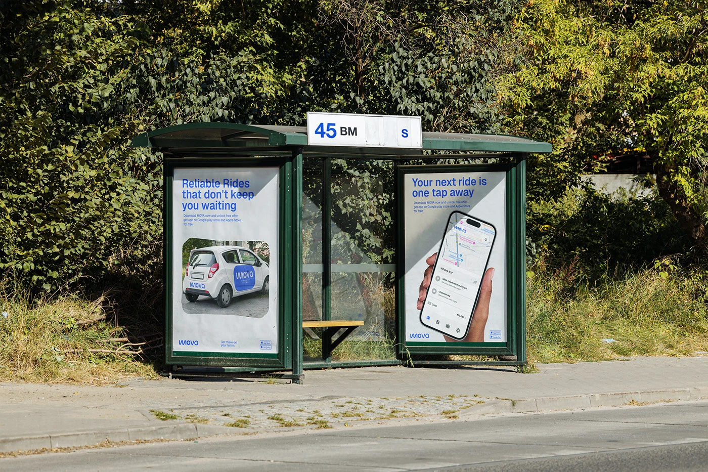
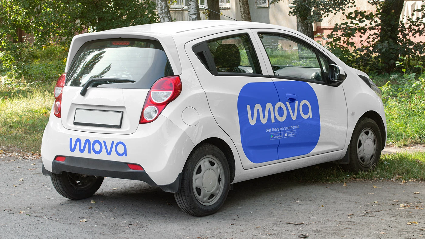
A bold, confident wordmark anchors the system, paired with a deep MOVA Blue and a Royal Blue accent for depth and contrast. Real photography of riders and drivers — never stock, never staged — carries the brand’s human promise across every touchpoint.
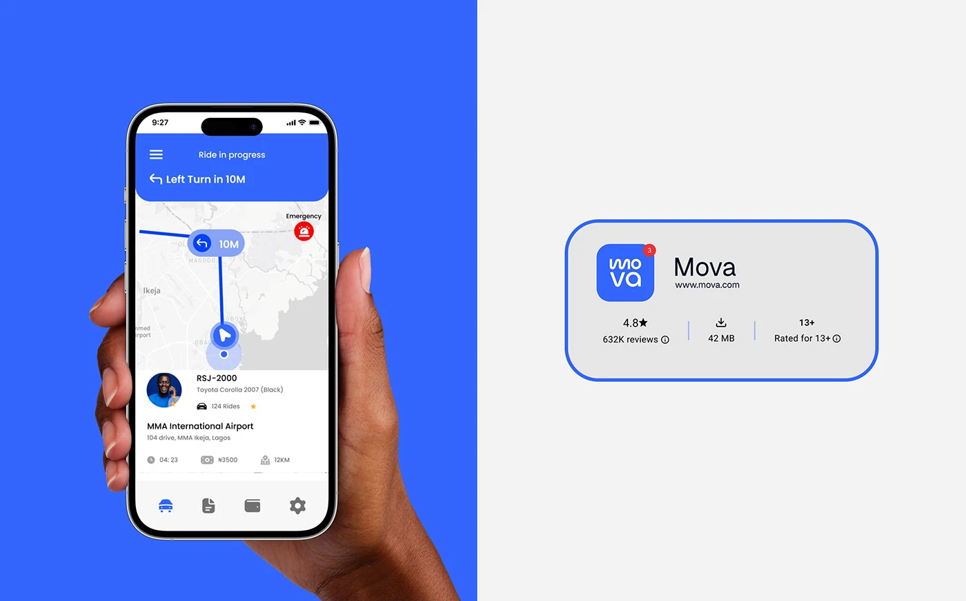
App interface
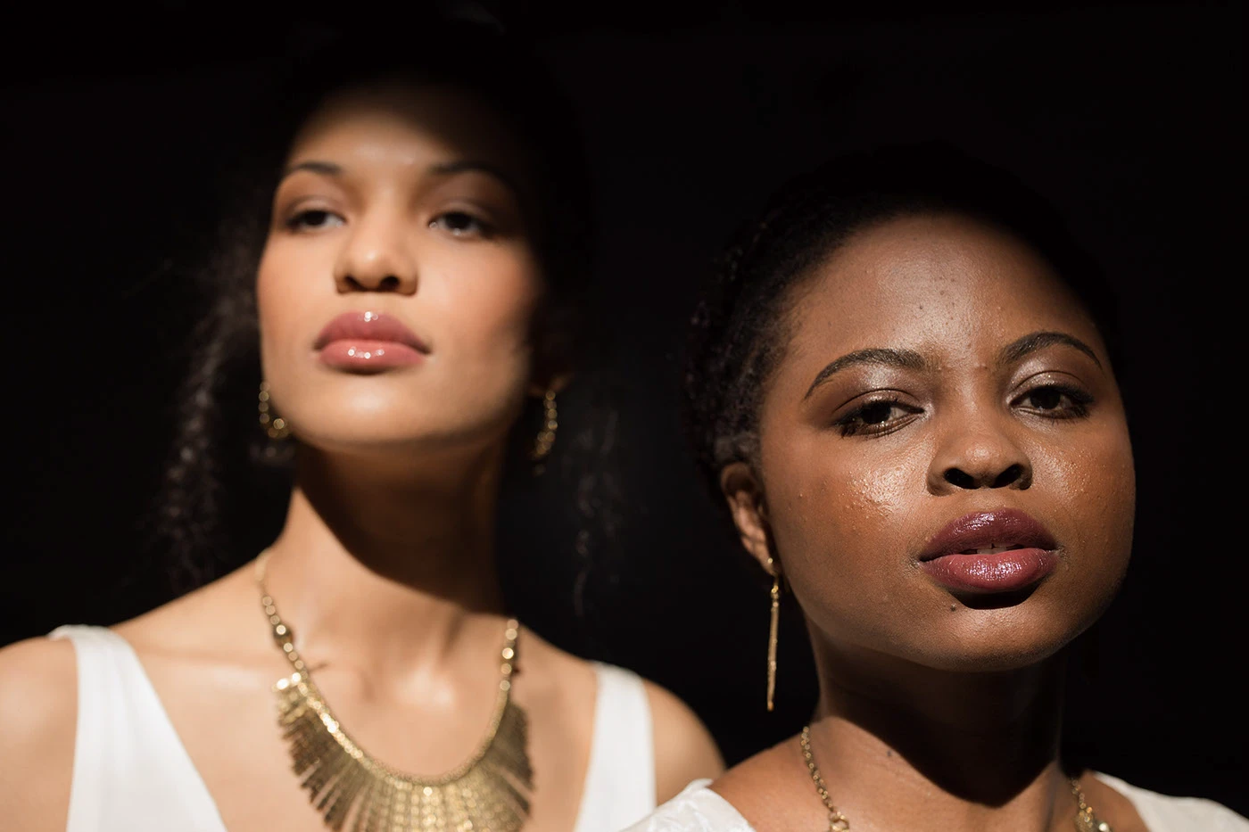
Campaign photography
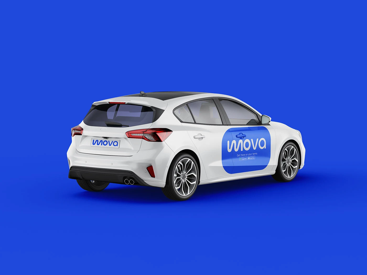
Driver & rider kit
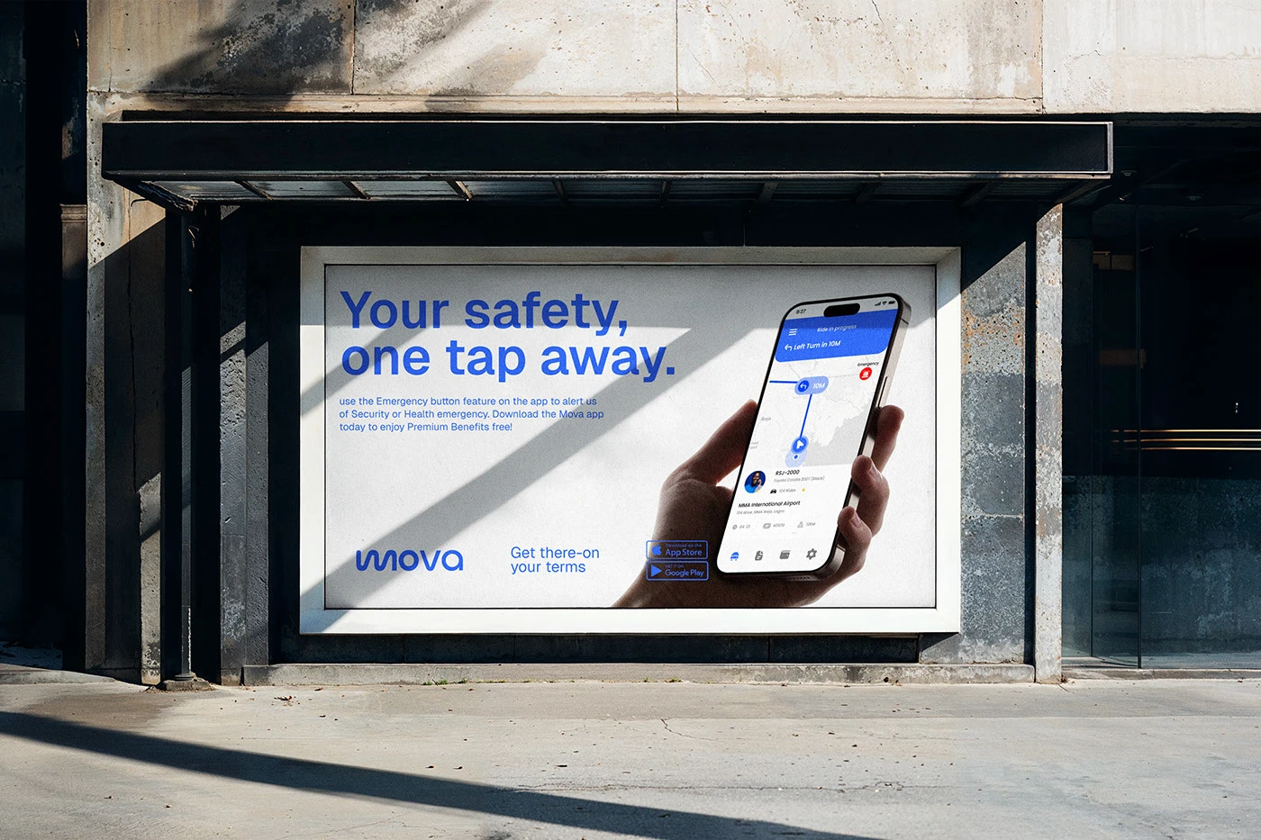
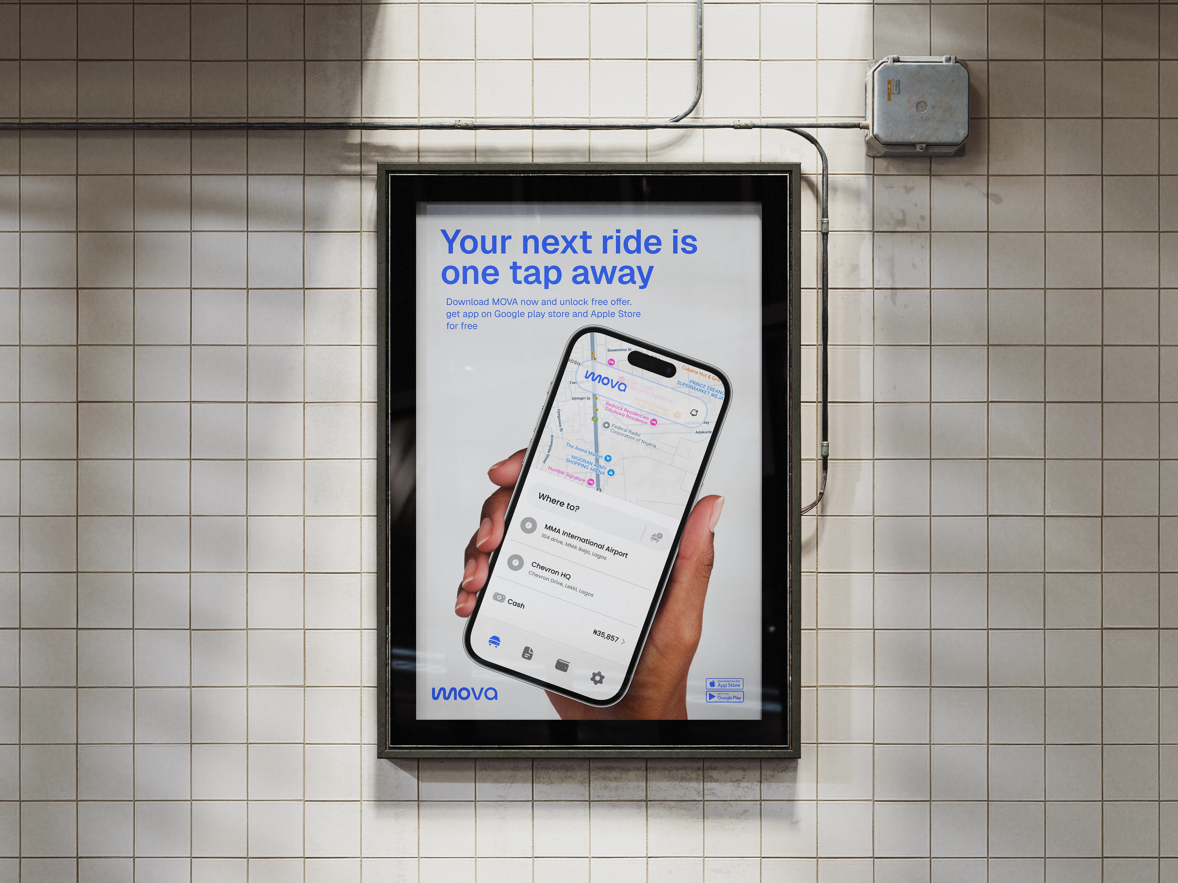
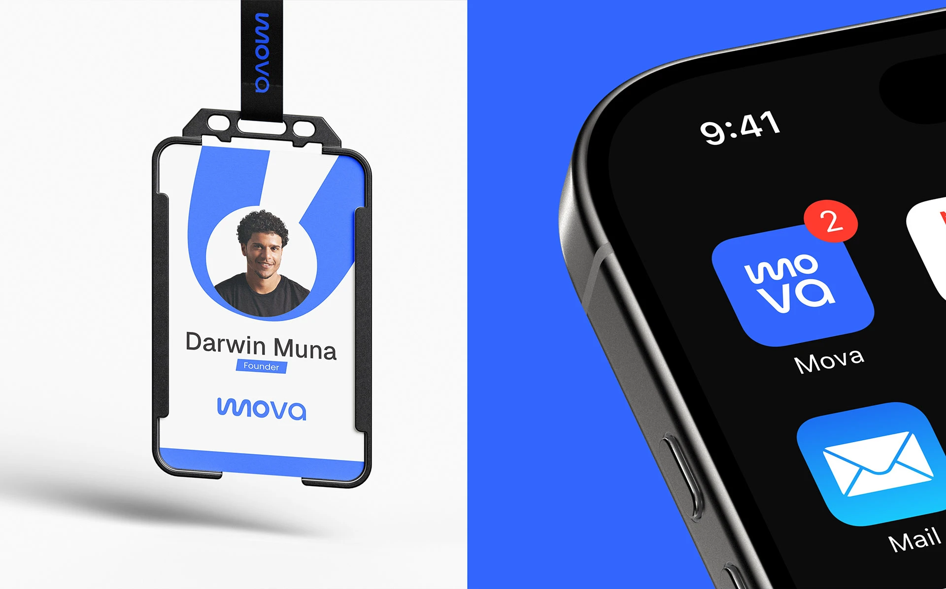
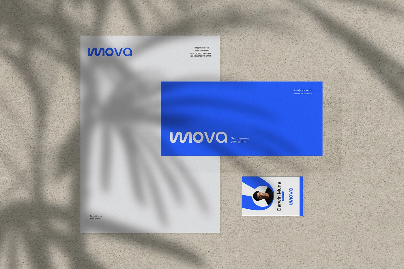
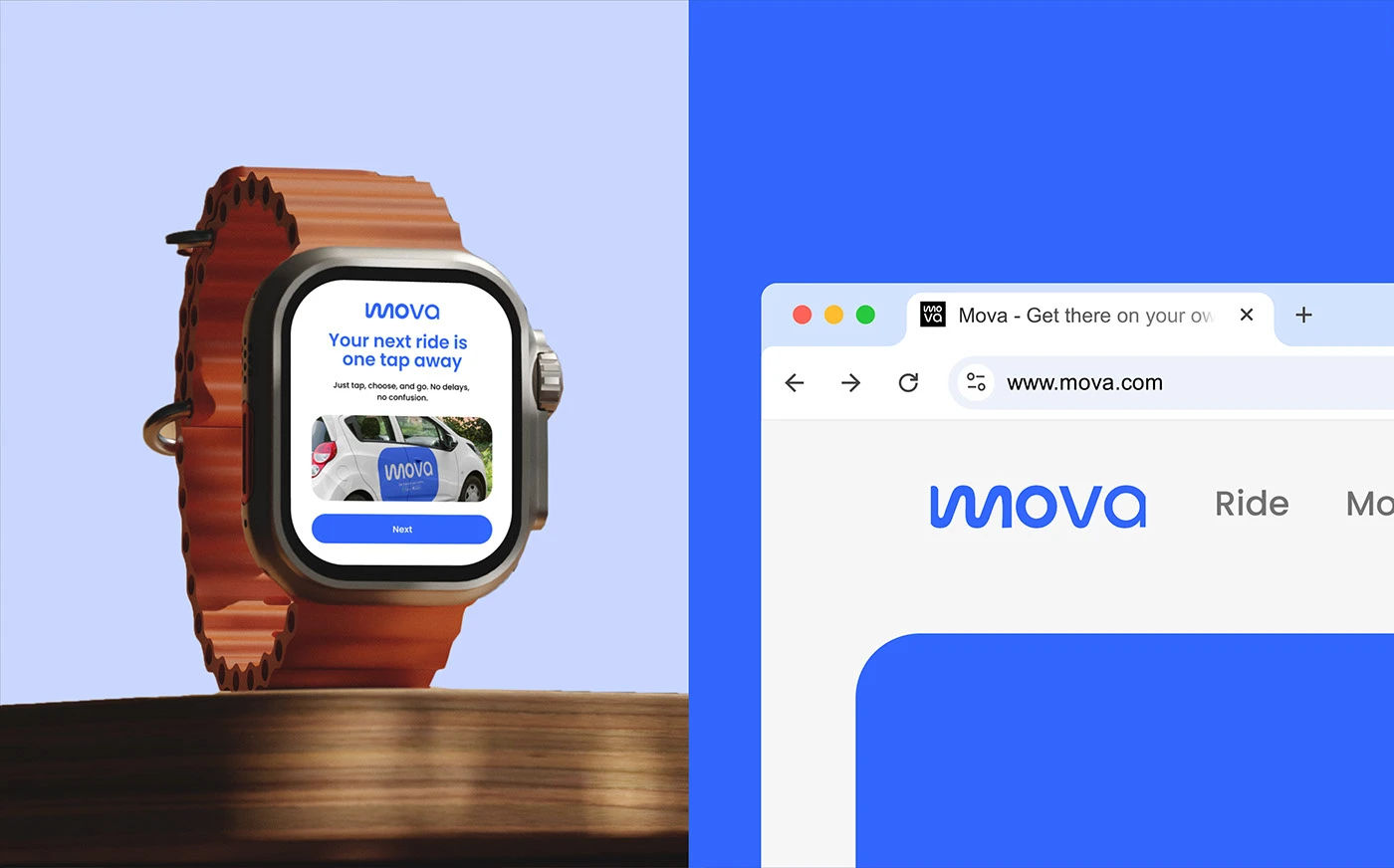
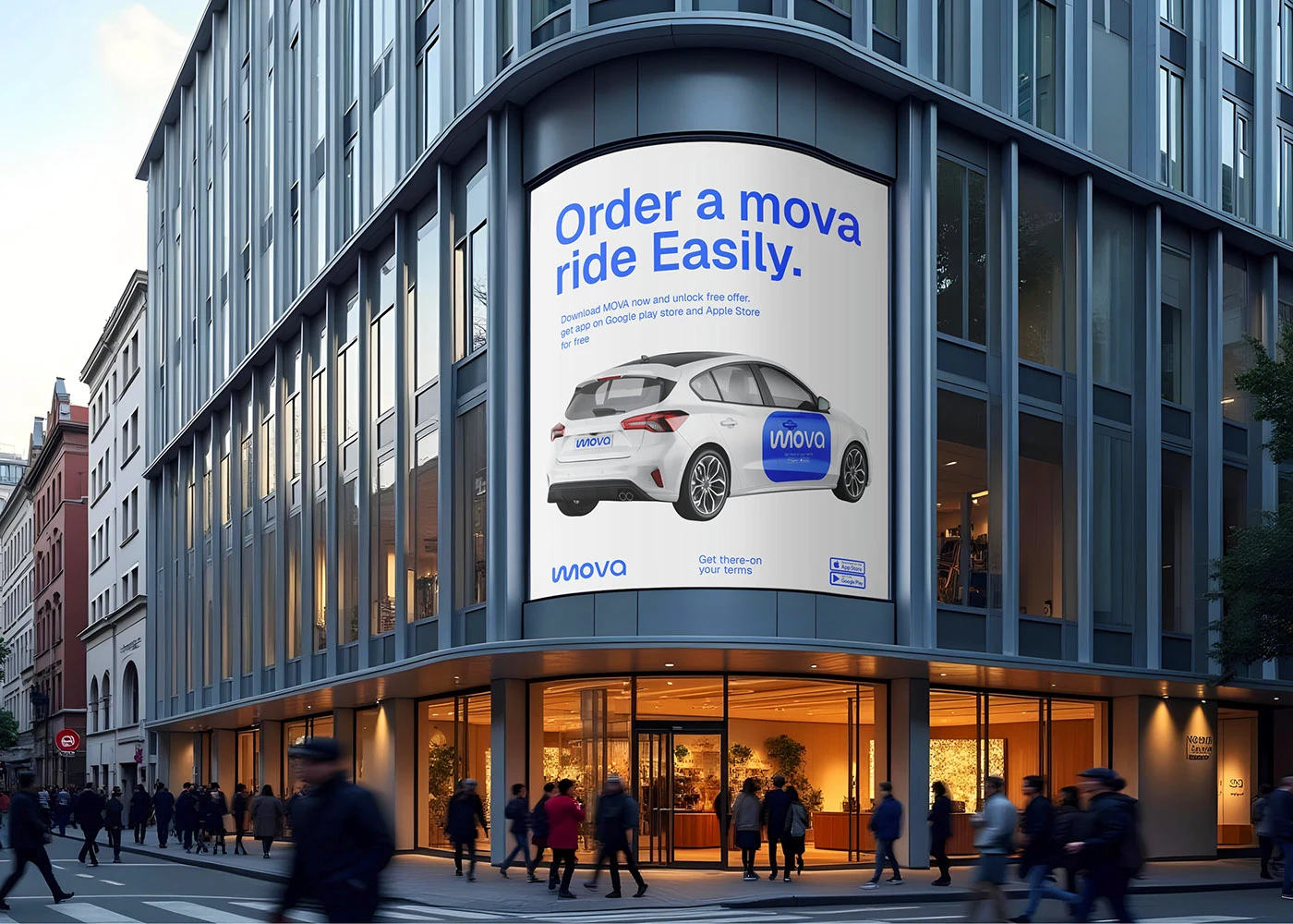
01 / 7 Campaign photography.
MOVA now has an identity that earns trust before the first ride even begins — a system built to scale from a single city launch to a platform riders genuinely recommend.
Every ride-hailing app looks the same until you actually open it. Eternull made sure ours doesn't - and that our riders notice the difference immediately.
Founding Team